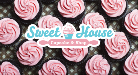
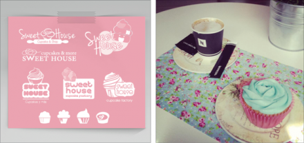
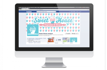
You’ve all heard the phrase “keep it simple, stupid” and that’s advice that can pretty much relate to anything in the world. It’s especially relatable to the world of branding. In the case of Spain’s Creatiff Studio and the work they did for Sweet House Cupcake & Shop, they added one word to the adage: “sweet”. Keep it sweet and simple, stupid. Naturally the branding of Sweet House has a soft, feminine touch to it, but the small details that Creatiff added are what help make this branding job pop. Sweet House implies a certain type of product, but they didn’t live off implications alone in the name. With the logo and much of the brand’s imagery, they added cupcakes, lots of them. The cupcake is an interesting food item because it has a unique shape that is easily identifiable and thus easy brandable. Cupcakes show up as a photography element in the first photo below and it creates a nice symmetrical image with a lot of visual appeal. I like the addition of the dough roller serving as the underscore of the logo. It’s a nice touch and Creatiff did a great job keeping this logo relatively simple, but as sweet as possible.