Obviously Smart Branding

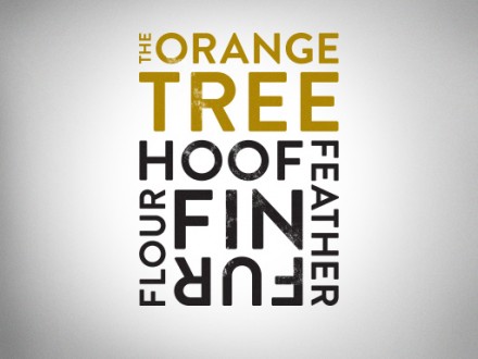
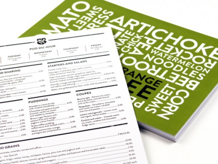
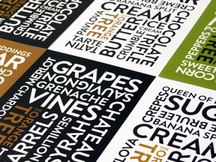
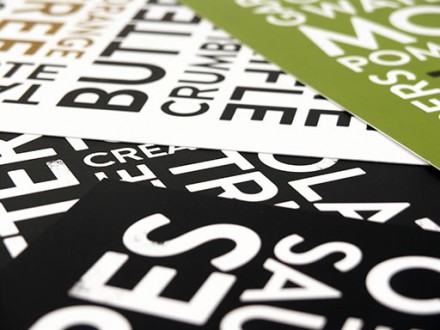
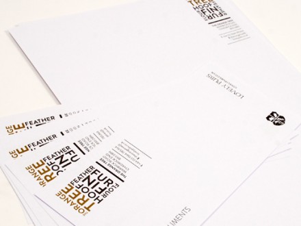
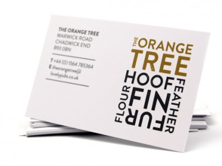
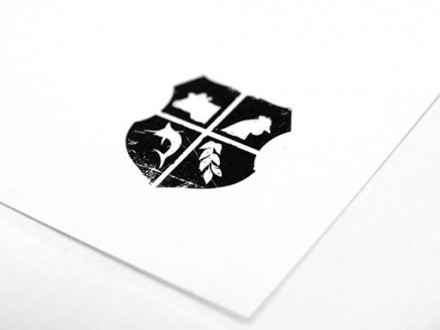
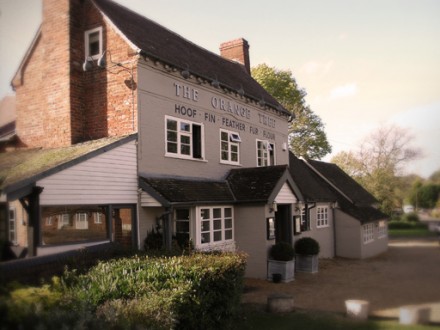
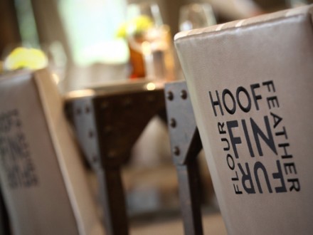
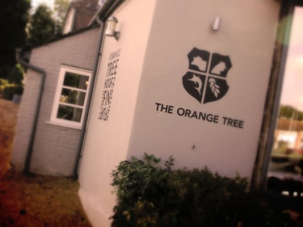
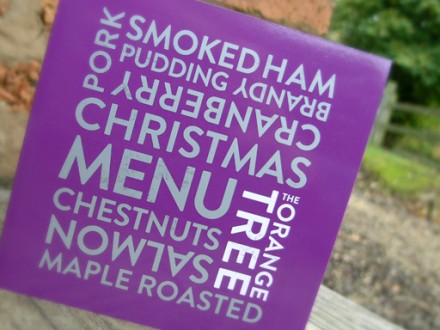
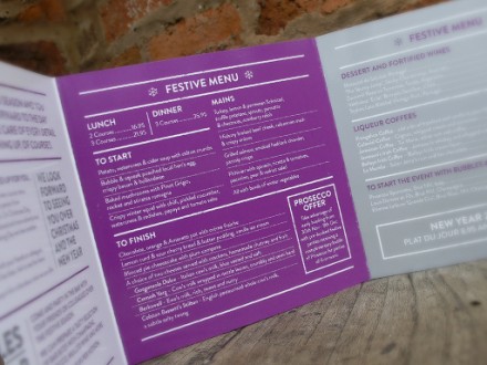
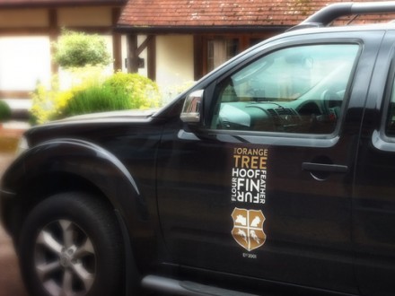
Stating the obvious is sometimes—obviously—completely necessary. In the world of branding, the obvious, when executed properly, can be a branding force to be reckoned with. The Orange Tree Pub in Warwickshire, England want to refurbish their brand and Design:One came up with a clever scheme to rebrand and remind what the pub does well. It started with the four primary protein offerings and one additional central ingredient and that turned into a logo that featured the words “hoof, fin, fur, feather, flour”. The use of words in their design became prominent once the new logo was created and those five words appear everywhere—all over the building and on the upholstery. The five words also translated into a logo stamp with images of the ingredients. The entire scope of the branding flows well together and is a nice meet up of modern and classic stylings for a pub on the countryside.

ot-1

ot-2

ot-3

ot-4

ot-5

ot-6

ot-7

ot-8

ot-9

ot-10

ot-11

ot-12

ot-13

ot-14

ot-15

Discuss this Project

Leave a Reply

This site uses Akismet to reduce spam. Learn how your comment data is processed.

The Forktales Podcast™: Interviews with restaurant industry leaders and visionaries

Restaurant and advertising industry headlines and thinking

Reviews of restaurant experiences from around the globe 

Reviews of our favorite design, business, & restaurant books

Our favorite typography and fonts

Inspiration in your inbox

Get the latest inspiration in your inbox every Monday morning, for FREE!

"*" indicates required fields

This field is for validation purposes and should be left unchanged.

Delicious Bits in your Inbox!

Get the latest and greatest content delivered to your inbox for free!

"*" indicates required fields

This field is for validation purposes and should be left unchanged.