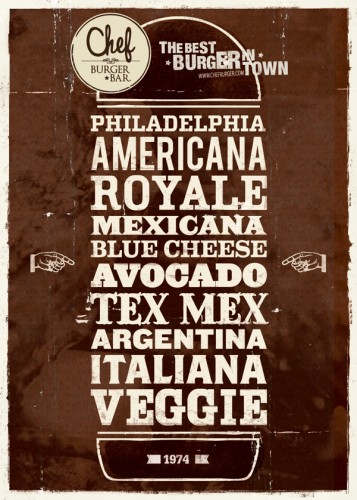
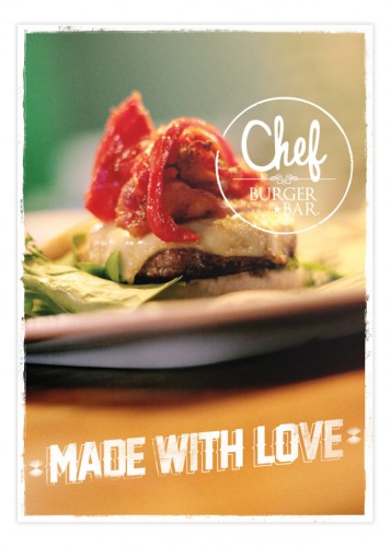
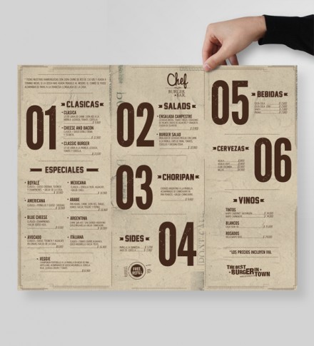
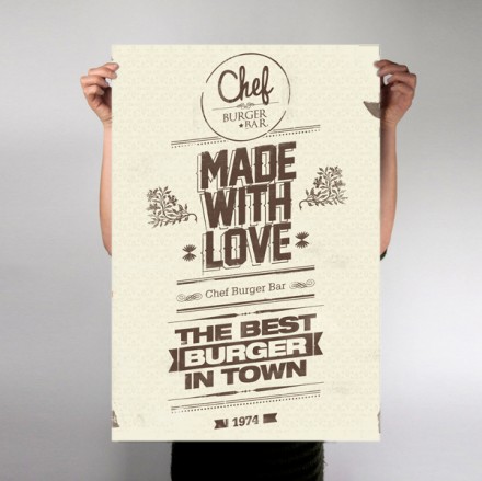
An American burger made in Medellin, Colombia. Sounds a little odd, but we’ve repeatedly seen examples lately of brands from around the globe turning to American influences in their branding, some going as far as to appear “American” at first glance. Chef Burger Bar, branded by Masif, has a distinct American burger restaurant feel, from the year stamp on many of their assets to the promotion of the “best burger in town” claims. The typography, logo and signage all feature a distressed and vintage look, but the imagery of the sandwiches themselves is a bit of departure. Using the best food porn angles in the business, they create photos of their burgers that look incredibly decadent and enticing. The whole brand captures Chef well; it’s a restaurant that mixes glamour and a wipe-your-hands-on-your-pants way of life, a nice balance for any restaurant, but especially a burger bar.
The Forktales Podcast™: Interviews with restaurant industry leaders and visionaries
Restaurant and advertising industry headlines and thinking
Reviews of restaurant experiences from around the globe
Reviews of our favorite design, business, & restaurant books
Our favorite typography and fonts
Inspiration in your inbox
Get the latest inspiration in your inbox every Monday morning, for FREE!
"*" indicates required fields

