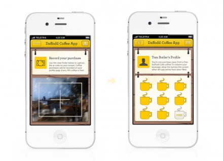
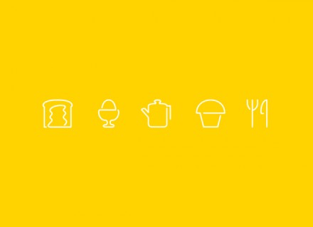
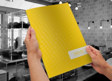
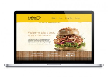
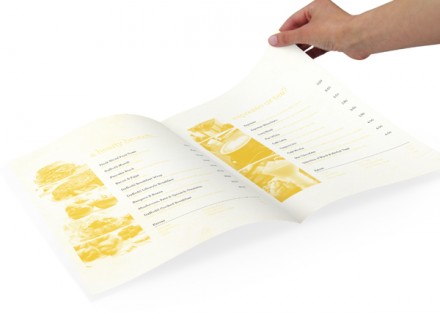
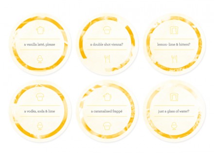
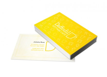
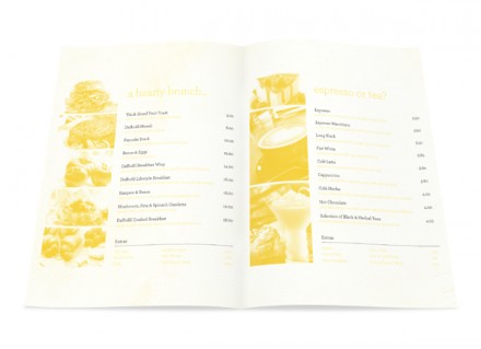
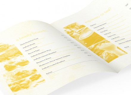
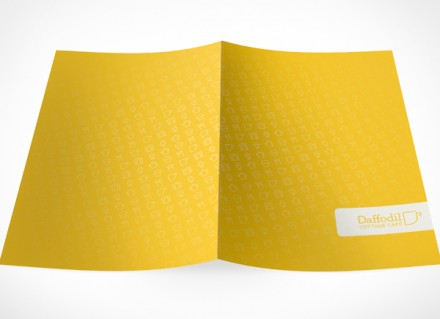
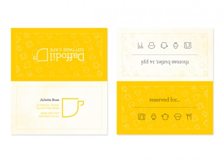
How about a little yellow to start your Monday morning? Color choice is always an interesting conversation when discussing branding and there’s an interesting one from Australia’s Daffodil Cottage Cafe, designed by Thomas Butler. Yellow is the decision here and it’s a bold yellow, but the beauty in what they’ve done is remove the boldness from the decision. It actually seems kind of smart. Daffodil is another shop looking to serve quality coffee and an experience that embraces social connections, friendly service and an even friendlier vibe. The question for Butler was how to differentiate that desire, which isn’t an uncommon mission in the coffee industry. He chose yellow, appropriate for the name and the desired execution. Daffodil is aiming for the younger client, a web- and tech-savvy individual so the icons in the branding work brilliantly. They tell a story and refer to the digital world that is a way of life for many. There’s a little bit of minimalism here, but I think it works in this age when people want to see and understand quickly. Yellow is a bright and bold color choice, but it sounds a loud message.

