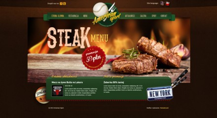
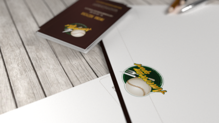
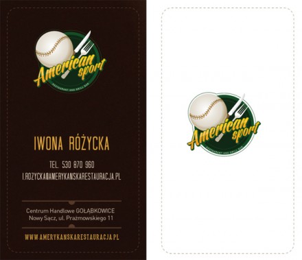
Pretty interesting concept we’re going to discuss today. In Poland, a restaurant was created to represent influences from American restaurants, specifically the American bar and grill. Typically these places show sports and the availability of sports on many televisions inside a location is a major draw for a restaurant like this and that seems to be the case with this restaurant as well. I’m not sure how this brand American Sport, created by David Nawrot, speaks to the Polish audience it’s placed in, but on the surface it looks like there’s some misses in execution. The website looks solid and clean and they clearly did a thorough job in creating a brand and extending it throughout the accompanying collateral, but I think the logo itself is limiting. Logos generally need a feeling of something unexpected, something new, fresh or never seen before. That’s a piece of the pie that makes them memorable, a key quality in a logo. American Sport’s logo feels obvious with its color scheme and icon choices. There’s a baseball and a place setting of a knife and fork. It doesn’t feel forced–another positive!–but it’s expected. The vibe projected by this brand is one that’s been felt before, that’s a miss in branding in my book.

