New American Grill’s Stainless Steel Inspiration

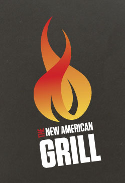
Working in branding, especially on the research and strategy side of things, you meet with clients often and you’ll hear a lot of interesting comparisons regarding what a logo should feel or look like. We kick off this week with New American Grill in Vermont and its designer Jessica Nichols. Nichols was told by NAG that the brand’s logo needed to be modern, unintimidating and feature the slickness of stainless steel. The results I think speak for themselves. The flame is a pretty universal symbol, but this version has enough curvature and color combos that it’s appealing. I love the font choices here. I think it’s bold and up front about what it is and I get the same vibe from the brand itself. My somewhat untrained eye sees a deep red for “The” in the name portion of the logo, but it doesn’t quite match the red in the flame. I’d love to see a little more consistency there, but in general I think this is a solid logo for this restaurant.

8a36c31afb56e0a79397466412b048a1

8dfd453d3db57b8ce3818c030a7bb193

42de447b06288be96bcba18db27c3e01

081740fc3c020c18949c171293a0f855


Discuss this Project

Leave a Reply

This site uses Akismet to reduce spam. Learn how your comment data is processed.

The Forktales Podcast™: Interviews with restaurant industry leaders and visionaries

Restaurant and advertising industry headlines and thinking

Reviews of restaurant experiences from around the globe 

Reviews of our favorite design, business, & restaurant books

Our favorite typography and fonts

Inspiration in your inbox

Get the latest inspiration in your inbox every Monday morning, for FREE!

"*" indicates required fields

This field is for validation purposes and should be left unchanged.

Delicious Bits in your Inbox!

Get the latest and greatest content delivered to your inbox for free!

"*" indicates required fields

This field is for validation purposes and should be left unchanged.