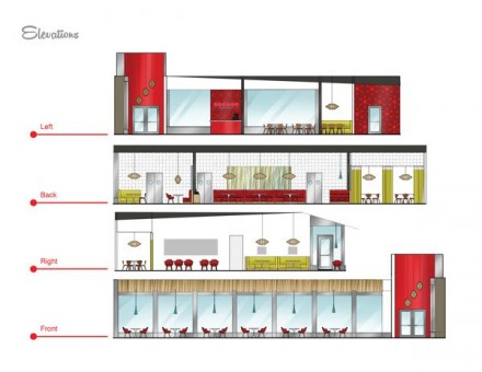
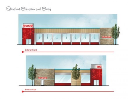
If by “wholesome family eatery”, the restaurant Cherry, branded by Natalie Benos, means a trip back to the atomic era of the 50’s, then they got it right. This restaurant is committed to family eating and serves nutritional meals inspired by home-cooked meals. While many that see the branding of Cherry will think back to the 50’s and 60’s in American history and recall some of the kinder memories of that time period, there are younger customers that won’t. The use of the atomic-style design from that era is also, i would imagine, friendly to the eyes of children. There’s a fluid motion to much of that style that is fun and energetic, the kinds of things children cling to. So I commend Benos for honing in on that specific style to capture the vibe of wholesome familiness, but I question whether she created enough brand value to generate respect from the customer. There are brands that we use and then there are brands that we use and respect. Many of the latter have managed to incorporate that sense of demand into their branding. That’s just a thought from some random guy, but all of that aside, what Benos did create for Cherry is a clean, thoughtful and fun brand for a restaurant serving up old-fashioned values.


