Bacano gets a nice, upbeat brand

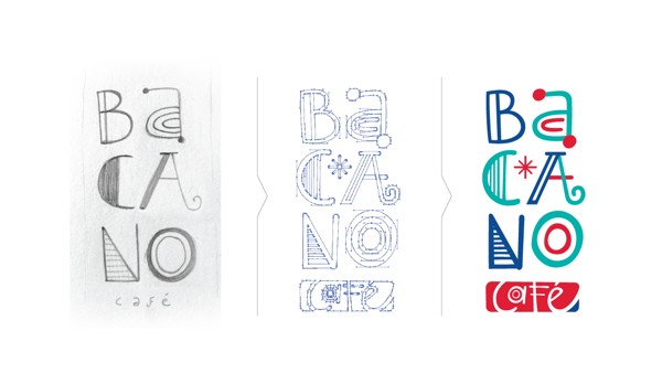
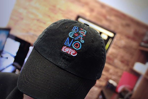
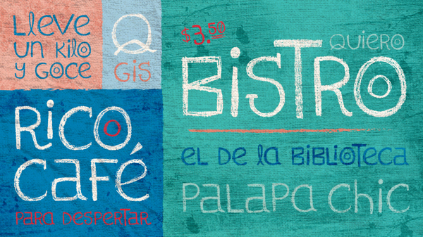
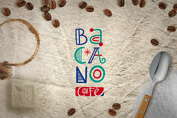
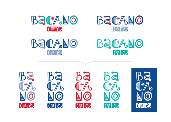
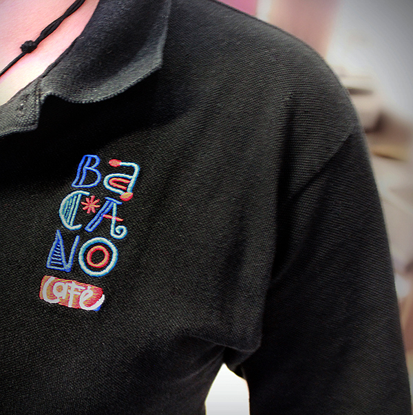
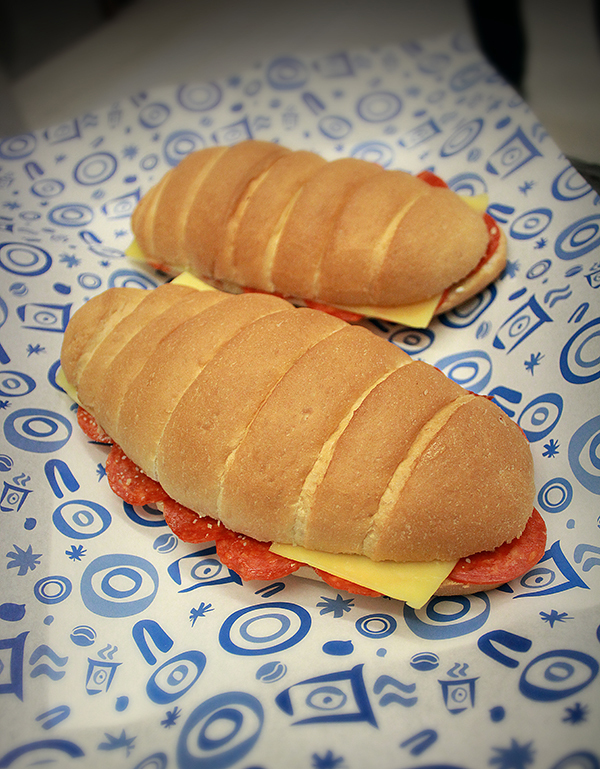
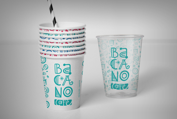
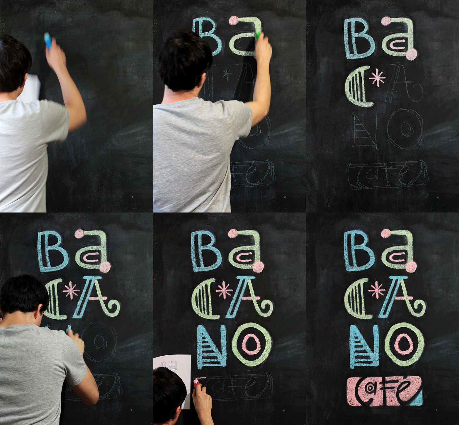
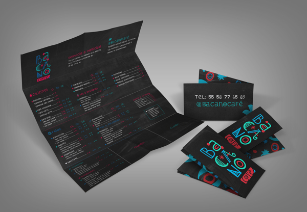
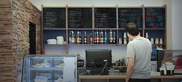
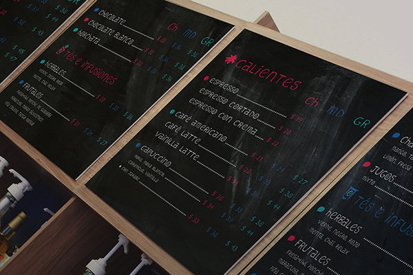
Looking to become a sort of oasis from the beach, Bacano tapped the creative minds at Studio Sub out of Mexico Distrito Federal, Mexico. Their design work leverages a playful, hand drawn chalk typeface with vibrant, upbeat colors. The typography is embellished with dingbat style graphic treatments to give it the fun, poppy look. These illustrated graphics are seen throughout the brand’s touch points. The typography for the menus is simple and readable with touches of color and graphic treatments to tie it back to the cafe’s identity.
0a5566ab5e75b96cd78929452138a679

3a63ab2875538bad08b7b1c2699ab09c

71ff9c80b0939de32b70e1391204dde9

082cc5cb7a6d11baf2dffa1720366910

394b22fe79a30e9606601d8bc20770ce

1014c3dddb9d5ab11423fd4958953c0d

3162d57864988816ab50cbff490e66b7

6725fca61b8a6ad5d40802d6a7e1be29

7414d38093811c39d22109d73f297d12

430439eb028ccc91fdf950a1e61161e9

d3c7d356a5c534d806342600429f49e8

d012767ebc57828747b92c1c003058a3


Discuss this Project

Leave a Reply

This site uses Akismet to reduce spam. Learn how your comment data is processed.

The Forktales Podcast™: Interviews with restaurant industry leaders and visionaries

Restaurant and advertising industry headlines and thinking

Reviews of restaurant experiences from around the globe 

Reviews of our favorite design, business, & restaurant books

Our favorite typography and fonts

Inspiration in your inbox

Get the latest inspiration in your inbox every Monday morning, for FREE!

"*" indicates required fields

This field is for validation purposes and should be left unchanged.

Delicious Bits in your Inbox!

Get the latest and greatest content delivered to your inbox for free!

"*" indicates required fields

This field is for validation purposes and should be left unchanged.