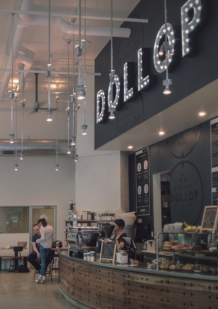
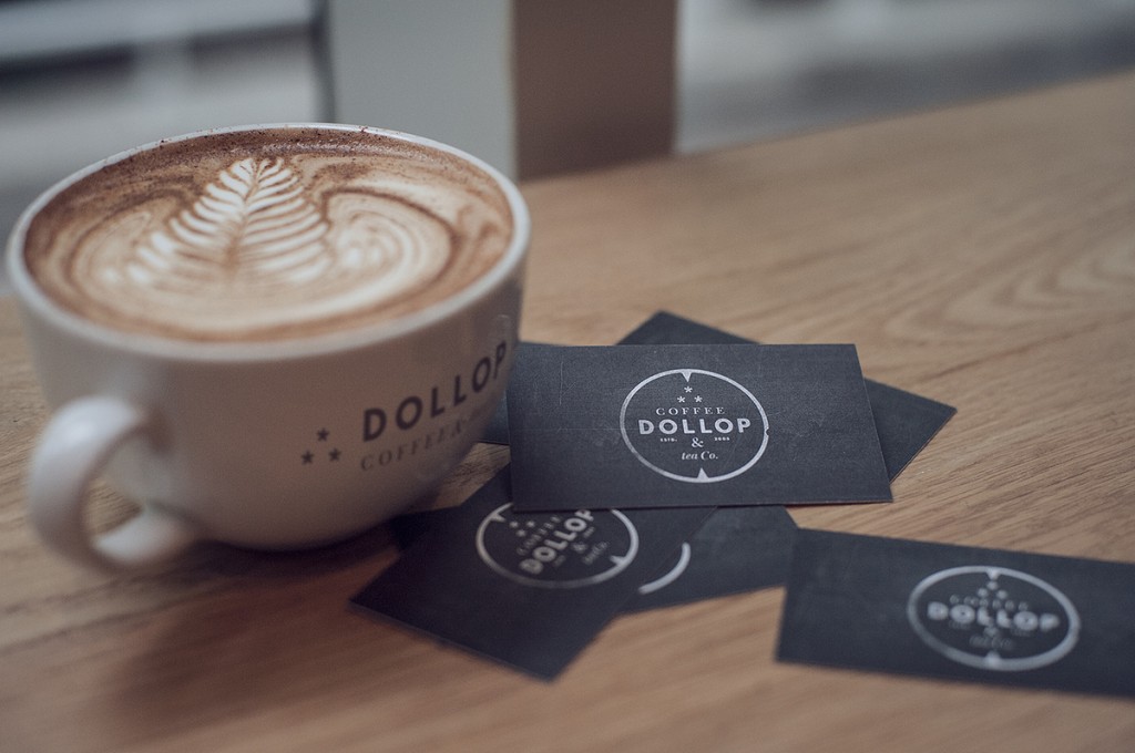
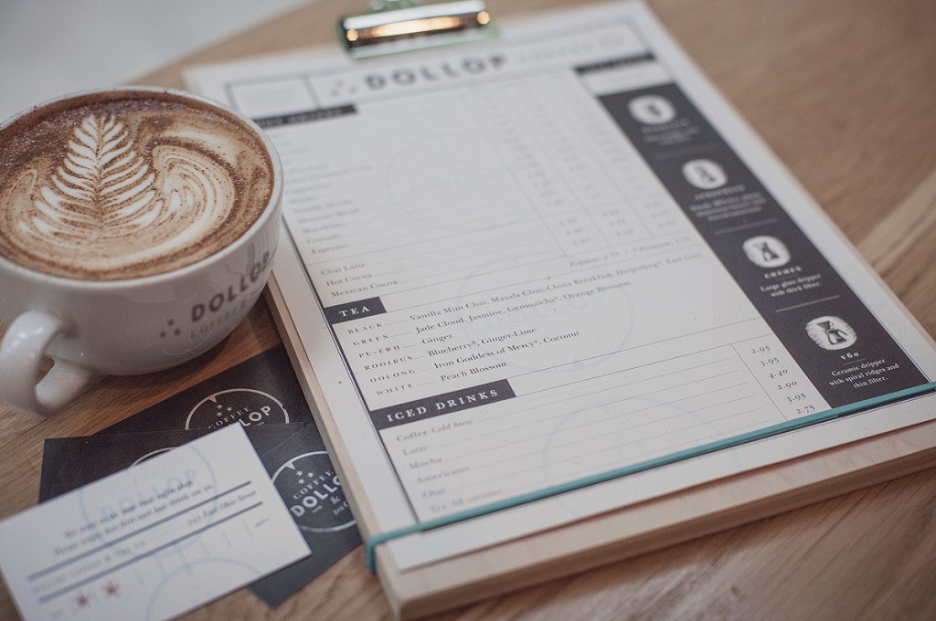
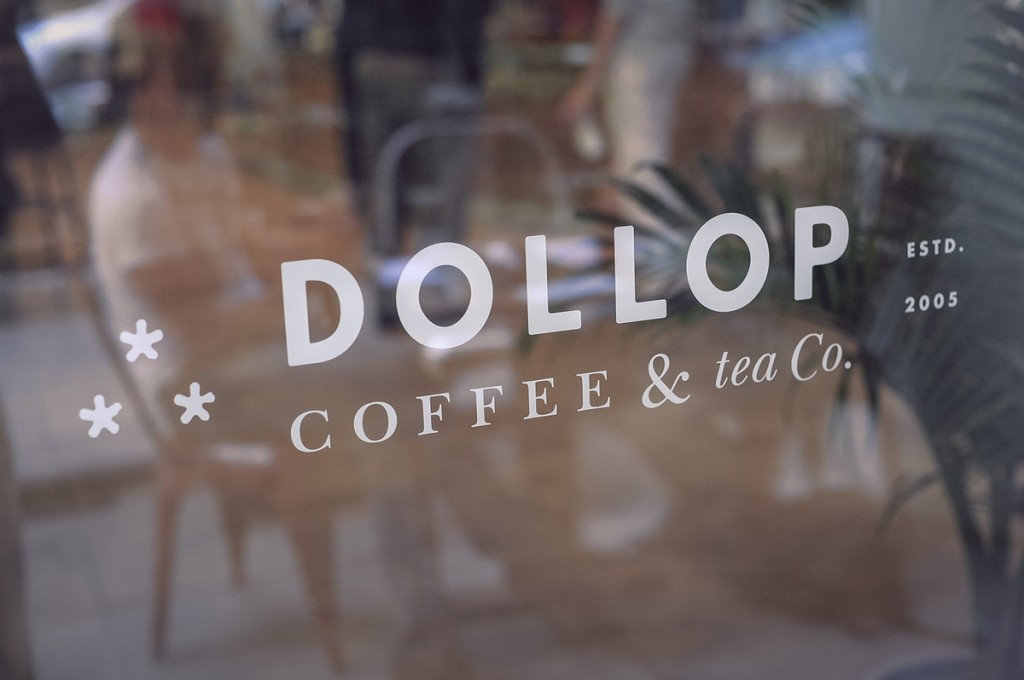
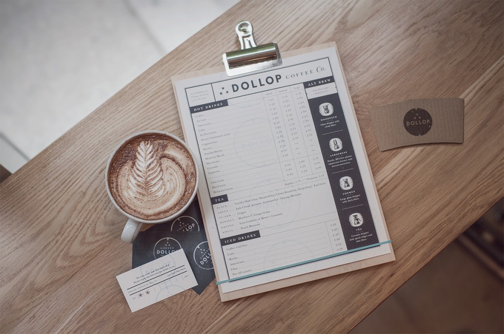
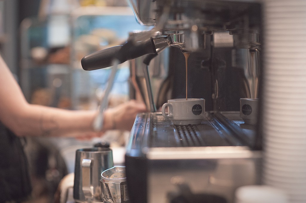
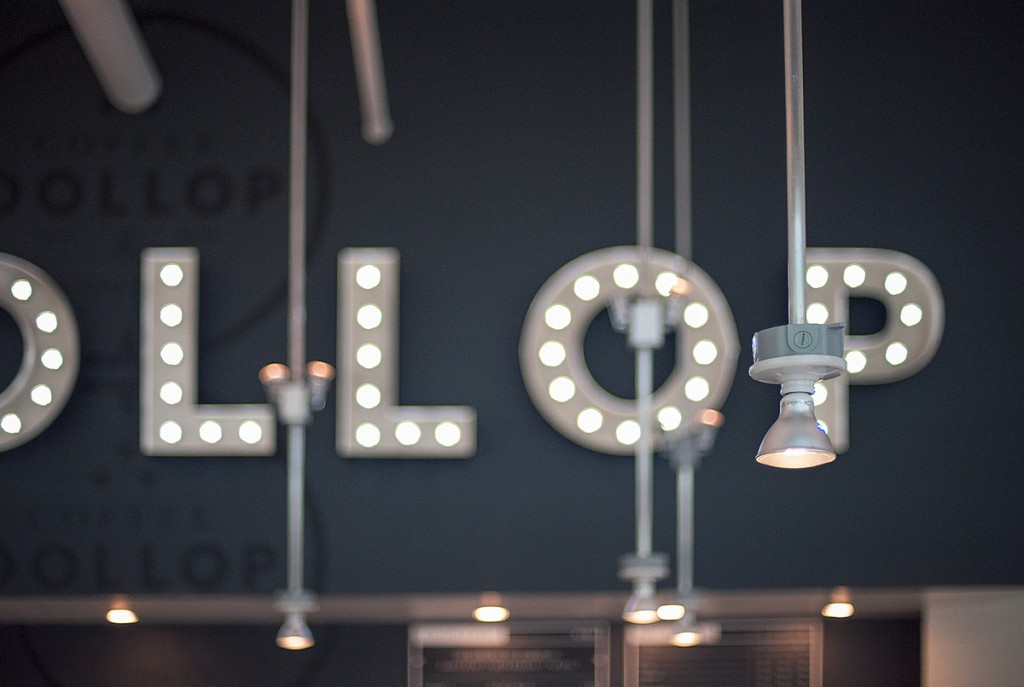
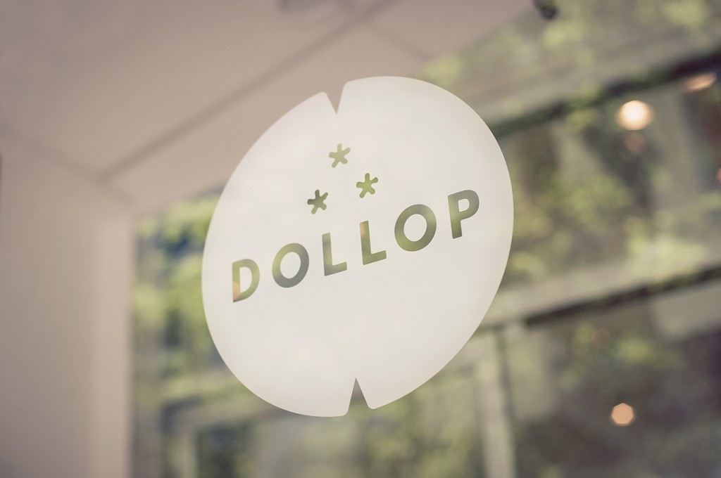
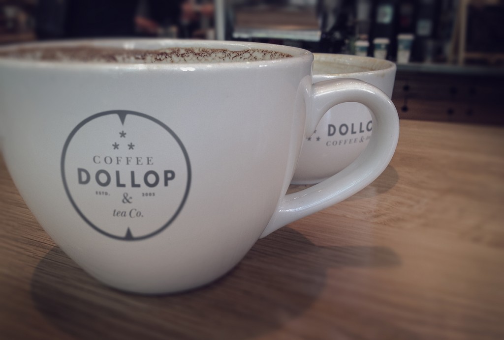
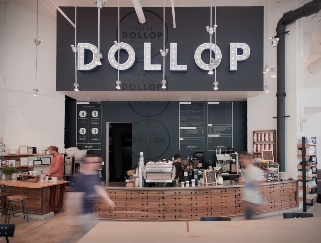
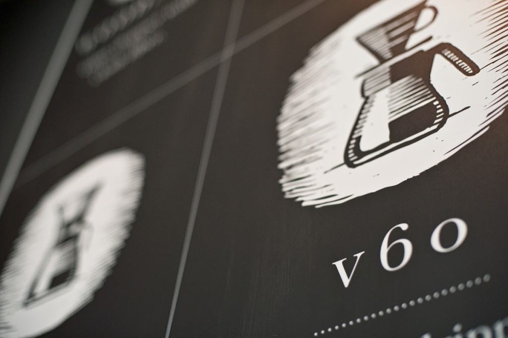
Dollop comes with a simple color palette and minimalist typographic and graphic treatments to portray clean simplicity. This translates into pure coffee experience where a person can expect everything to be quite good. The logo is nearly completed typographic featuring only asterisks and a circle treatment. The identity comes to life with that logo’s elements being applied in new ways like a leaderboard lighted sign on the interiors, black on dark gray walls to have add subtlety, and a menu that’s features a neat, strong grid system. Overall the experience has a natural vibe that flows nicely. It’s quaint and humble, but still of high quality design. A nice selection of work for which Firebelly should be proud.