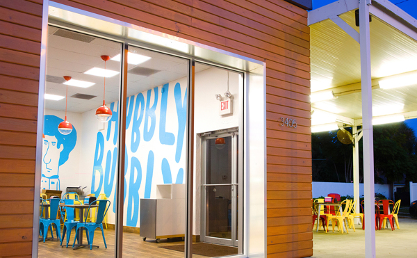
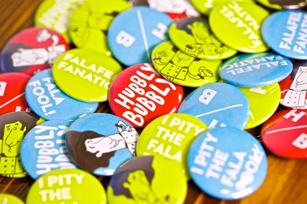
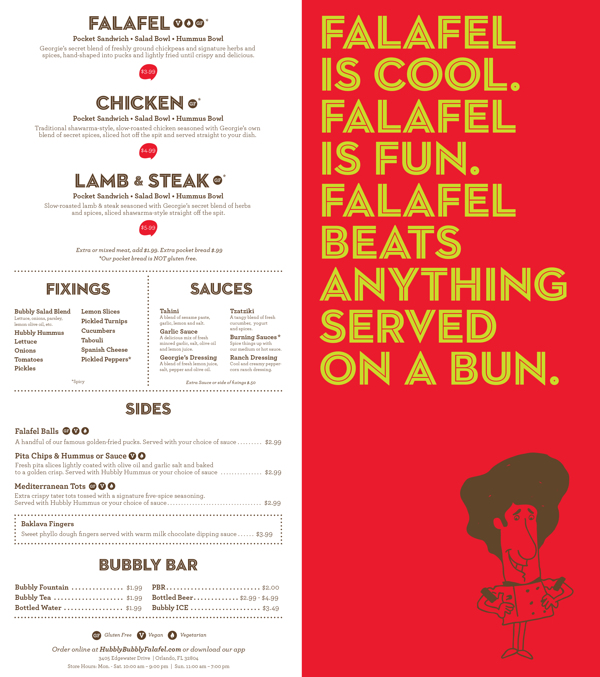
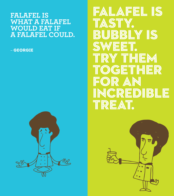
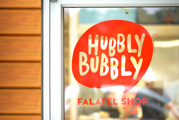
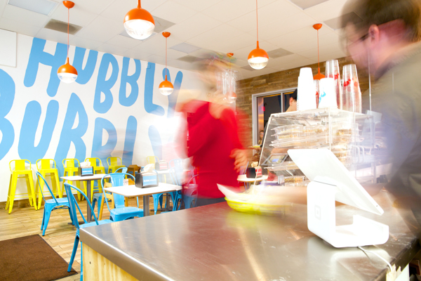
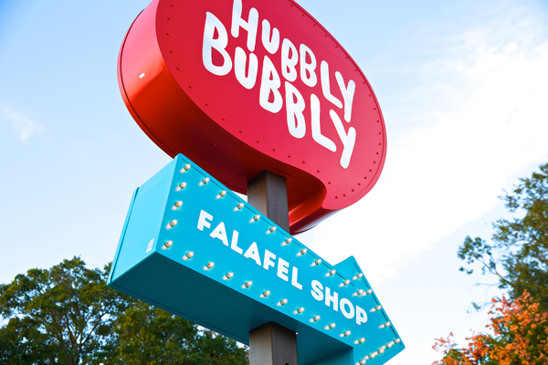
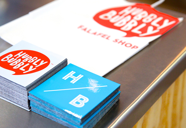
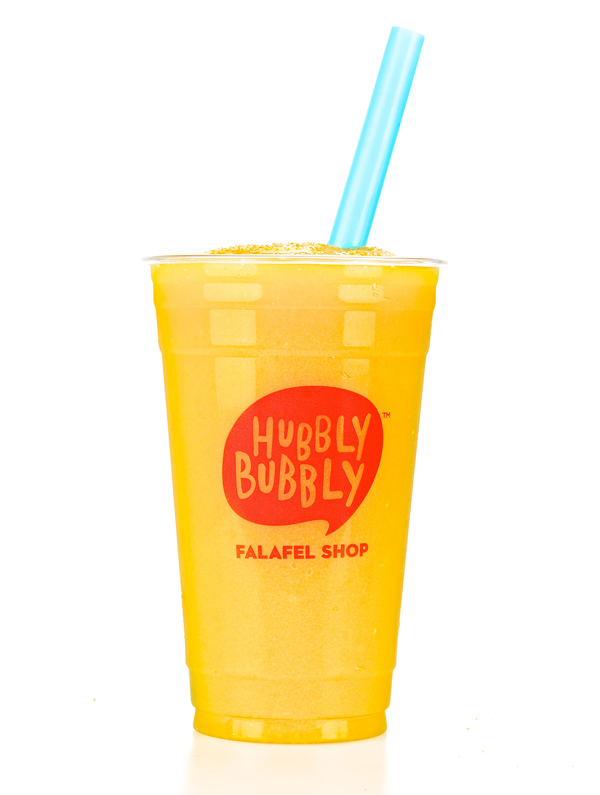
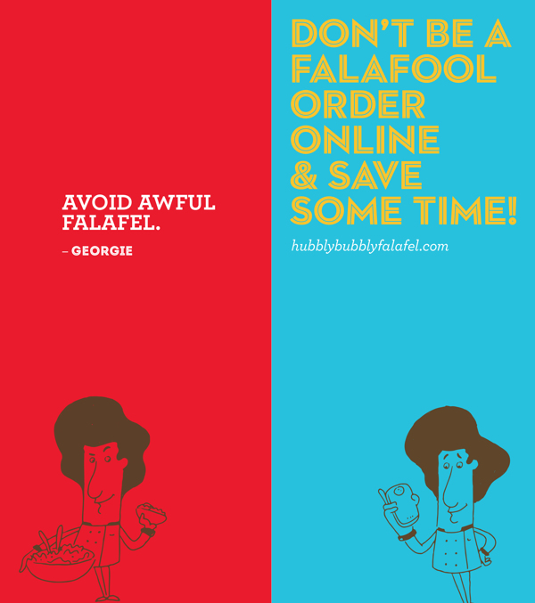
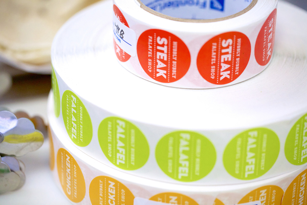
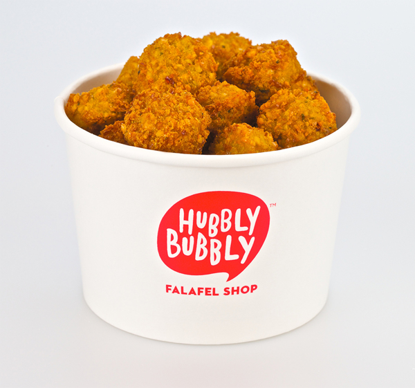
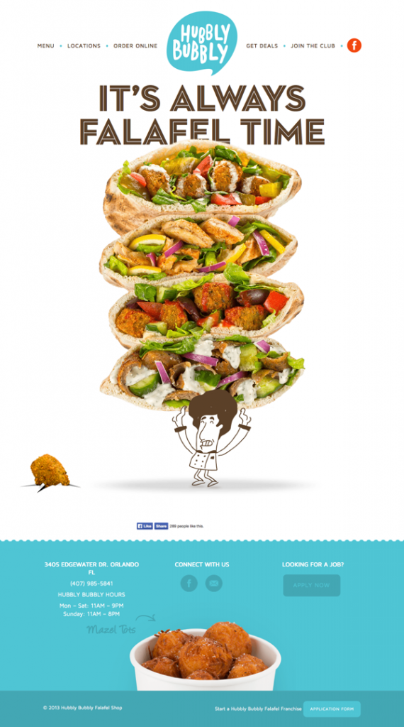
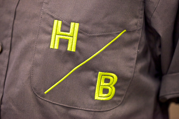
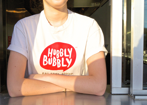
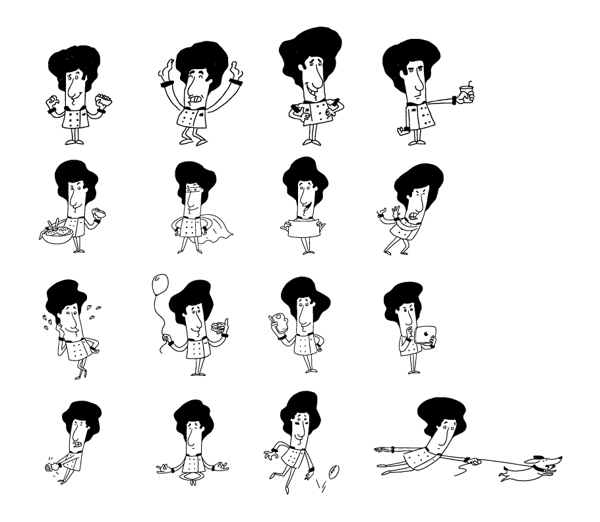
The peeps over at Push are at it again with another awesome restaurant brand identity design. This time it’s for Hubbly Bubbly, a fun falafel shop. First, i have to say it is extremely close to Yeah! burger in architecture and design elements. Although the illustrations by Tad Carpenter found at Yeah! Burger are more abundant, the style and vibe over all seem to be found here at Hubbly Bubbly. With that being said, the look is fun, upbeat and, yup, BUBBLY. Bright cool colors are offset by a pop of red. The brand’s little representative illustration is seen throughout ads, menus and even on the walls adding a personal, cartoony touch. What I love most about this work is the restaurant’s sign. It’s over the top awesome. Signs are expensive and they’re usually not thought through enough, but Hubby Bubbly and the Pushers did a great job of making sure this sign popped!
