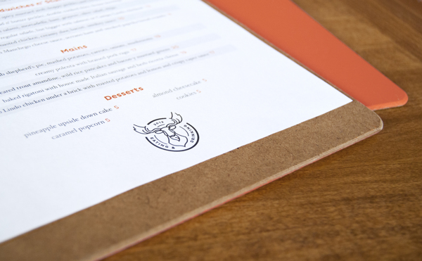
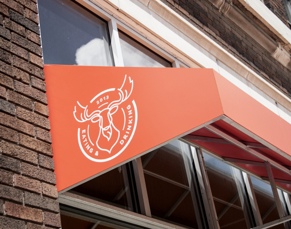
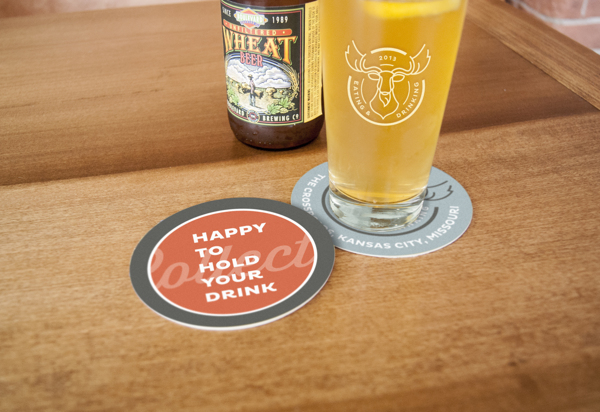
Collection is the newest restaurant from Celina Tio of much acclaimed Julian. Once again Stir & Enjoy out of Kansas City designed up a dynamic and intriguing identity for this new restaurant venture. The use of simple lines meld well with the script logotype while the semi-muted color palette keeps things neat and approachable. Here’s Stir’s description of what they did and why:
The name derives from Tio’s former boarding school in Pennsylvania, where the mascot was a moose. “Collection” was a homeroom-type gathering time for students. The restaurant fosters that kind of casual interaction over some of Tio’s personal favorite dishes, like her takes on baked rigatoni with sausage and manchego mac n’ cheese.
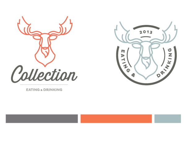
The tight-budget identity and elements hinge on a stylized moose head that is at once familiar and intriguing. The script word mark utilizes some signature flourish without getting overly fussy, while the dominant red-orange in the color palette conveys friendly energy and fun.