Frankie’s Fine Foods Restaurant Branding

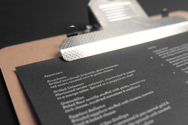
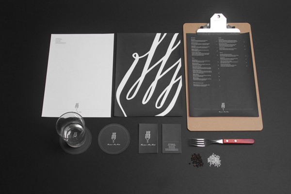
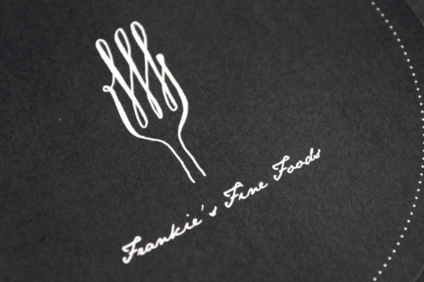
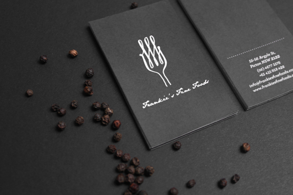
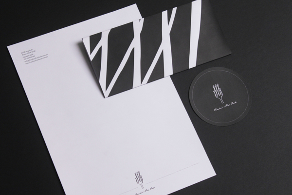
This stark and simple, black and white restaurant brand identity package let’s basic design principles speak loud and clear. It sets a backdrop for the logo to jump and pop with its witty rendition of a fork and monogram combination. I love how the white type on black background keeps this identity on a higher class level. Designed by Yerevan Dilanchian.

6bbcfc606e93e1d0adbc650e3a370fbd

6cc7ac05d2a1835801954c75a084145e

74a3e2de0221875471a3dd7730c3cd25

91307f8a513d0c5b4f4ddf65a41bd82a

fc4d6d73a6ec4728db75db81636fc189

Discuss this Project

Leave a Reply

This site uses Akismet to reduce spam. Learn how your comment data is processed.

The Forktales Podcast™: Interviews with restaurant industry leaders and visionaries

Restaurant and advertising industry headlines and thinking

Reviews of restaurant experiences from around the globe 

Reviews of our favorite design, business, & restaurant books

Our favorite typography and fonts

Inspiration in your inbox

Get the latest inspiration in your inbox every Monday morning, for FREE!

"*" indicates required fields

This field is for validation purposes and should be left unchanged.

Delicious Bits in your Inbox!

Get the latest and greatest content delivered to your inbox for free!

"*" indicates required fields

This field is for validation purposes and should be left unchanged.