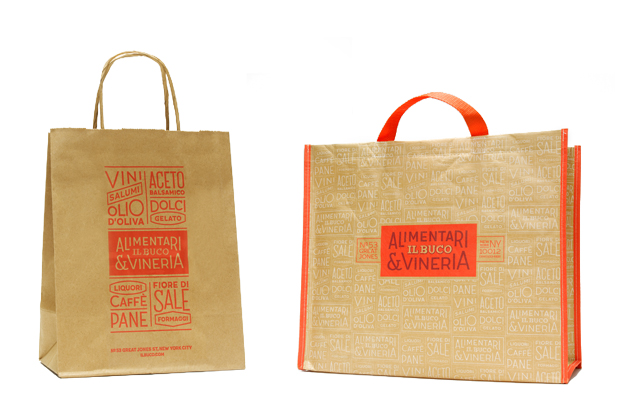
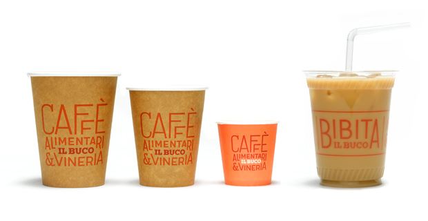
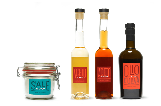
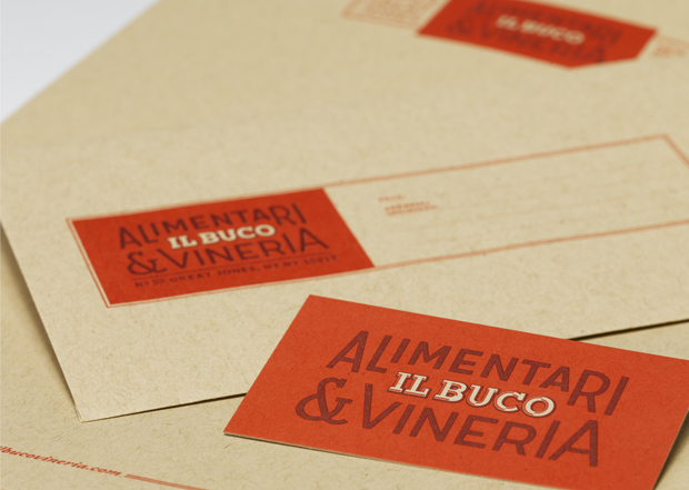
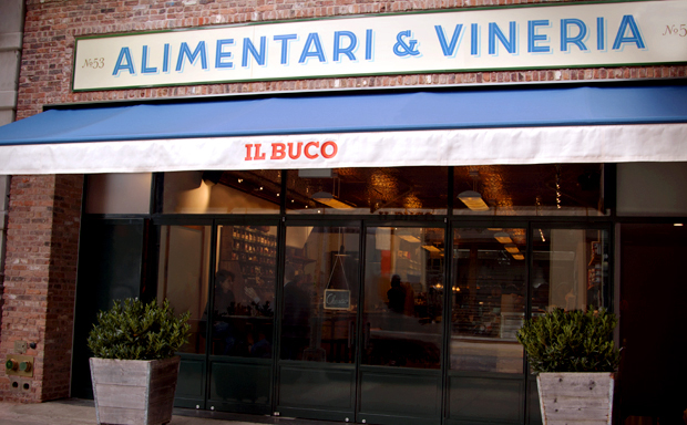
New York’s restaurants and retailers have a certain look. They have held onto the art deco era that boomed in the city for a quite some time. However, things change as the saying goes. That doesn’t mean a complete shift into something new though. Instead of pulling away in another direction, restaurants, bakeries and other purveyors of delicious delights are simply updating their identities while relying heavily on that Art Deco flavor. Case and point, Il Buco, an alimentari and vineria (a basic grocery store and wine bar) designed by the team at Mucca.
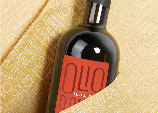
Il Buco features simple art deco typography that’s pushed to new, modern levels with angles, extensions, and interesting formats/layouts. It’s inviting in its warm color palette, and fresh in its approach. The staggered typographical treatments create a visual language that’s easily expanded into the various touch points this business has (eg, coffees, olive oils, etc.) It’s all married together with a common vision and graphic execution. Here’s what Mucca says on their site:
We created an identity that celebrates the spontaneity of authentic Italian eateries and markets, marrying a bright and modern visual language with the alimentari’s reverence for culinary traditions. Designed to be flexible, the identity redefines the Il Buco brand across a broad range of applications, from signage to menus to packaging.
