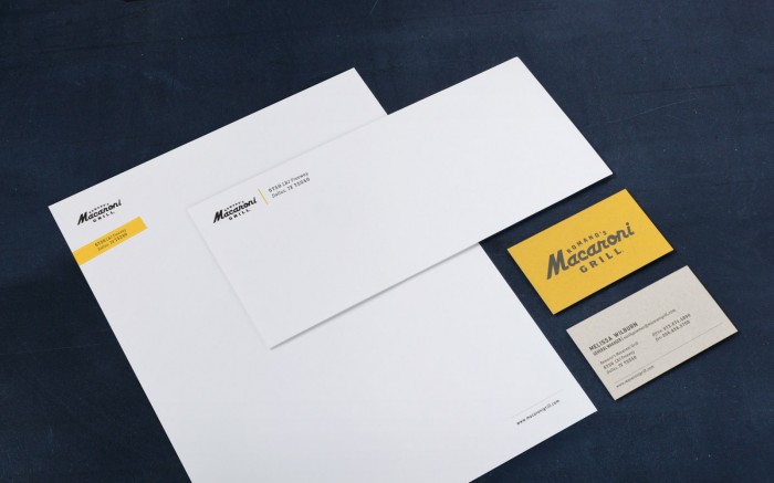
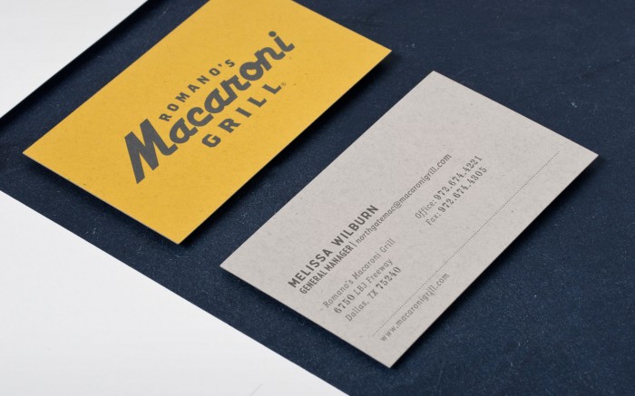
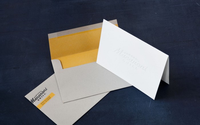
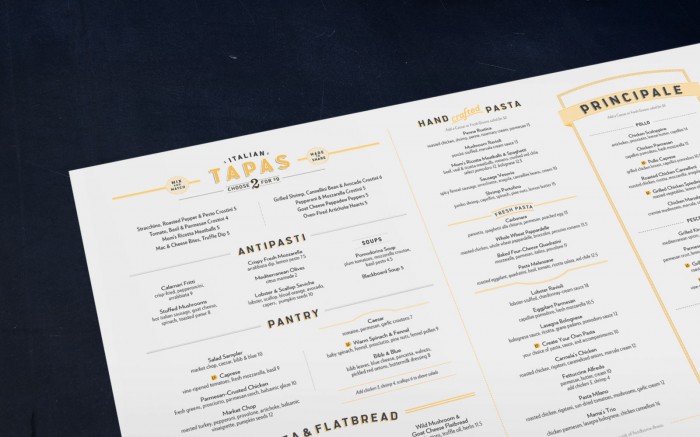
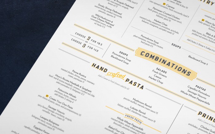
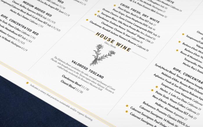
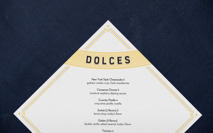
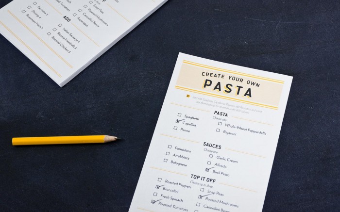
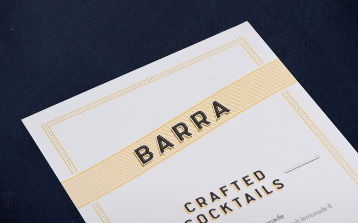
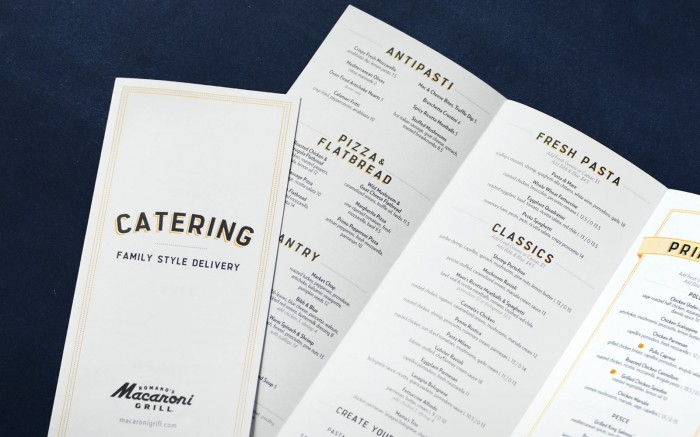
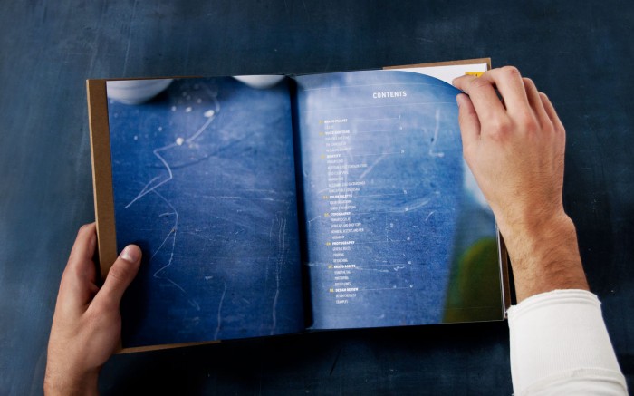
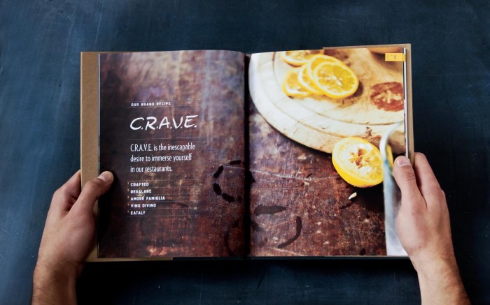
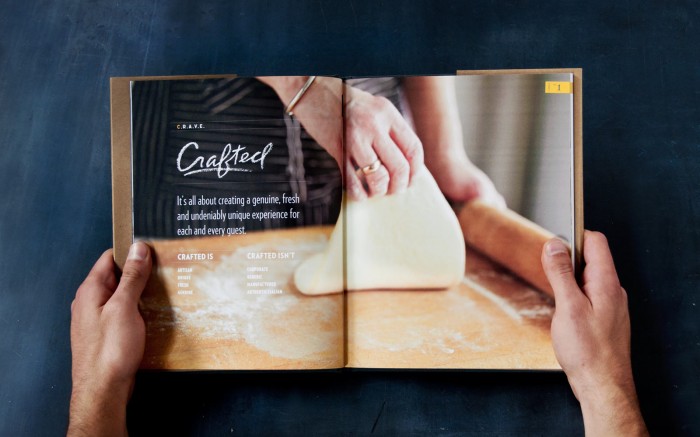
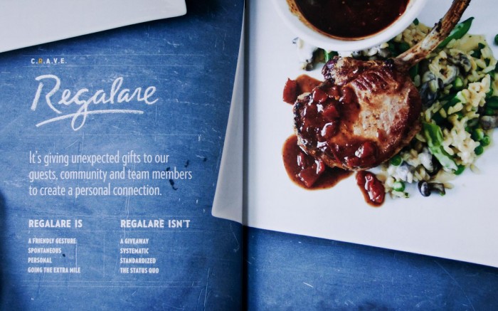
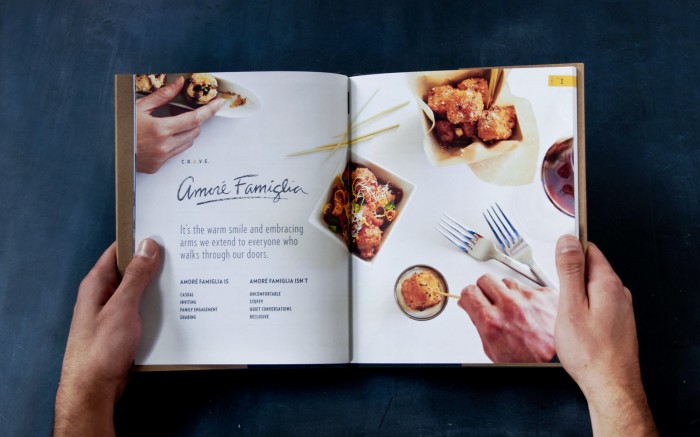
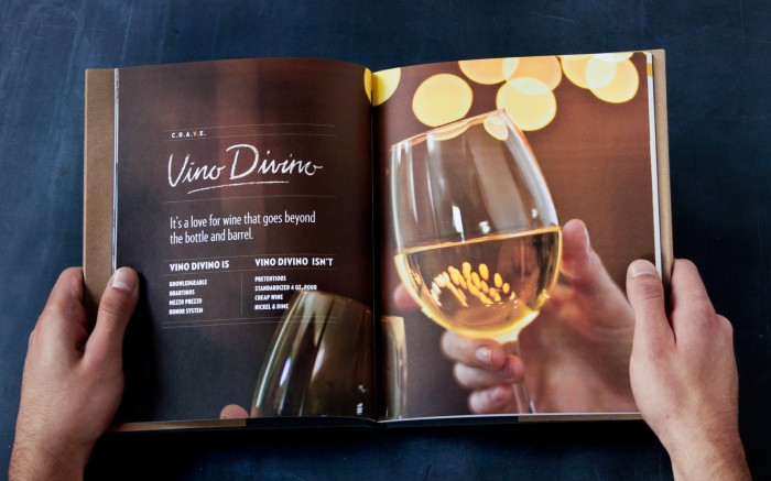
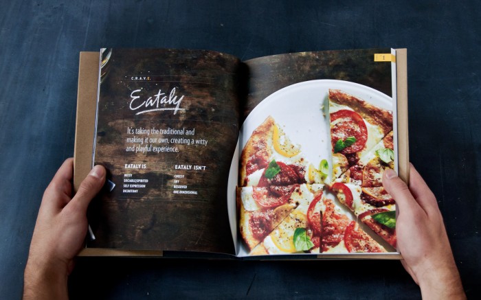
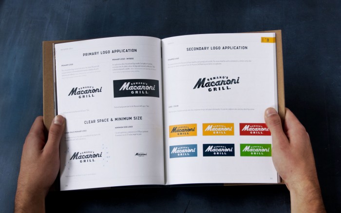
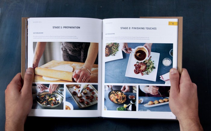
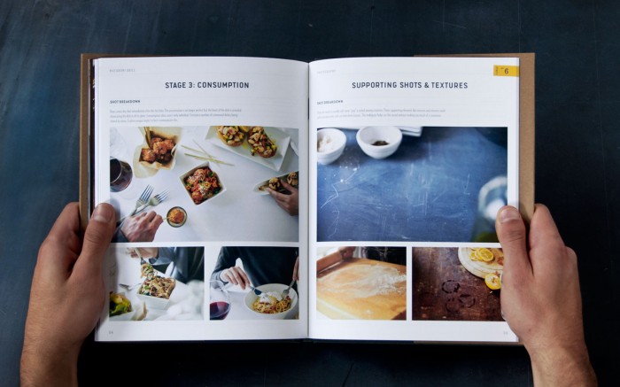
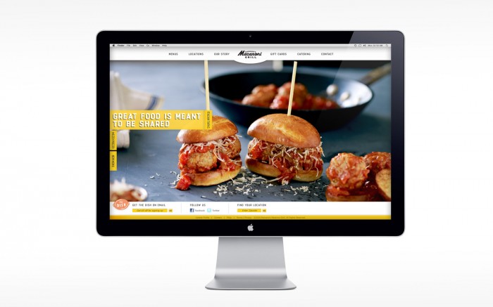
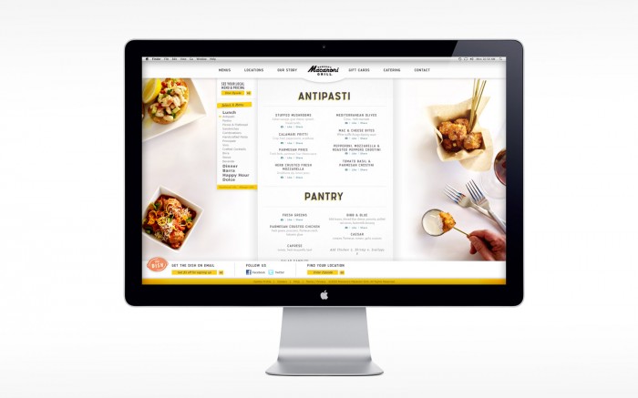
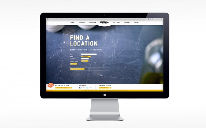
A lot of the work I curate for this blog is for small multi-unit or one off independent restaurants. That seems to be where the most wiggle room lays for developing a restaurant brand. However, once in a while, a large brand decides to make the right move towards bettering their brand. It’s a large undertaking and unfortunately the agency is either unknown or doesn’t choose to show the work publicly. That’s not the case with the Macaroni Grill and SuperBigCreative‘s brilliant work for them.
The Macaroni Grill is a simple brand with a great brand experience, but their previous image fell into the same ol’ cliche Italian-esque design expected from an Italian restaurant. It’s natural to go in this direction. It makes sense, but it’s not different, not unique and not memorable. I assume Romano’s Macaroni Grill realized this and engaged with SuperBigCreative to reignite the original flames that stoked Macaroni Grill’s brand fires.
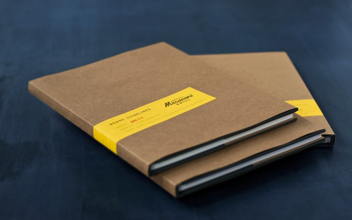
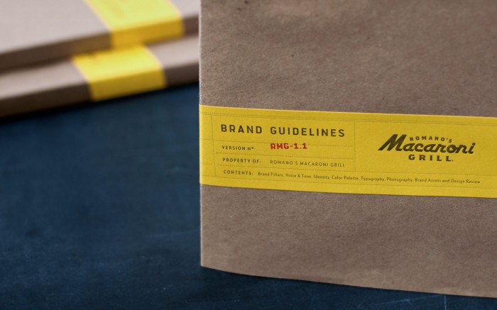
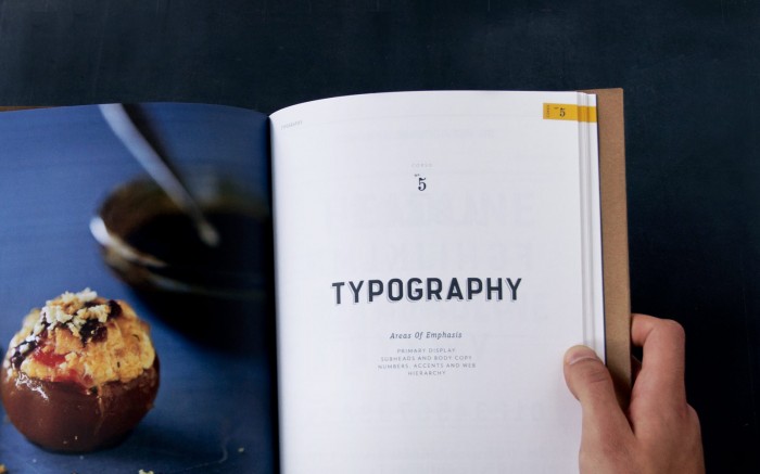
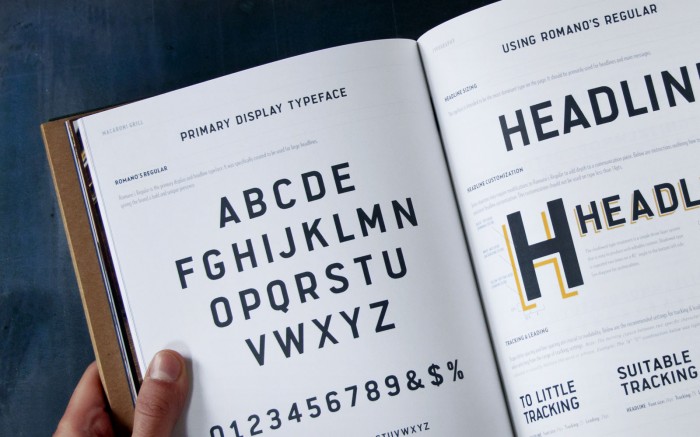
Their approach was thorough, smart and well executed and implemented. They furnished the inhouse team with all the tools necessary to carry out the brand’s many touch points beyond what they were contracted to accomplish. As a bonus, I will post one of the inhouse designer’s work so you can see how well done it is and how she stayed “in brand.” For now, I’ll let the work do the rest of the speaking.
