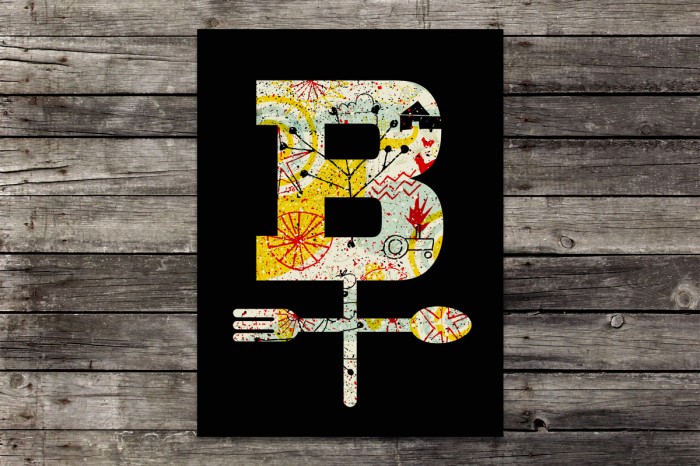
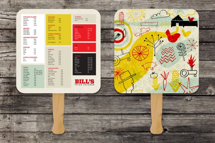
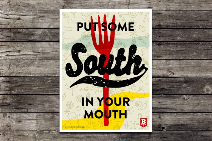
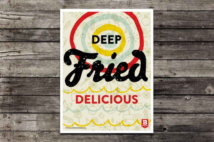
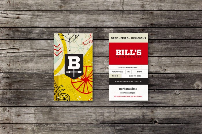
Kyle White‘s design for Bill’s Fried Chicken restaurant reflect a kitschy, hand drawn vibe that says “country” without the cheesy Texas starts and painted wood trinkets. The color palette is funky and fresh and the illustrations are fun with a subdued vibrance. I love the weathervane inspired logo. It’s memorable and new. Great work.


2 Responses
Hand drawn, fun, friendly. This proves that you don’t always have to be as clever as a fox to get work done.
Damn straight. Well said.