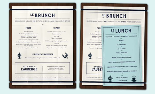
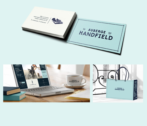
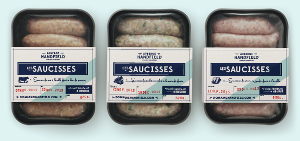
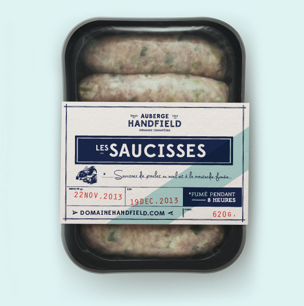
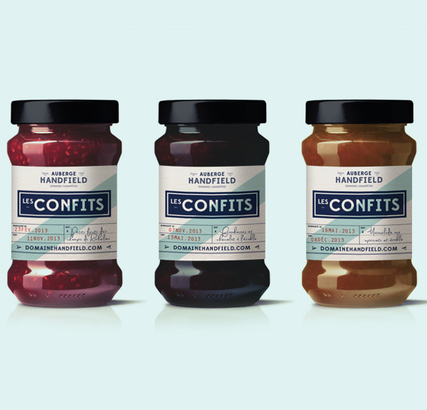
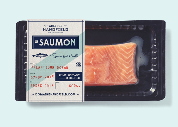
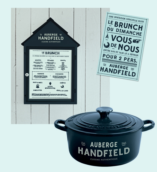
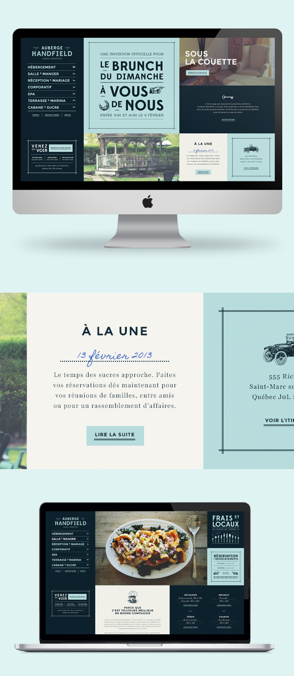
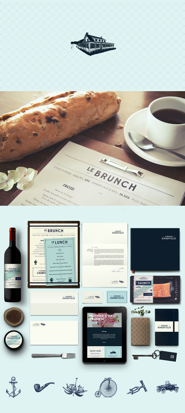
A soft bluish color is the foundation of this excellently designed brand identity for Auberge Handfield. Using strong grid layouts and superb typographical selection the designers, Carolane Godbout and Catherine Marois, pull together an authentic, genuine look and feel for this cafe. I especially love the heavy grid use in the packaging which makes it look almost office-like.

4999937e397a9f879ce4026100d01302

64812668f0497c8603a95d5cc7ef6cfa

369dbf31edac1ef184da288fb4059ebc


eb93a236d5dbea54bc64bd40a395ed20

656faa65a7340a7ebdffbfddfe102e70

1ae0131262f008070b542c3f547ba0e3

9801b24890d0277241f8f68dac5e506e

10a7568b0bdecec0c5c29d67c18e683c

def7b0d1decf576a8a3557b889f8d894

db94e780b24f83a6e6661c3b786def96

ca5936cd8aa5a35d285c38df1e738d1c


64544f9c82d4f8e068e9c6284f1fbc4a

Discuss this Project

Leave a Reply

This site uses Akismet to reduce spam. Learn how your comment data is processed.

The Forktales Podcast™: Interviews with restaurant industry leaders and visionaries

Restaurant and advertising industry headlines and thinking

Reviews of restaurant experiences from around the globe 

Reviews of our favorite design, business, & restaurant books

Our favorite typography and fonts

Inspiration in your inbox

Get the latest inspiration in your inbox every Monday morning, for FREE!

"*" indicates required fields

This field is for validation purposes and should be left unchanged.

Delicious Bits in your Inbox!

Get the latest and greatest content delivered to your inbox for free!

"*" indicates required fields

This field is for validation purposes and should be left unchanged.