
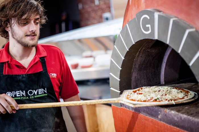
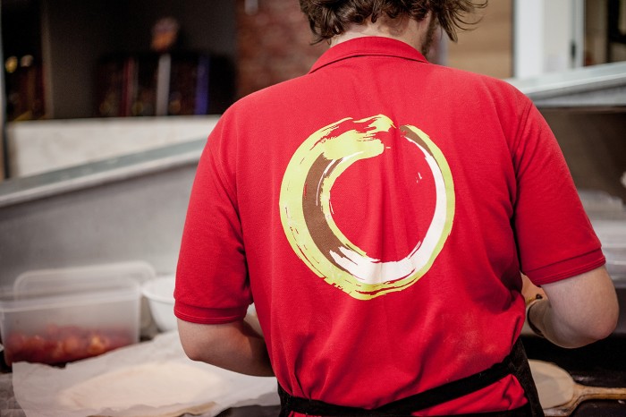
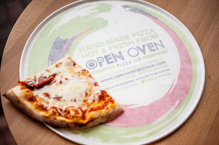
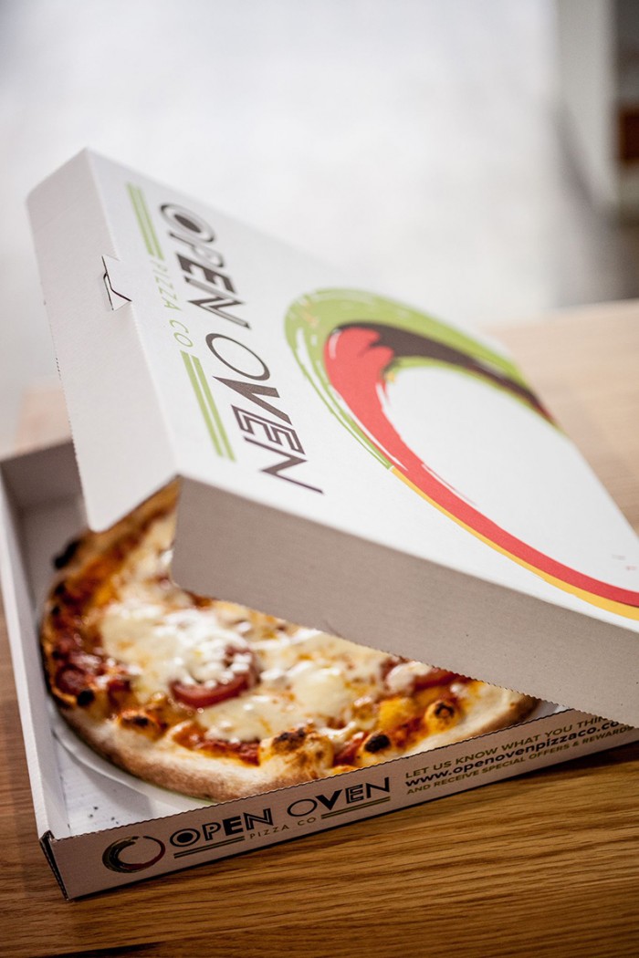
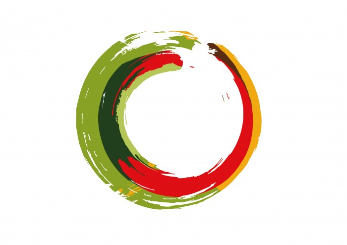
The design for the Open Oven Pizza Company is centered on playing with food. The brand mark is a splattered circle of sauces where the typography has fun with different treatments of the letterforms. The use of the expected red, green, white combo is made fresh with variations of the pure Italian colors. Great work by Toast Design.
![]()
![]()


One Response
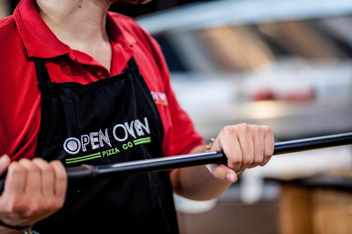
Not a fan of any of it really. The basic graphics package looks like it could be an update to CiCi’s Pizza Buffet. The logo is awkward in how it mixes the brush stroke feel of the circle and the not quite hand done letter forms. The brush circle itself is poorly built with little specs floating that seem unintentional when paired against a circle that is to obviously computer created. Just in the few images in this post they have used the logo inconsistently in every place it exists. Electronically (assumed true logo) the letters and circle have full color. The pizza box keeps full color on the circle but for some reason drops it for the logotype. Same with the pizza tray. Both use the circle and logotype in relationships which are both different from the logo and from each other. The front of the apron has another version now without the circle at all and the circle on the back of the shirt looks like a mistake because they decided to use a printing method that can’t do what they wanted to rather than create a nice single color version for use in those situations.
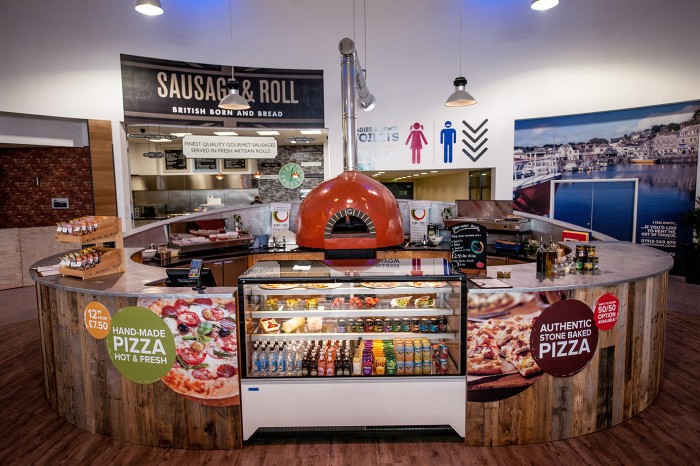
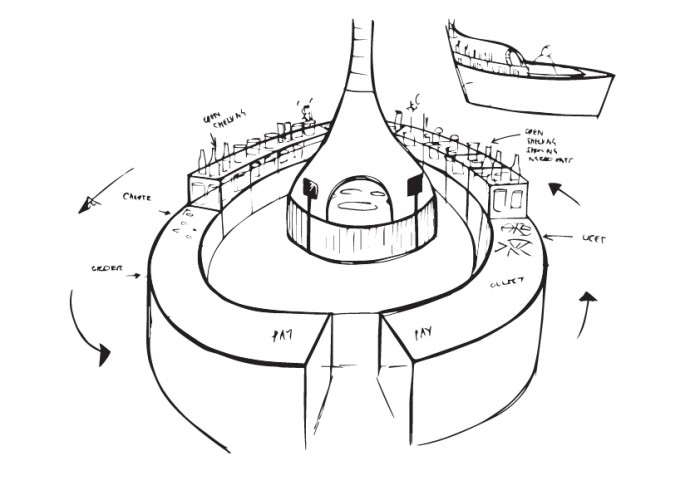
The environmental design looks like a random collection of every cliche over the last few years. “Reclaimed”wood overlaid with a hodgepodge of signage which is neither consistent or creative in its use of imagery (photography or icons), color or shape it all appears to have been put together by a series of managers who put up whatever they liked but without the feeling of being genuinely organic. You should know you have made a mistake when in the primary visual approach the word “toilet” appears above your pizza oven.