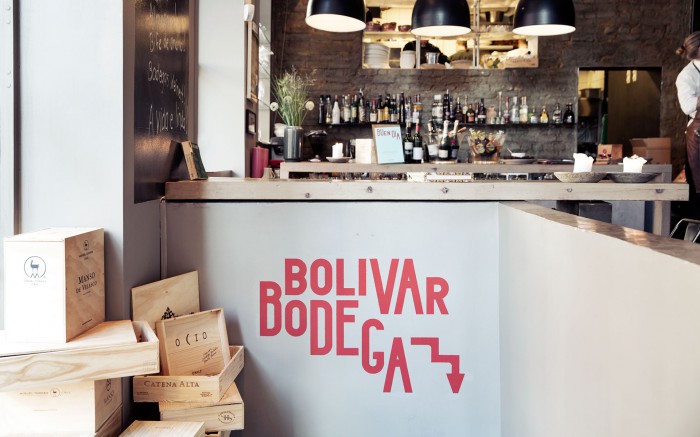
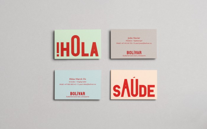
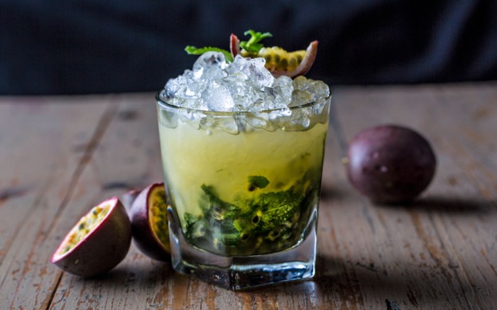
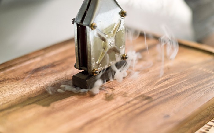
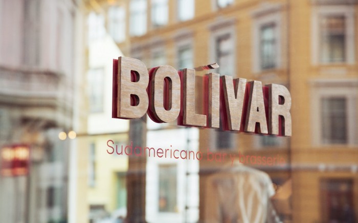
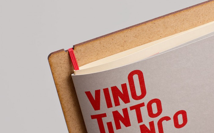
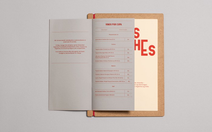
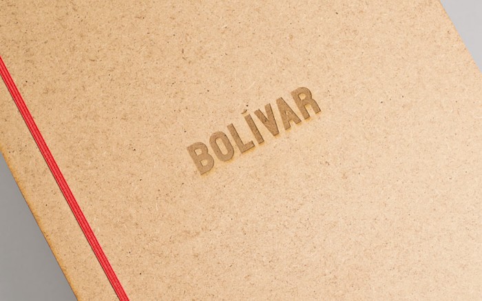
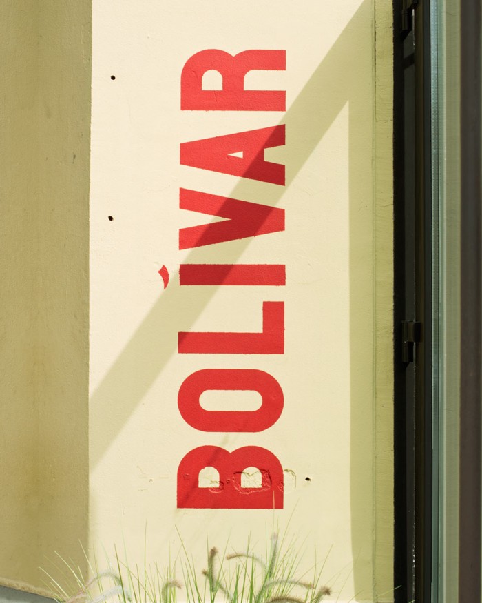
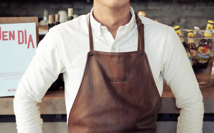
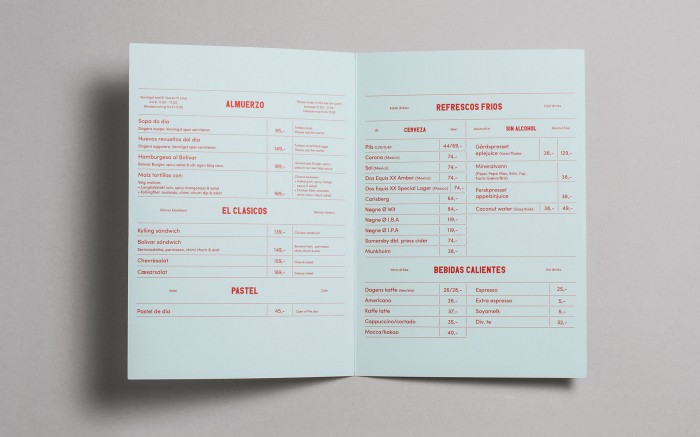
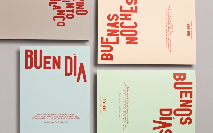
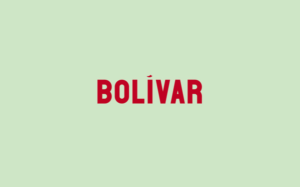
The designers at Heydays in Oslo, Norway created this lovely exploration of typography and color. The identity for Bolivar is completely inspired by South American culture and style. I love the way that although they change the dimensions of the type, they keep the thickness the same so it looks naturally resized. Excellent work.

heydays_bolivar_18

heydays_bolivar_07c

heydays_bolivar_23

heydays_bolivar_10

heydays_bolivar_22

heydays_bolivar_17

heydays_bolivar_06

heydays_bolivar_02

heydays_bolivar_01

heydays_bolivar_19

heydays_bolivar_05

heydays_bolivar_03

heydays_bolivar_12

69fdaf9006b589db5d0bd9b9bd4a0baf

a9013ecf41a313ac72d9db140fe54d46

Discuss this Project

Leave a Reply

This site uses Akismet to reduce spam. Learn how your comment data is processed.

The Forktales Podcast™: Interviews with restaurant industry leaders and visionaries

Restaurant and advertising industry headlines and thinking

Reviews of restaurant experiences from around the globe 

Reviews of our favorite design, business, & restaurant books

Our favorite typography and fonts

Inspiration in your inbox

Get the latest inspiration in your inbox every Monday morning, for FREE!

"*" indicates required fields

This field is for validation purposes and should be left unchanged.

Delicious Bits in your Inbox!

Get the latest and greatest content delivered to your inbox for free!

"*" indicates required fields

This field is for validation purposes and should be left unchanged.