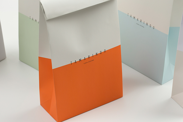
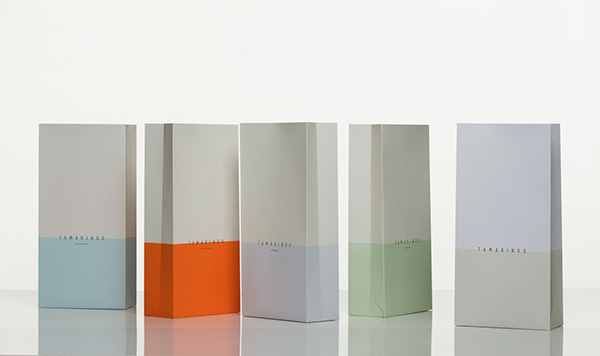
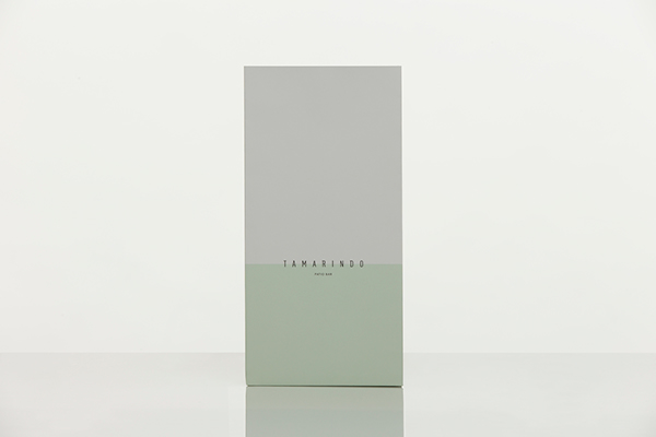
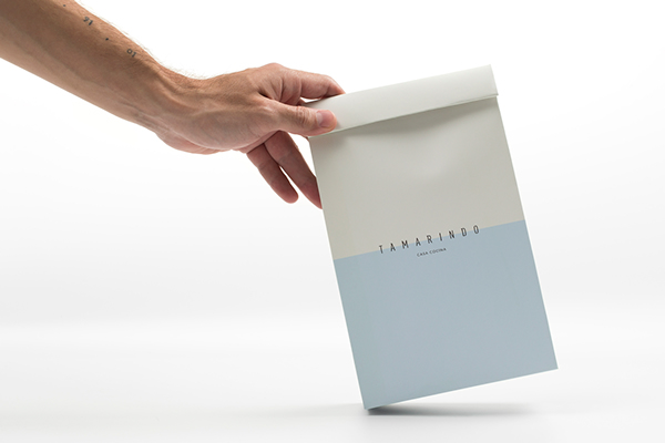
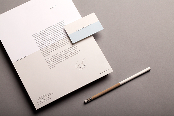
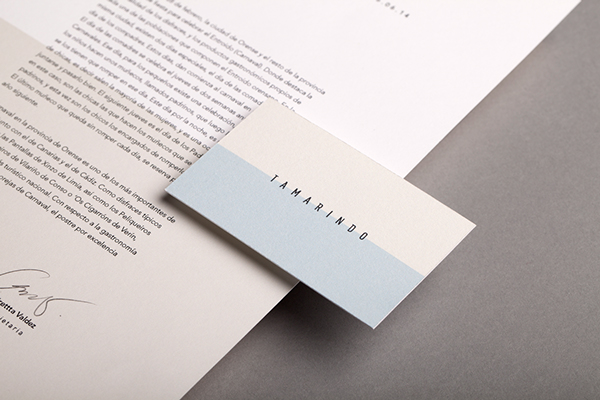
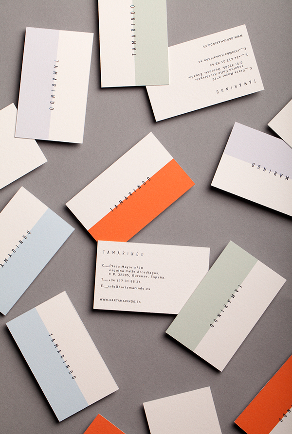
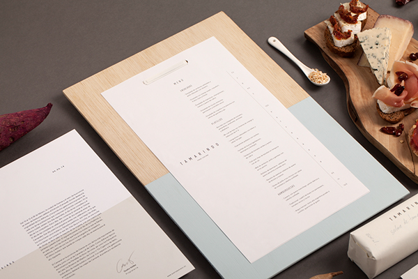
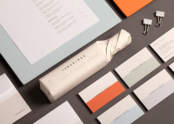
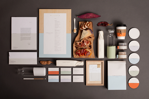
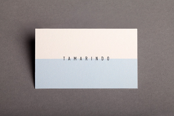
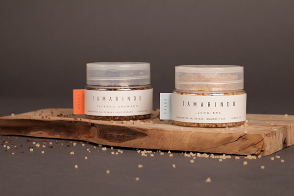
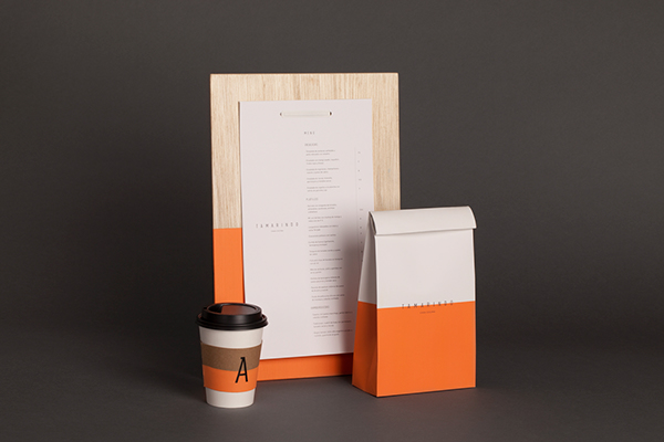
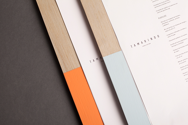
This exploration of simple typography and strong planes of color brings a fresh, clean look to Tamarindo. Designed by La Tortilleria, the brand identity is confident and simple. It let’s textures and minimalism speak loudly. The use of color dips on packaging creates an unexpected interpretation of the graphic design element. Excellent work through and through for a complete identity package.

c10a6c2e6a4f518693e055c6fb453a1d

9ac3190eb6ea20b078fee1e0f41e14ed

da92646067e59d76abf89212ec1d8c22

de2aec649968338e64a323dcc9ef5d98

6a44dc4f7adc7adb0824760f50697930 \e6b5f1174ccc10eddb43624e231a6409

14c0c803ae78cef19246bc40a00d749f \

8315cd450ceb6cdc813f2ed97b4f3ca6

e58a83386b9684ef6f4054e5ebb3a454

7230464f5e44697815691857264e01b7

684b6543714a08cb86059f6a502ef5a0

811f6d1814293a9a96aad8d3d7cd9cff

6bb5765f8b3e76939180717a7b9b5eea

5c284a5bdb94c73f44efc772bf8427d9

8ed57644e3d464ed4ad87bedc825cadb

2f388e50f441ac419a66b0e4f5d464e7

b926bff090e8723915f83fb8250ca014

6d269c5f043c99eee6e7e68b2b3064bf

b24846c31625a2d09d84c7c91011444d

7e6dc9a6c488afb31f7e212aab5baf68

a7b5d14e381f307976611bced324b41e

10dddde405cfee6d5bded3a7045c7651

8e12fe6b237e991752ac3f71a693bde3


Discuss this Project

Leave a Reply

This site uses Akismet to reduce spam. Learn how your comment data is processed.

The Forktales Podcast™: Interviews with restaurant industry leaders and visionaries

Restaurant and advertising industry headlines and thinking

Reviews of restaurant experiences from around the globe 

Reviews of our favorite design, business, & restaurant books

Our favorite typography and fonts

Inspiration in your inbox

Get the latest inspiration in your inbox every Monday morning, for FREE!

"*" indicates required fields

This field is for validation purposes and should be left unchanged.

Delicious Bits in your Inbox!

Get the latest and greatest content delivered to your inbox for free!

"*" indicates required fields

This field is for validation purposes and should be left unchanged.