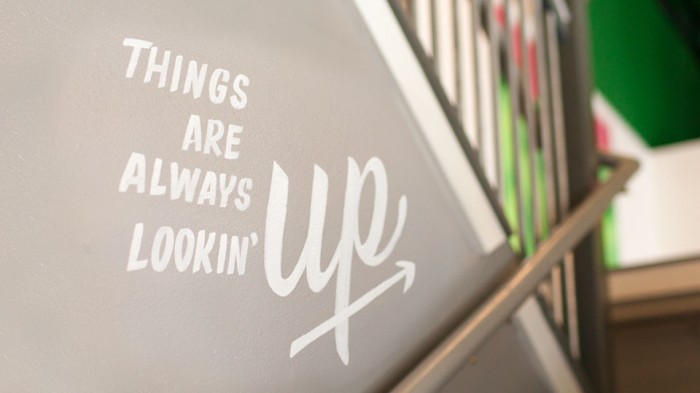
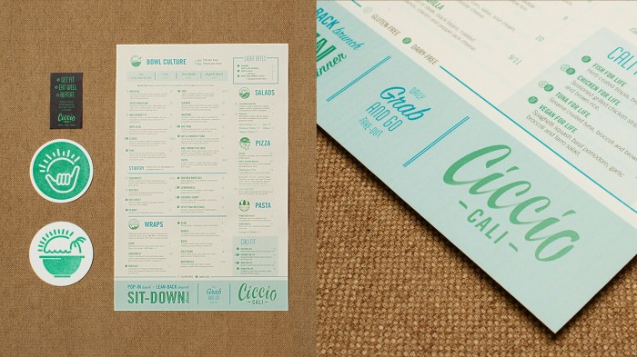
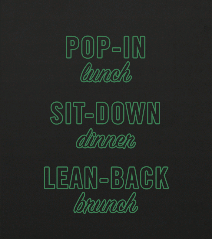
I’ve been pretty adverse to emerald green. I don’t quite know why, but i just don’t like it personally. A teacher once told me you’re not a good designer until you’ve designed using the colors you hate. This is because good design has nothing to do with personal likes/dislikes. It’s all about what works. The design for Ciccio Cali works. Even though it uses a color I dislike, the brains at Spark make that color interesting and attractive to even me. The iconography creates a memorable graphic language that can grow with the brand quite easily. The typography harkens back to old sign painter style giving the brand a transitional look melding modern and old school.


