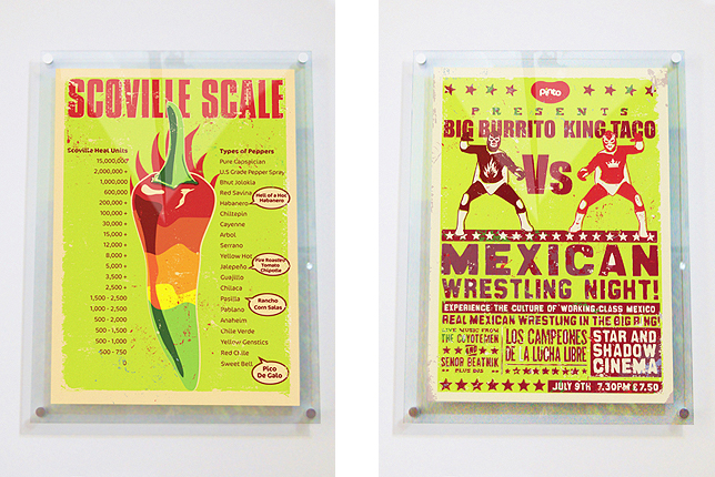
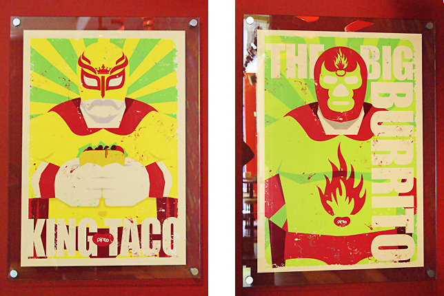
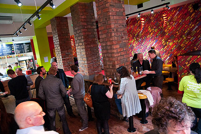
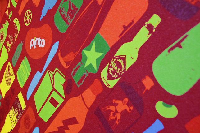
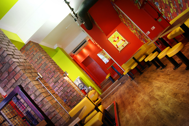
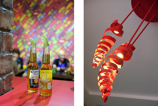
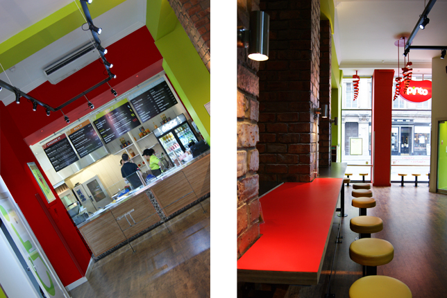
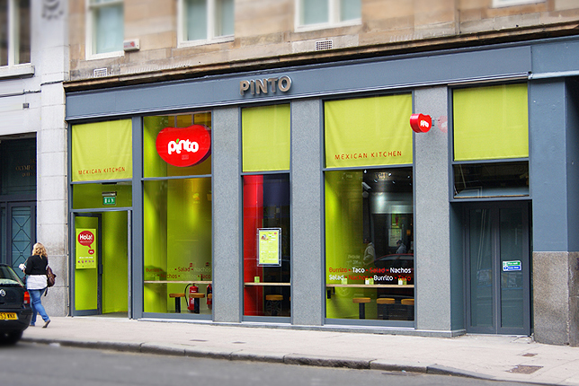
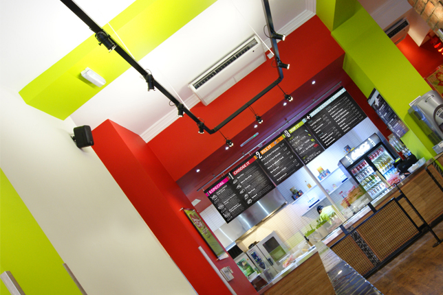
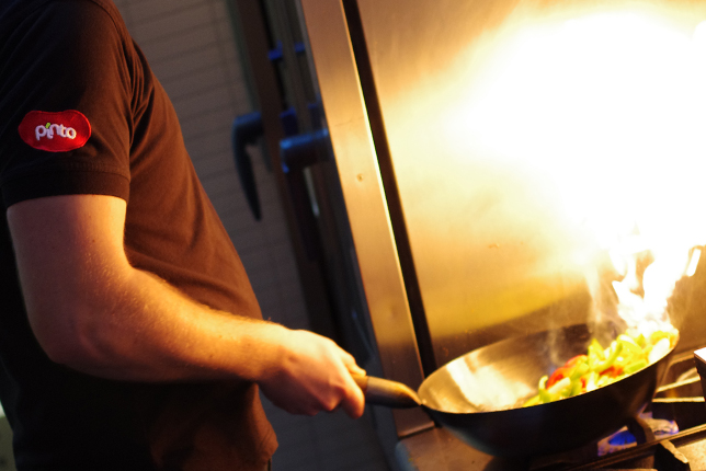
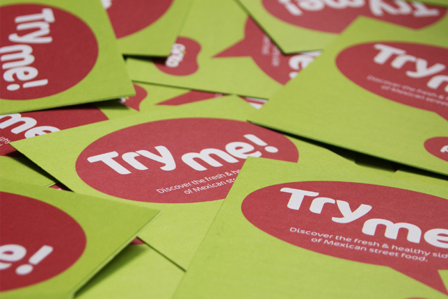
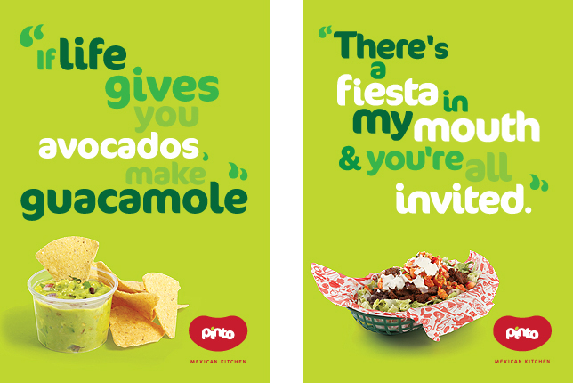
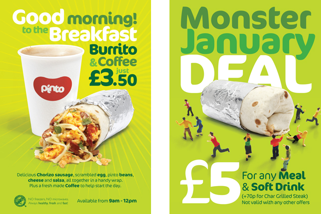
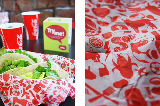
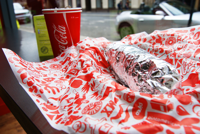
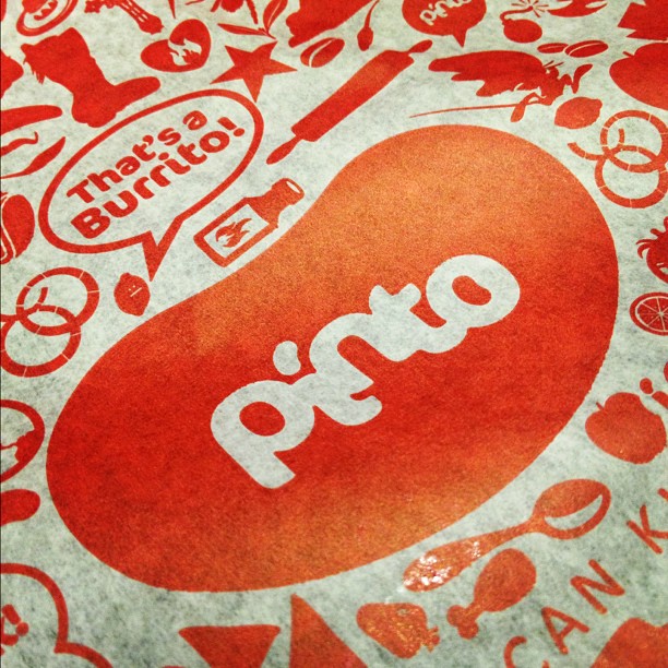
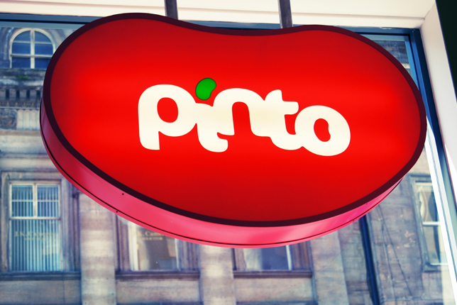
The brand identity for the restaurant Pinto is on point. The team at My Creative really pushes the boundaries of the bright lime and red color combination. They tread lightly making sure it never looks Christmas-y. The logo is simple in its delivery of a visual metaphor while the supporting design work takes off in many directions all boiling down to one hell of a fun look and feel.

image (17)

image (16)

image (15)

image (14)

image (13)

image (12)

image (11)

image (10)

image (9)

image (7)

image (6)

image (5)

image (4)

image (3)

image (2)

image (1)

image

image

Discuss this Project

Leave a Reply

This site uses Akismet to reduce spam. Learn how your comment data is processed.

The Forktales Podcast™: Interviews with restaurant industry leaders and visionaries

Restaurant and advertising industry headlines and thinking

Reviews of restaurant experiences from around the globe 

Reviews of our favorite design, business, & restaurant books

Our favorite typography and fonts

Inspiration in your inbox

Get the latest inspiration in your inbox every Monday morning, for FREE!

"*" indicates required fields

This field is for validation purposes and should be left unchanged.

Delicious Bits in your Inbox!

Get the latest and greatest content delivered to your inbox for free!

"*" indicates required fields

This field is for validation purposes and should be left unchanged.