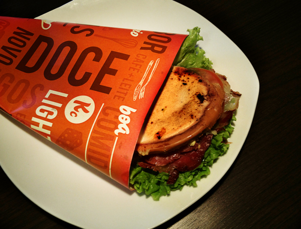
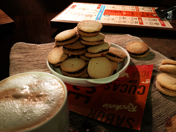
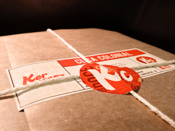
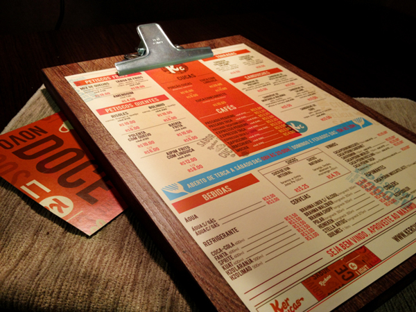
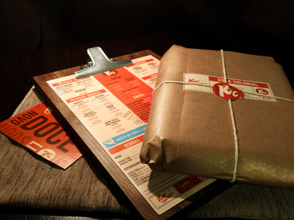
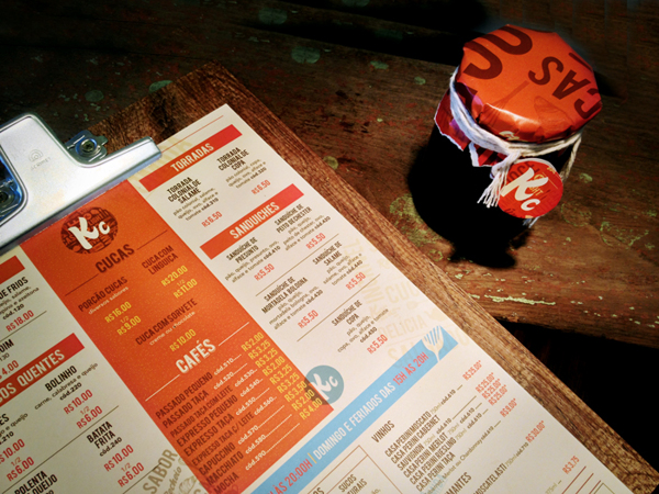
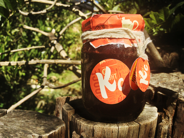
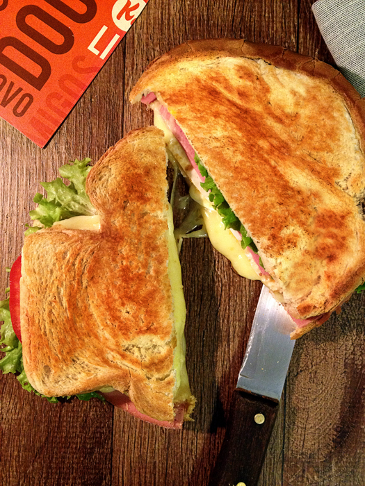
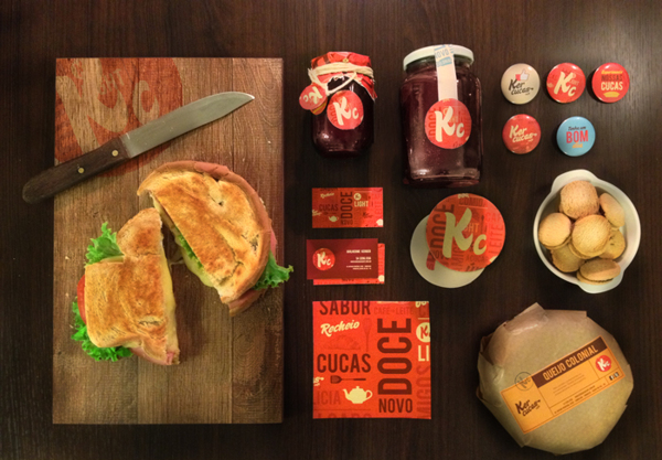
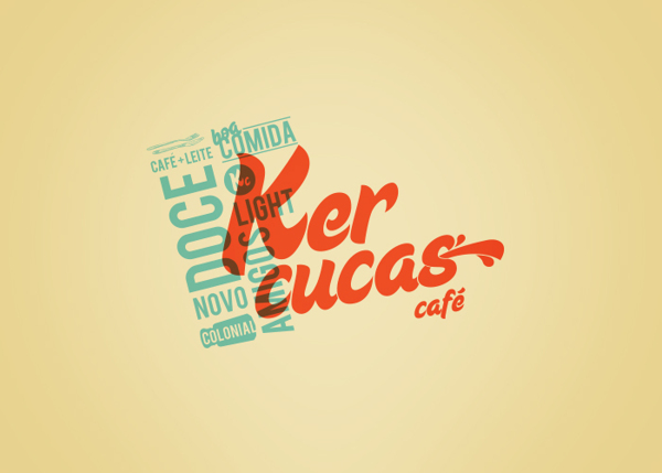
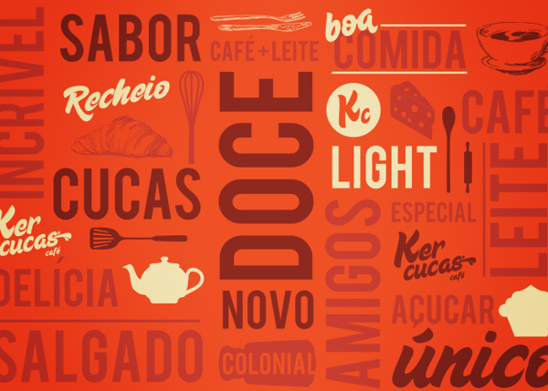
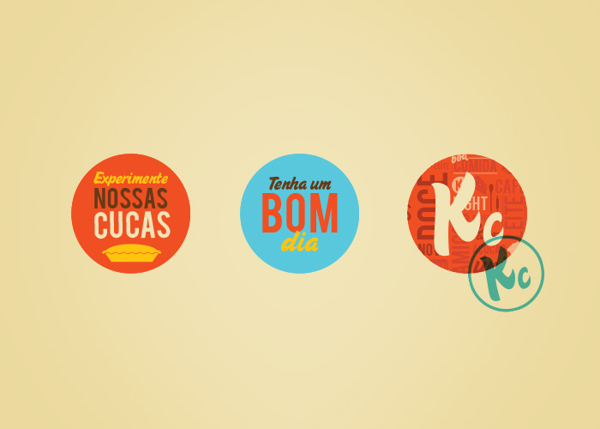
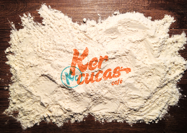
Bigode Ideias (Brazil) is the designer behind this excellent cafe, restaurant branding work. The bright, heavy orange color serves as an excellent base for the typography-based identity language. Although the stacked type as a pattern device has been used quite frequently (I’m guilty myself), they really pull it off nicely in this set of elements. The use of a teal as a secondary, supporting color helps round out the feel of the brand. I’m especially liking the heavy use of grid for not just the  menus, but the other pieces as well.
c3ac8ae34fbbac7d45b361997e6405ee

de59d699bfa05015d19fd4363935d7d7

41a3b912d02a825713c557bc1247b274

655fc38482218f214a7faee184bddc85

4e8cdfb6213ac45f0b72896030e53116

ba3259f45be7187096dafffb967486d3

6c75ce48996190ad93fe920cef69ab15

b08b3e1c2059152ded28462404873bed

b47738ec9dda8db945e012979265143f

558dab45f9b58c75eecda49c87d43748

61f6c54f3d1a886e21868dacf6c8ff19

06e060a5453c329e5fa81fe923af0778

258dead4d13b9d8fe3abd048dbeee5d2

Discuss this Project

Leave a Reply

This site uses Akismet to reduce spam. Learn how your comment data is processed.

The Forktales Podcast™: Interviews with restaurant industry leaders and visionaries

Restaurant and advertising industry headlines and thinking

Reviews of restaurant experiences from around the globe 

Reviews of our favorite design, business, & restaurant books

Our favorite typography and fonts

Inspiration in your inbox

Get the latest inspiration in your inbox every Monday morning, for FREE!

"*" indicates required fields

This field is for validation purposes and should be left unchanged.

Delicious Bits in your Inbox!

Get the latest and greatest content delivered to your inbox for free!

"*" indicates required fields

This field is for validation purposes and should be left unchanged.