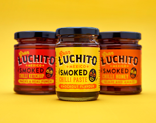
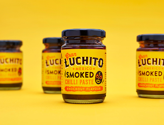
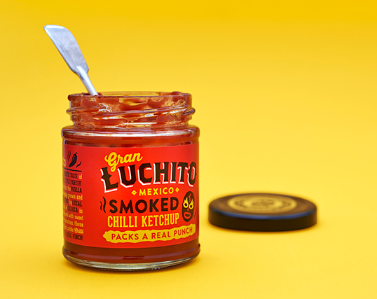
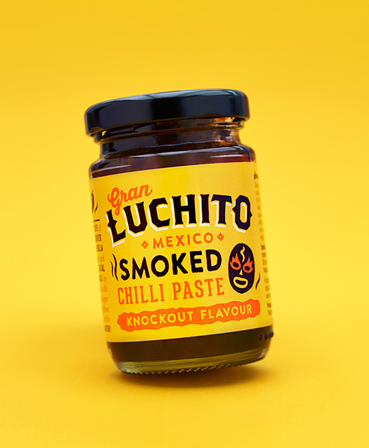
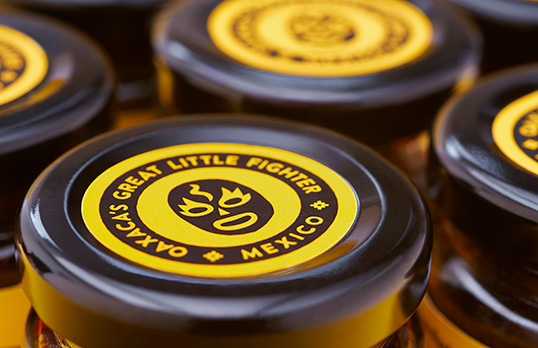
Okay, this will finish our week of reds and yellows. What started as a coincidence has now gone too far, but with good reason. Check out this excellent package design work for Gran Luchito by Midday. I know that the luchador can be a bit played out. It seems like every hipster Mexican joint has used it. I mean, they’re fun as hell to draw and use, but let’s tone it down people. In this case, the luchador imagery makes total sense. It’s in the name. The package design is a simple label with a tip on cap element. Relatively low cost, but still effective. The color palette implies heat and the typography and illustrations send home that hand-crafted feel one wants from a salsa company.
