Greenfield Natural Kitchen branding

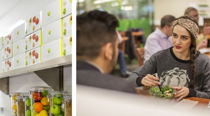
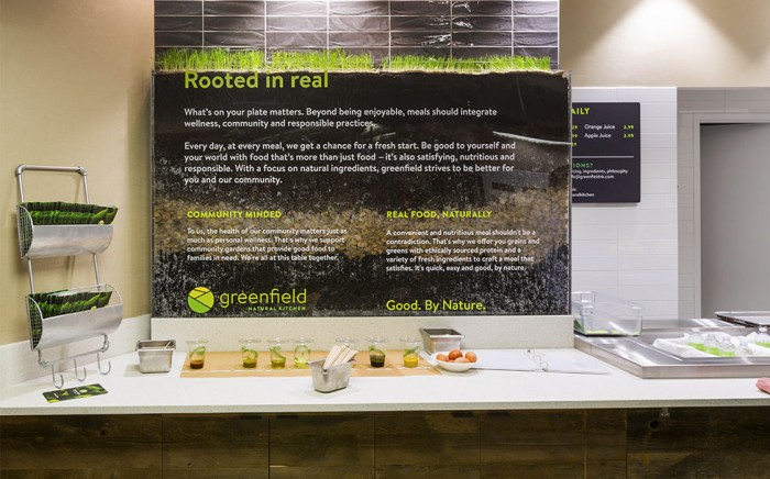
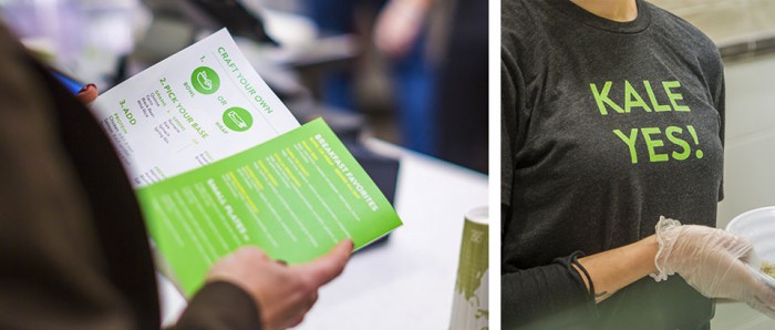
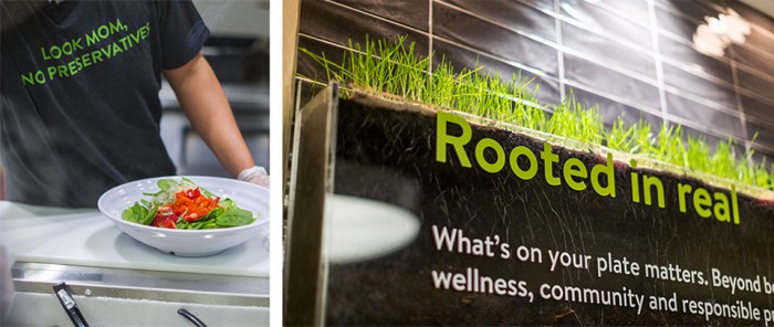
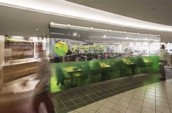
The team at Bolster really did an excellent job designing the experience and brand for Greenfield Natural Kitchen. The logo is a graphical representation of earth meets fields; a witty way to communicate “green” and “natural.” The interiors are simple, clean and poignant with natural textures and elements allowed to speak for themselves without shoveling messaging down the patron’s throats.

greenfield_logo

greenfield_image7

greenfield_image6


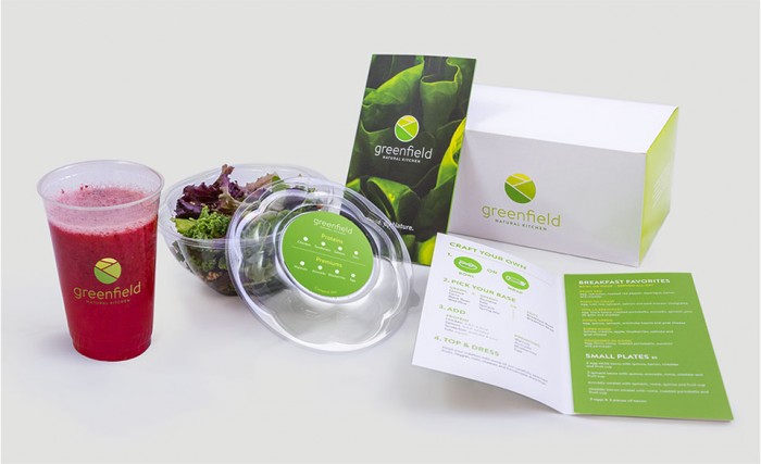
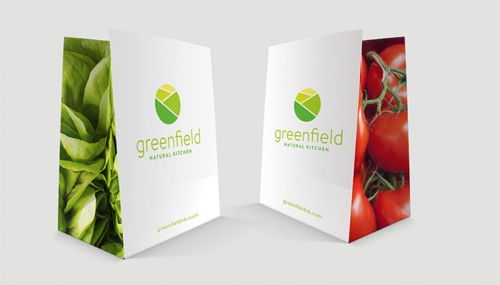
The packaging design for the restaurant follows suit with simple graphic treatments and natural photography.

greenfield_image5

greenfield_image4

greenfield_image3

greenfield_image2

greenfield_image1

Discuss this Project

Leave a Reply

This site uses Akismet to reduce spam. Learn how your comment data is processed.

The Forktales Podcast™: Interviews with restaurant industry leaders and visionaries

Restaurant and advertising industry headlines and thinking

Reviews of restaurant experiences from around the globe 

Reviews of our favorite design, business, & restaurant books

Our favorite typography and fonts

Inspiration in your inbox

Get the latest inspiration in your inbox every Monday morning, for FREE!

"*" indicates required fields

This field is for validation purposes and should be left unchanged.

Delicious Bits in your Inbox!

Get the latest and greatest content delivered to your inbox for free!

"*" indicates required fields

This field is for validation purposes and should be left unchanged.