Noteworthy Gin beverage branding

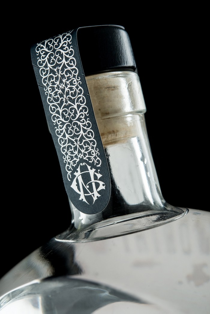
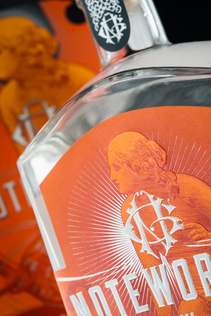
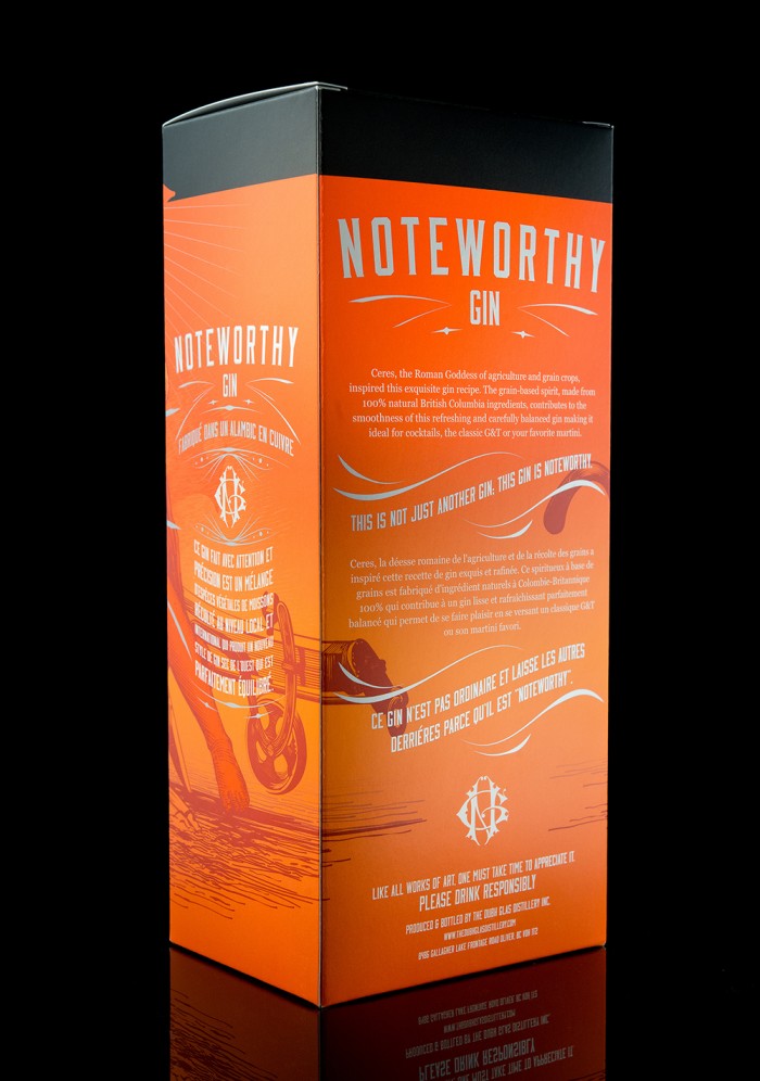
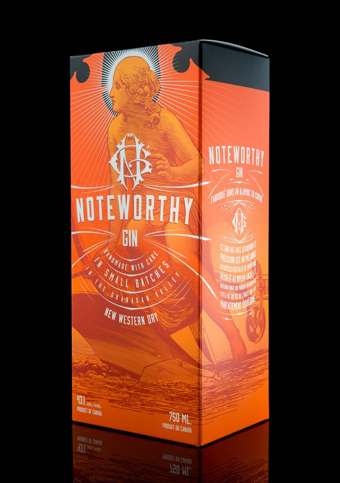
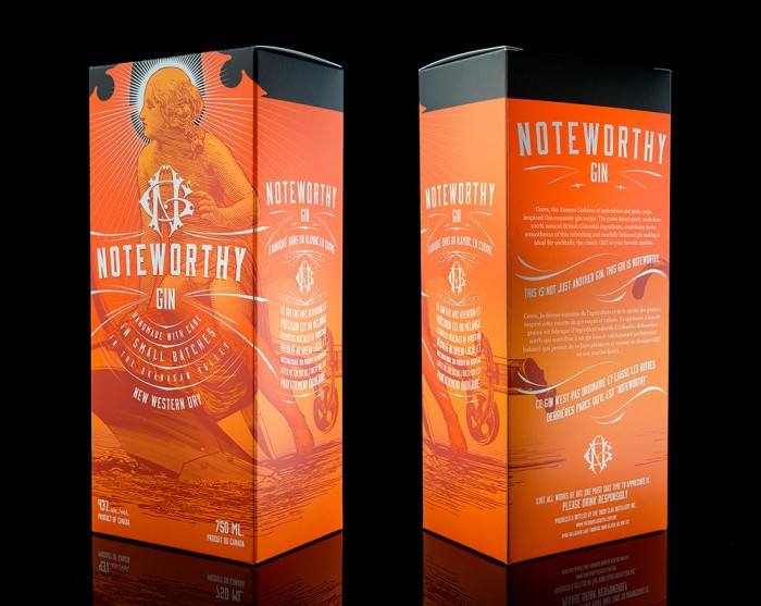
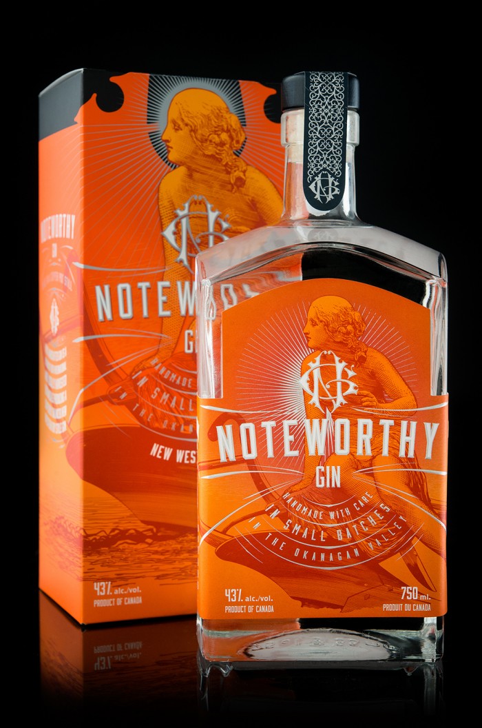
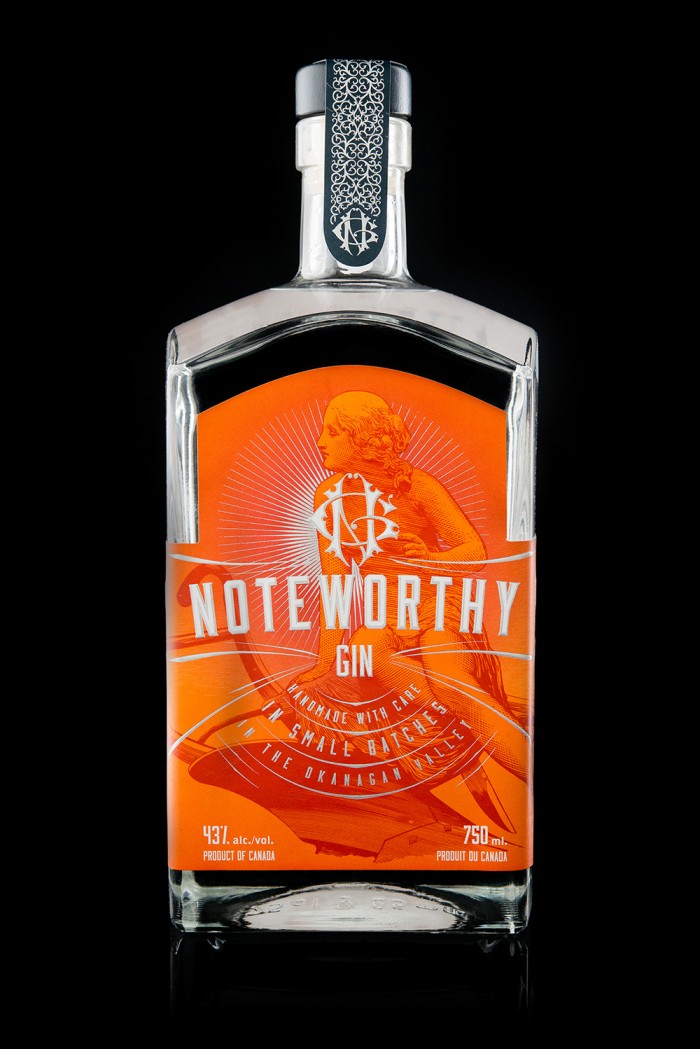
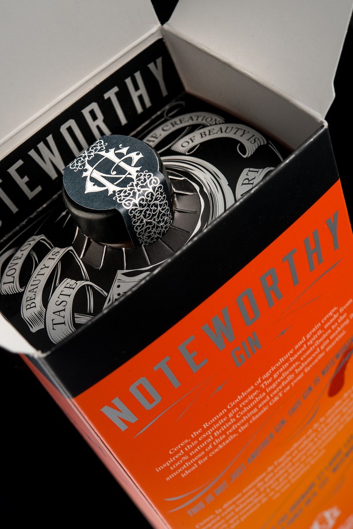
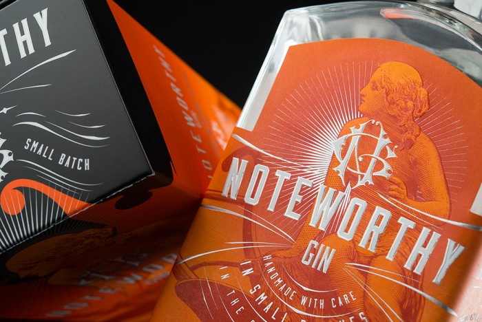
I’m absolutely in love with the style used for the Noteworthy Gin brand packaging design. The use of bright, deep oranges mixed with the excellent craft work found in the illustrations, filigree and flourishes create this classic meets modern composition. The firm uses this style to communicate the craft put into the gin, while elevating the spirit to a modern level. That insignia really pops out as an excellent use of letterforms. What’s especially great is the attention to detail the team at Hired Guns Creative use to create unexpected moments with the package design.
noteworthy-09

noteworthy-08

noteworthy-07


noteworthy-06

noteworthy-05

noteworthy-04

noteworthy-03

noteworthy-01

noteworthy-02

noteworthy-logo

The Forktales Podcast™: Interviews with restaurant industry leaders and visionaries

Restaurant and advertising industry headlines and thinking

Reviews of restaurant experiences from around the globe 

Reviews of our favorite design, business, & restaurant books

Our favorite typography and fonts

Inspiration in your inbox

Get the latest inspiration in your inbox every Monday morning, for FREE!

"*" indicates required fields

This field is for validation purposes and should be left unchanged.

Delicious Bits in your Inbox!

Get the latest and greatest content delivered to your inbox for free!

"*" indicates required fields

This field is for validation purposes and should be left unchanged.