Del Viejo salsa packaging and branding

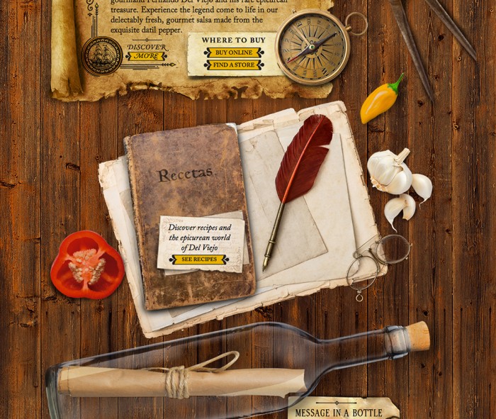
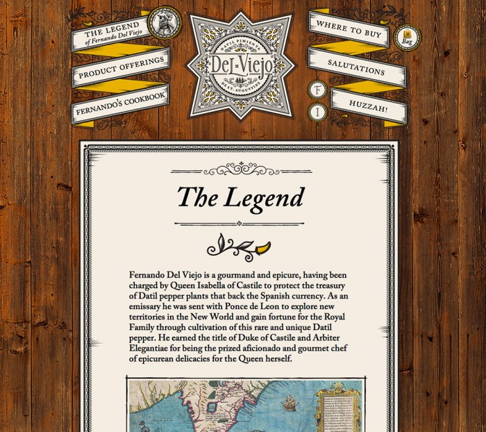
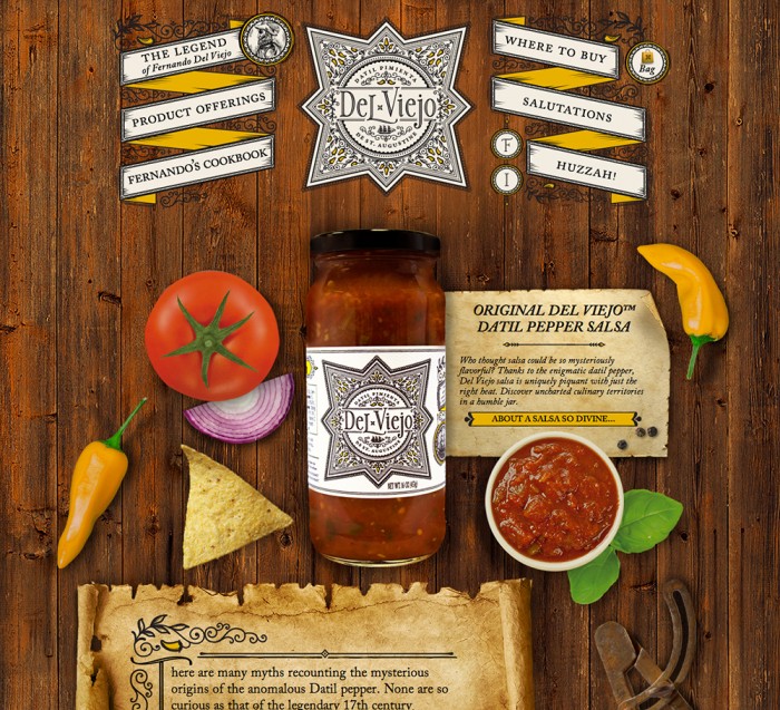
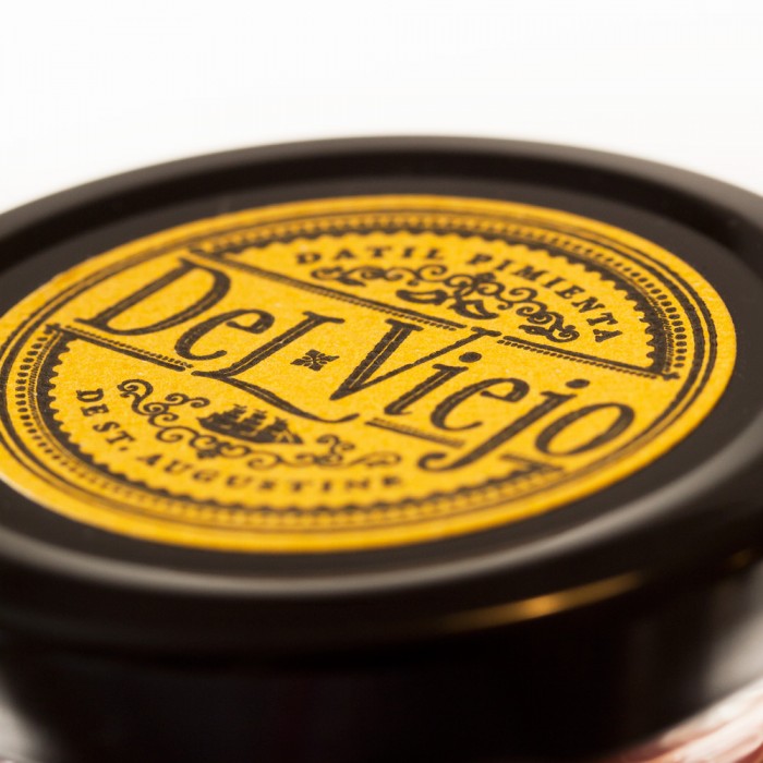
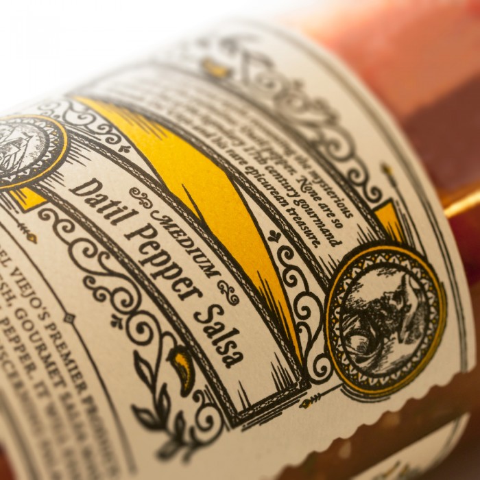
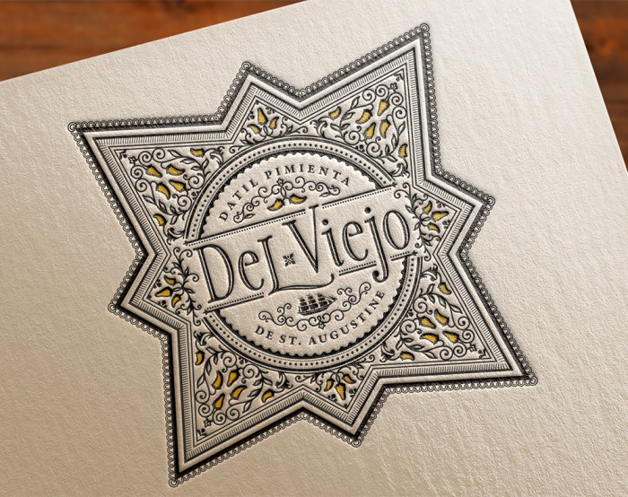
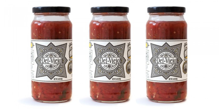
Del Viejo’s brand jumped out at me because of the dedication Miller Creative had toward classic design techniques throughout each touch point. It wasn’t a “Hey let’s make a cool, vintage package design, but then go totally modern on the website!” Instead, they maintain a look and feel across the brand identity that marries together naturally to create a classic vibe. From the website with it’s semi-realism design to the crafted label with intricate filigree and and rustic typography. The illustration style carries through into the website design for the salsa company.

The Salsa Company Site

Miller Creative

Found on The Dieline

DelViejo-Web_02

DelViejo-Web_03

download (1)

download (2)

download (3)

download (4)

download


The Forktales Podcast™: Interviews with restaurant industry leaders and visionaries

Restaurant and advertising industry headlines and thinking

Reviews of restaurant experiences from around the globe 

Reviews of our favorite design, business, & restaurant books

Our favorite typography and fonts

Inspiration in your inbox

Get the latest inspiration in your inbox every Monday morning, for FREE!

"*" indicates required fields

This field is for validation purposes and should be left unchanged.

Delicious Bits in your Inbox!

Get the latest and greatest content delivered to your inbox for free!

"*" indicates required fields

This field is for validation purposes and should be left unchanged.