
After seeing and publishing his work for Yellowstone Whiskey, I just had to pick this guy’s brain. Luckily he said he had just enough brain left to be picked successfully. David’s work is quite detailed and awesome to look at, as you’ll see below. I step inside his approach, his inspiration, and chat about the world of booze and food. Enjoy.
So, you get to live the dream. You play with booze and food all day. How did you break into this specific category of package design for food and beverage?
I just made up my mind that’s what I wanted to do and I did it. It took all my first year as a freelancer – producing a very high volume of work. That allowed me to continually narrow my focus and curate my portfolio: First general “graphic design” (including logos, brochures websites and even motion graphics), then mostly packaging, then mostly food & beverage packaging, then mostly beverage, then spirits, etc. Narrowing, narrowing, narrowing. You just stake a claim and own it.
Have you always been freelance, or was there somewhere you honed your chops?
I worked for about 12 years in Seattle-area design agencies (none of which specialized in packaging) before setting out on my own. I’ve only been working for myself since 2012.
It seems you have have a particular style, dare I say “niche.” Is this something you’ve purposely worked toward, or is it something that market demand has dictated?
It’s a combination of factors. I just happen to have a design approach that works well for many spirits brands – heavy use of typography and old-timey illustration, a bias toward the more vintage-looking paper textures and print processes, etc. I have always found those things personally interesting as a designer, even before I’d found an industry and category that welcomed it. That has always been my happy place. So that certainly set me up for good things to come. After creating a few pieces that fell into that category, my portfolio attracted more clientele who wanted something similar and the momentum quickly built in that direction. I love having my little niche and I also welcome the occasional projects that offer some diversity and new challenges. Currently I’m enjoying a nice balance of both.
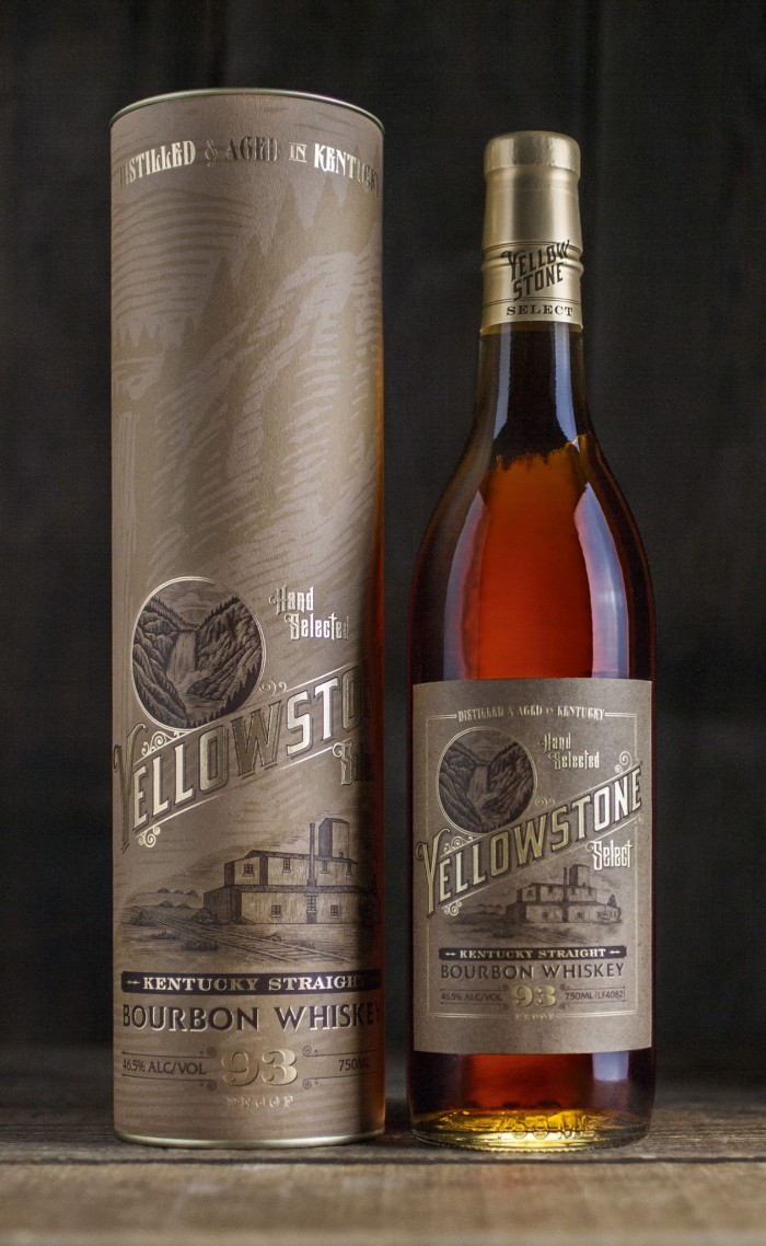
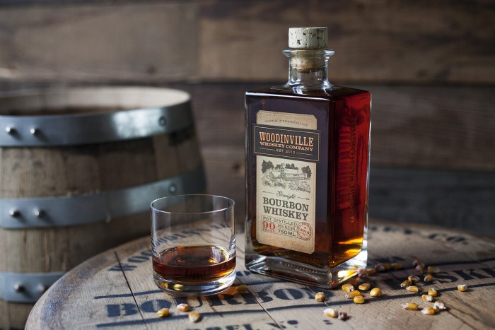
That style requires an amazing amount of craft. It can be seen perfectly in the Yellowstone work. How long does something like this take you? What’s involved with the process? Take us through that journey.
It’s impossible to quantify. Some projects take days and others take months. For that reason I don’t charge hourly rates. All my projects are priced at a flat rate. It’s up to me to find the balance between working efficiently and putting the extra time in to the details that demand it. I do usually indulge myself to keep going whenever I think that something isn’t quite right – whatever it takes. Whether that’s customizing the shape of a serif or spending a little extra time on the phone with a print rep to find just the right paper stock. I always find that it’s worth the extra effort when the samples come in and the photos are done. I’ve never regretted trying a little harder to get it right. It feeds directly into the quality of work and the quality of the portfolio and that means more business, so it’s always a win-win situation. My clients get the best results possible and I get to work with more amazing people who demand similarly high quality. It’s an upward spiral the just keeps feeding into itself.
I’m of the same mindset when it comes to flat-rate versus hourly. Although, in freelancing with an agency you’re sort of pinned down to hourly or at least a day rate. Have you ever gotten into that?
Yeah, I’ve had agencies ask for my hourly rate and I give them a reasonable number. It almost seems like a formality though because, as far as I can tell, every respectable freelancer out there knows that the “standard” hourly rate for professional work is somewhere between $75 and $120/hour. Usually at the mid-to-upper end of that range. In the end, it doesn’t matter. They inevitably tell me that they have (whatever budget) available for the project and I’m free to decide if that’s going to work for me or not. So they can divide that budget up into hours however they like and so can I. At the end of the day, it’s a question of whether or not I can get the job done for the budget they have available. And again, it’s my problem if I can’t do that quickly/efficiently and it’s to my benefit if I can. Sometimes I come out ahead because I was able to nail it first try. Sometimes I come out behind because I worked slowly or failed in some way before eventually succeeding. It all balances out in the end (for me) and my clients are all getting good work for fair, market-value prices. My experience is worth far more than my time at this point. I haven’t logged my hours since I left my last agency job and I haven’t punched a clock since my last factory job – and I don’t intend to resume doing either ever again.
How much whiskey do you drink during the design process? How much after?
I don’t drink much during the work day. Not that it hasn’t happened, but I’m mostly guzzling coffee during business hours, trying to meet deadlines and keep ahead of a very busy schedule. From time to time I can’t resist sampling something new just because I’m personally interested in whiskey and I enjoy exploring the category. After hours however, whiskey is certainly my drink of choice – much more so than wine or beer.
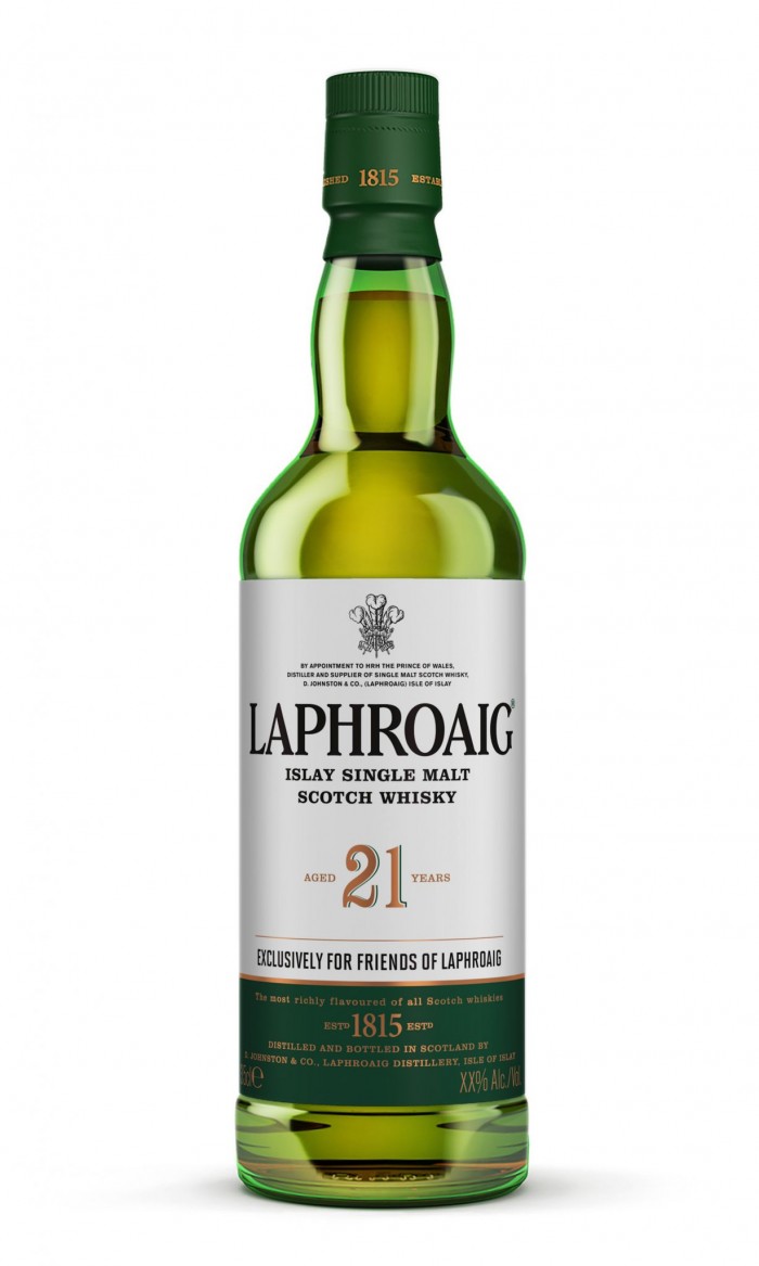
In my opinion, a brand like Laphroaig has a brand voice that’s quite different from the brand identity. Their marketing is ballsy and unapologetic. The packaging is gorgeous, refined, but has always seemed in line with a typical scotch “look.” What are your thoughts on balancing the brand’s voice and its identity? What are your thoughts on Laphroaig?
As a part of the Beam Suntory family, Laphroaig has a large network of creative professionals who are involved in their packaging and advertising, most of which is handled internally at Beam Suntory’s Deerfield, Illinois headquarters. So most of that is up to them. I was fortunate to be contracted to help with some of the packaging (only). From time to time, they are extra busy and reach out to contractors such as myself to either get some fresh ideas into the mix or simply to expand their capacity due to a bottleneck in their schedule. But from an observer’s point of view, I think they are striking a good balance. The product is staid and respectable, as it should be. The brand has been around for 200 years and it’s all about tradition, and that’s what a Scotch drinker typically wants. But, within the world of Scotch, Laphroaig (and their neighbors on the island of Islay), are known for their big, bold, peaty/smoky flavor profiles. So big and smoky in fact, that quite a few drinkers find it quite disagreeable and even unbearable. Smartly, they have turned that fact to work for them by “owning” the concept and more or less drawing a line in the sand through their advertising. Either you can handle Laphroaig (and you’re one of us), or you can’t (and you’re a sissy). They don’t quite say it in so many words, but the point is made. For the record, I’ve never been involved in any internal discussions with regard to the advertising at Beam Suntory, that’s just my observations as an interested consumer. So, despite the apparent disconnect, I think it makes sense and it’s working.
Do you like to drink Laphroaig?
Yes I do. I love Scotch and – along side with many others – I enjoy Laphroaig very much.
Skilled in design and has a palate for whiskey, double threat. Here’s where I ask for some advice for up-and-coming talent. What would you tell your 20 year old self if you could take a Delorean back in time?
Don’t whore yourself out. Don’t work for peanuts. Do treat yourself like a professional. Be selective in who choose to work with. Don’t let anybody waste your time. Be willing to walk away from a job/project and mean it – that’s the hardest part but it’s the most important part. Say “no” when it doesn’t feel right. Specialize. Focus. Raise your rates. Don’t bullshit us. Be exactly who you really are, unapologetically, humbly. Don’t try to sound like a big agency if you aren’t one. Just be honest. Start at the bottom. If you need to work your way up then work your way up. You’ll get there eventually. Don’t fool yourself. Don’t suck. Don’t be cheap when it comes to re-investing in your own skills and equipment. Raise your rates again. Always be raising your rates. Always be learning. Work hard. Don’t settle. Drink lots of coffee.
###
How about that last answer?! Dang. Every word of it I subscribe to, endorse, and proliferate. Strong words, but completely true.
I hope you enjoyed this little step inside the mind of an artist and designer who’s honed his craft to reach the cream of the crop. You can get more of David at his website at www.davidcolecreative.com and annoy him in the social interweb thing at @DavidSCole on Twitter and @DavidScottCole on Instagram.


