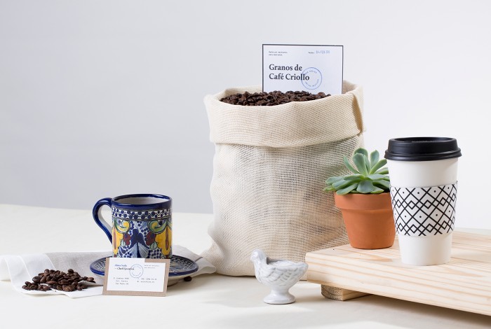
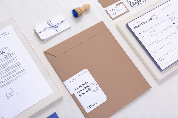
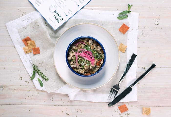
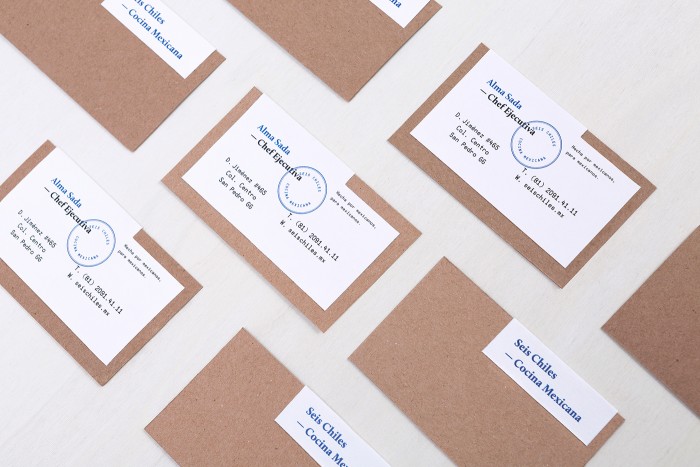
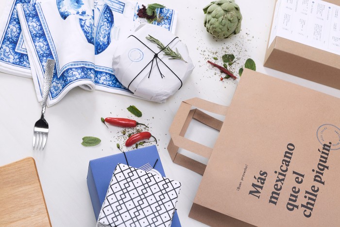
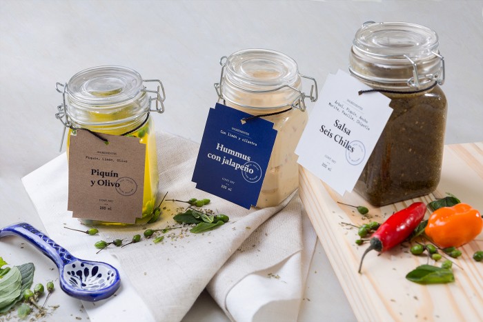
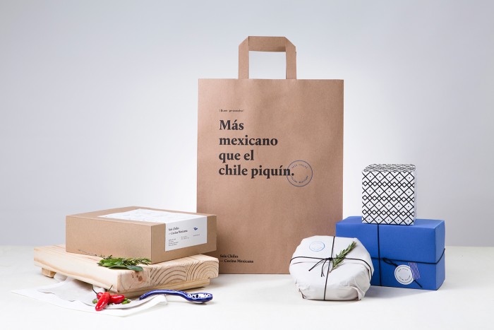
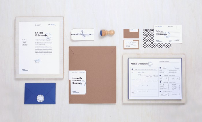
I think I have Mexico on my mind. We’re headed there for a friend’s wedding next week. Why not keep the fiesta rolling with more work from the design scene in the MX? This gem is brought to us by Sabbath out of Monterrey, Mexico. The design for this cafe uses beautiful classic typography, strong grid systems, and respect for white space to create an airy, and beautifully restrained brand. Seis Chile’s brand color palette continues the beauty of simplicity with black, white and navy blue as the core. This strong base sets a foundation for introducing unique patterns and textures throughout key touch points for the cafe. They explain the inspiration perfectly:
[The brand identity] takes inspiration in the traditional Talavera crafts from Puebla. Seis Chiles is a brand that keeps simplicity and neatness at the same time. The navy blue is inspired in the talavera that can be appreciated in all the branding and packaging. Amazing food and friendly service is the vibe that Seis Chiles Mexican Cuisine wants to transmit to their costumers.
Designed by Sabbath
Photographs by Estudio Tempiquito
