Over the weekend Cracker Barrel announced the plan to launch a spinoff restaurant concept called Holler & Dash. It’ll be a biscuit house in a fast casual format located in Homewood, Alabama. In a company statement they say they’re ” bringing flare to Southern fare.” Definitely piqued my interest.
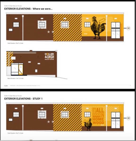
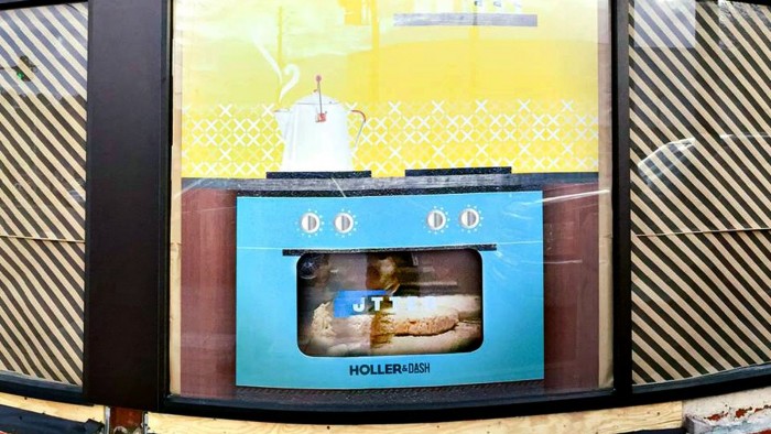
If i had to guess, Holler & Dash will be a fast casual take on the items CB is known for. It’ll be a strong breakfast offering with some lunch. Breakfast will dominate however. That’s just my educated guess however, what we do know is little and I was able to scour the interwebs to find some initial looks of the restaurant’s brand identity.
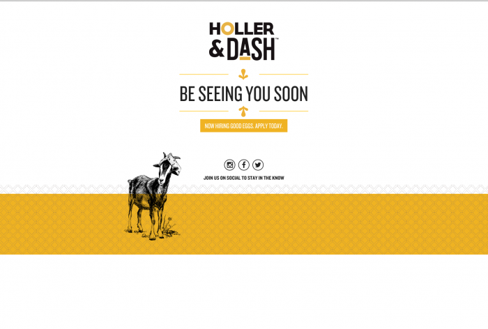
It’s a vast improvement from the hokey, down home feel of Cracker Barrel. The warm colors are reminiscent, but much more modern than CB. They’ve pulled in the classic, vintage pen and ink illustrations and melded them with simple patterns to create a modern country feel.
The restaurant’s logo is simple. I personally like the aesthetic, but I have a hard time understanding the need for the underline on the “A” in Dash, or the yellow “O.” It seems to be design for the sake of decoration. Of course this comes without a backstory, nor do I have credit to give at the moment so if you hear wind of who’s behind the work, please do reach out or comment.
I plan to update the post once Holler & Dash opens and more imagery is available. Until then, post your critiques in the comments!


![]()


