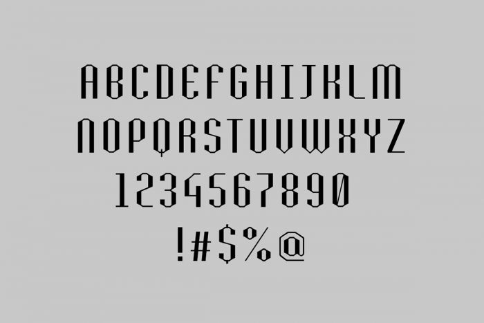
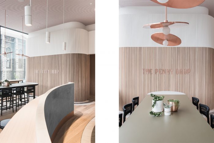
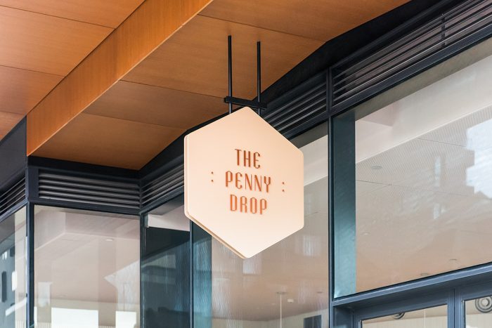
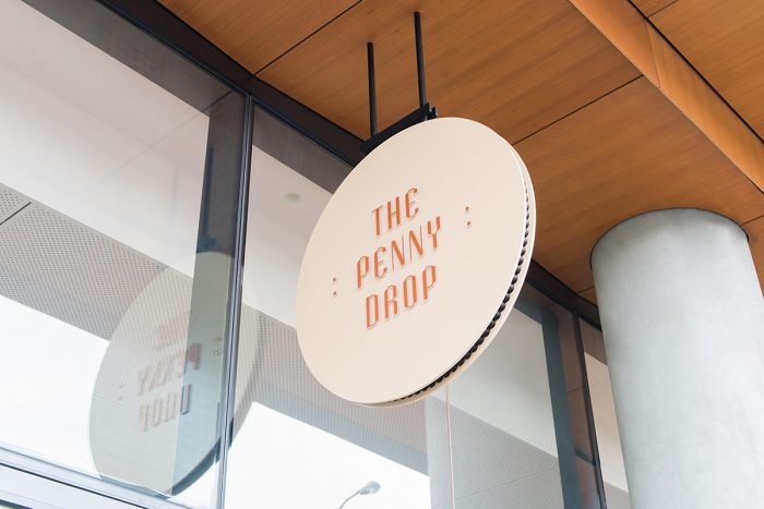
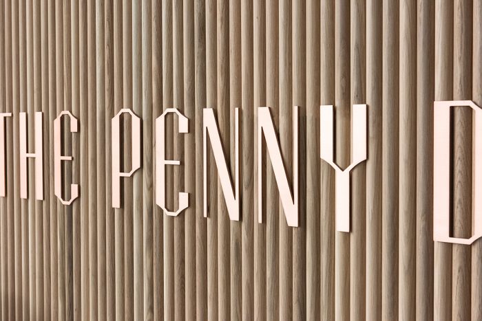
The desire to bring a sense of “Brunswickness” to the “Chinatown of the East” set owners Steven Liu and Mary Lai to create a contemporary Asian dining experience never before seen. Set in Melbourne, Australia, the vision was clear: Craft a new experience worth talking about. The design team at Pop & Pac took the challenge and ran. The brand’s identity is spearheaded by a brilliant custom typeface that’s highly geometric and modern with notches of classic style. Pop & Pac describe their inspired implementation and design:
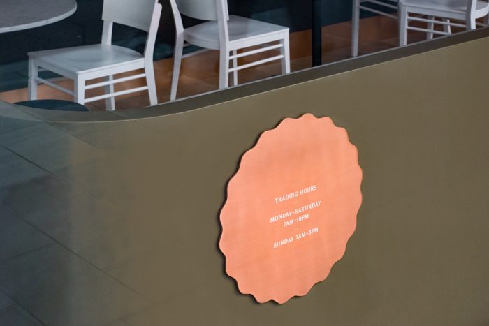
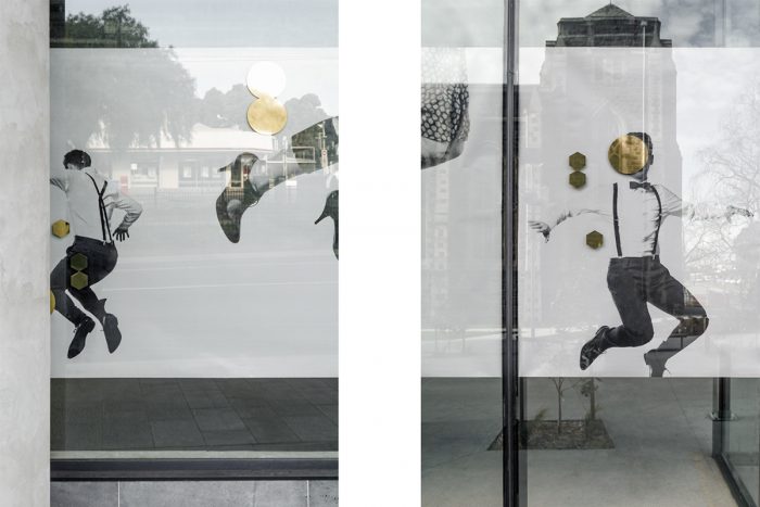
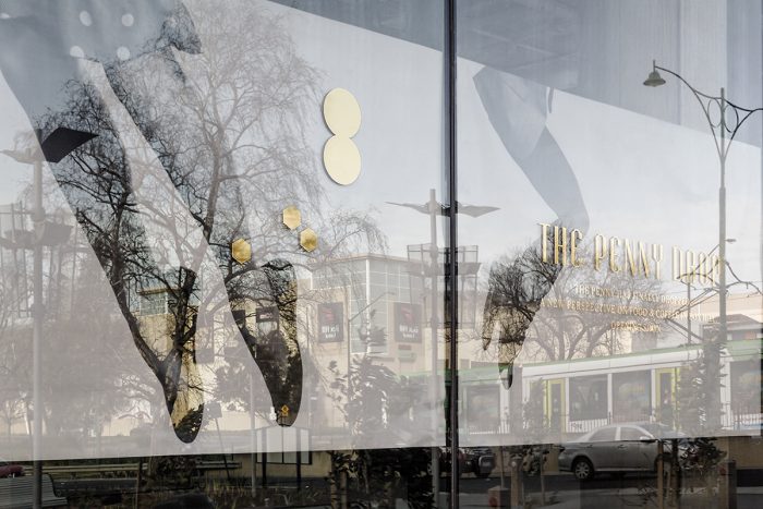
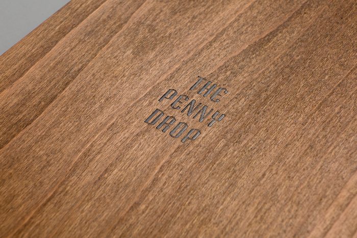
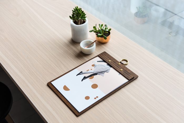
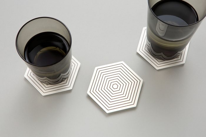
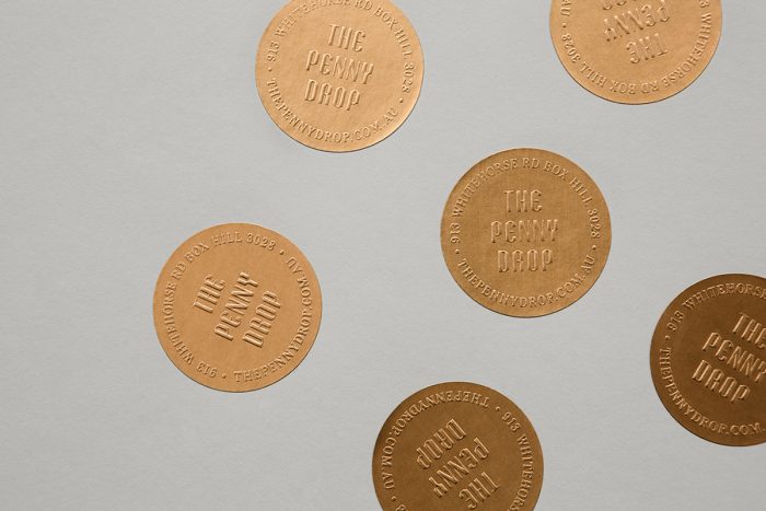
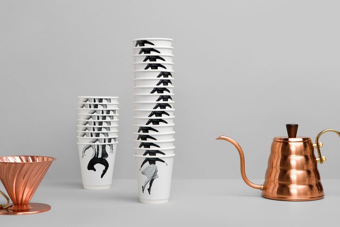
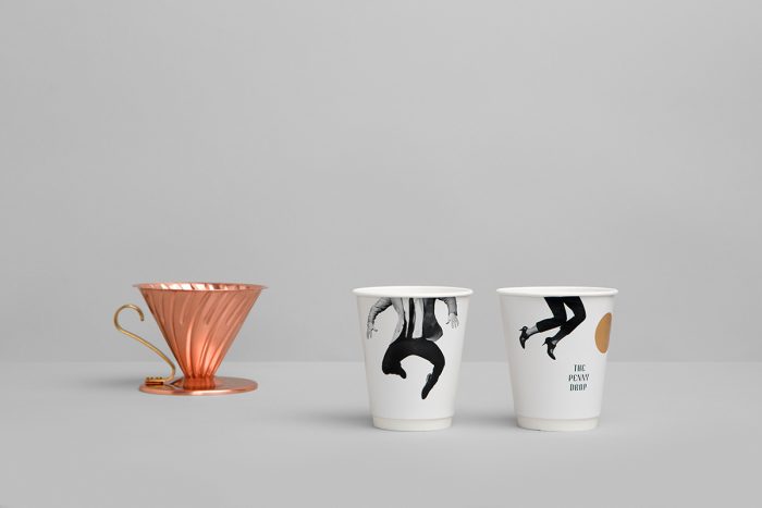
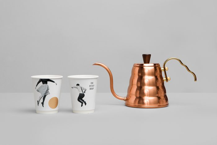
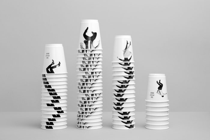
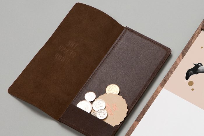
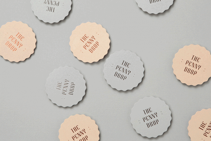
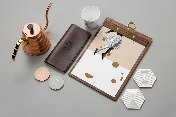
Pennies provide inspiration throughout; evident in brass menu finishes, the shapes of business cards and coasters, and use of circular elements. Bill folders are reinterpreted as leather wallets. The result is a comprehensive suite of collateral, including custom typeface, menus, coffee cups, stickers, hoarding and signage.
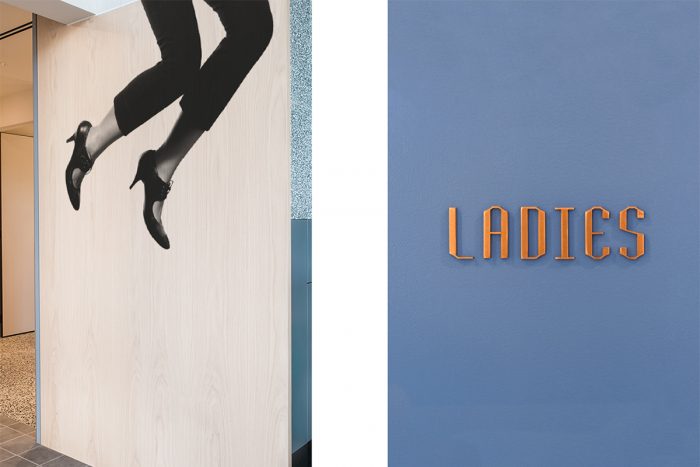
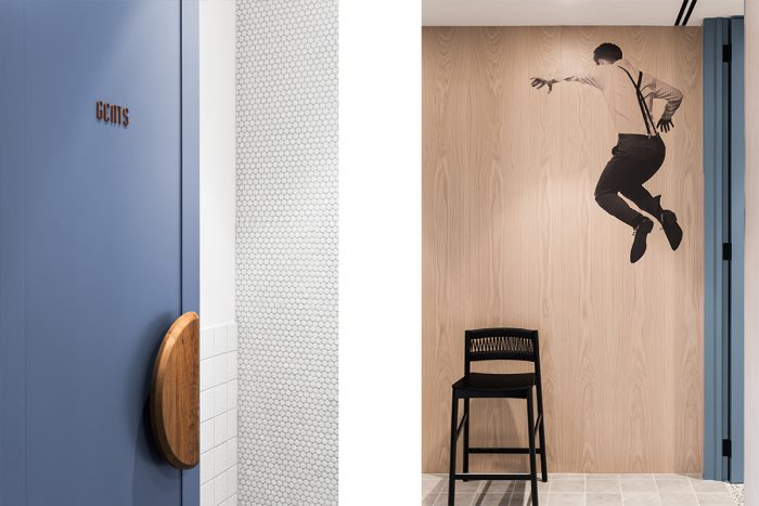
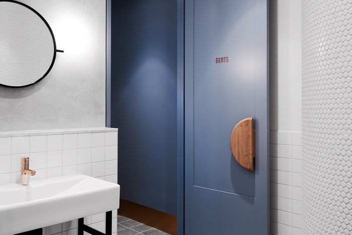
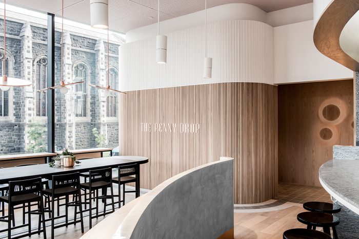
The use of the jumping human imagery creates a higher energy to the would-be standard textures and treatments throughout the space. It’s unexpected and fresh. This combined with the subtle, well-placed notes of copper create individual moments of surprise worth remembering. The interiors relate perfectly to the printed and digital elements of the brand with the help of congruent use of photography, typography, texture, and color. This creates a unified design language in one of the strongest displays of brand integration I’ve seen in a while. Kudos.
Designed by Pop & Pac
