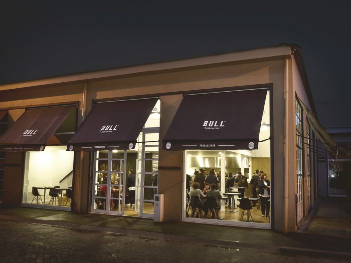
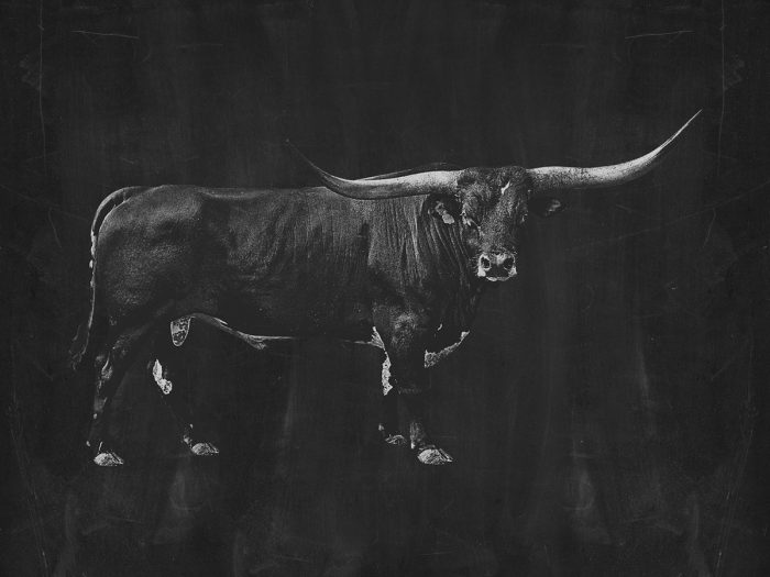
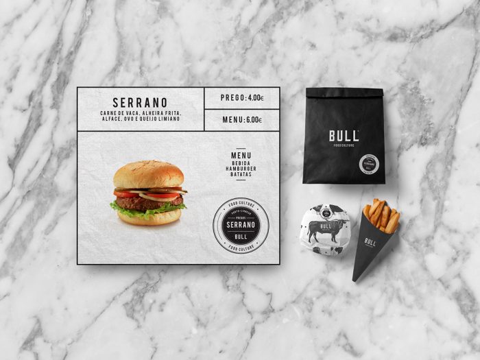
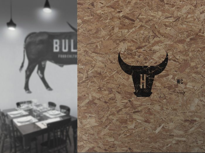
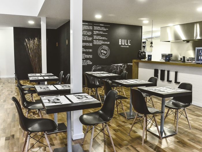
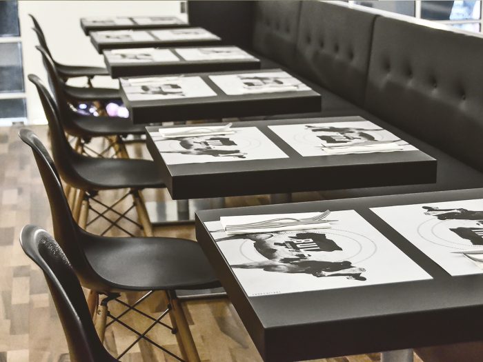
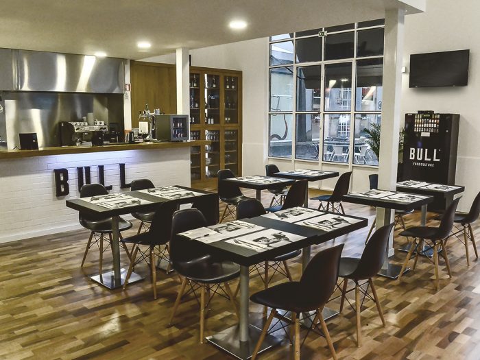
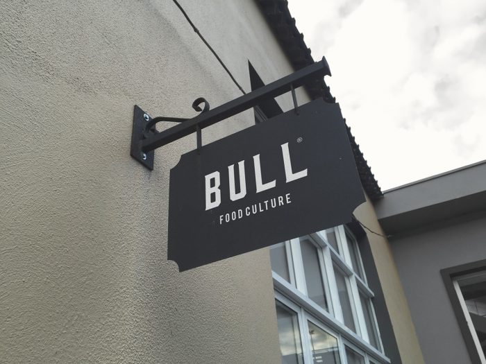
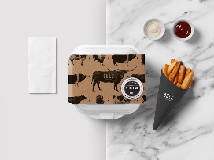
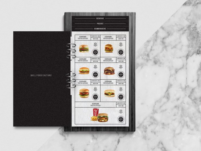
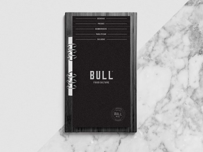
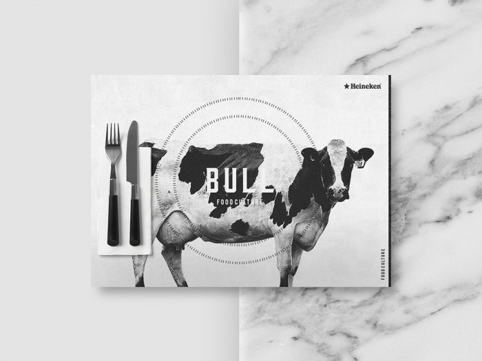
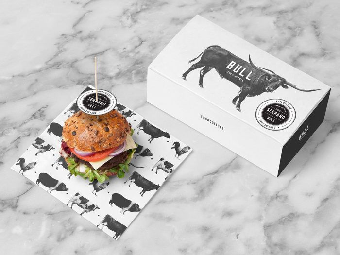
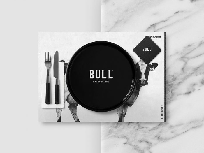
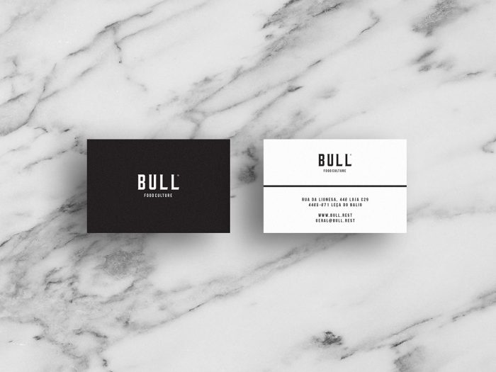
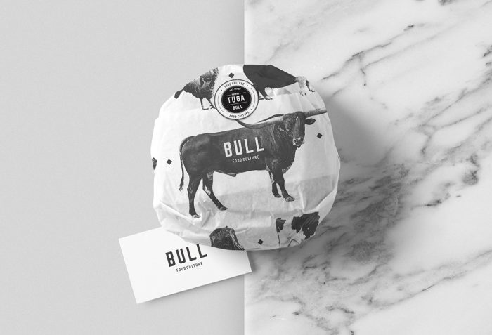
I love how simple this design is for Bull, a restaurant located in Portugal. The identity is reserved with a limited color palette of just black and white. It creates a strong look that’s stoic. From the name through every touch point this reserved, confident design aesthetic shines. Although some of the touch points could be thought through a bit more – it tends to get a little logo slappy – it’s still strong. It’s hard to NOT know where you are, and it’s safe to say this identity comes with no “bull” 😀
Designed by Bullseye
