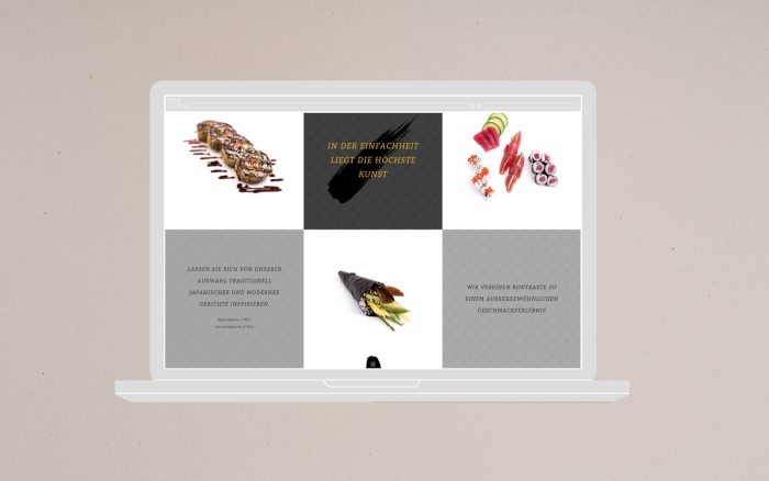
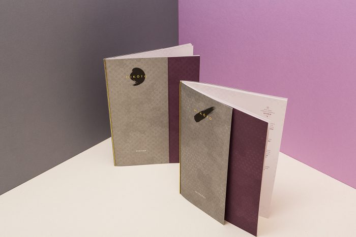
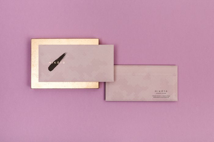
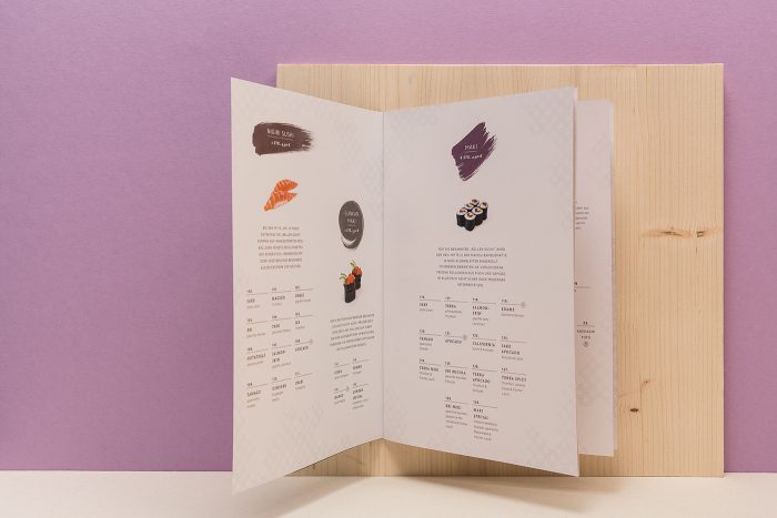
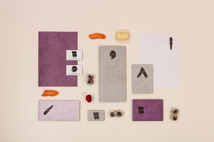
So often Japanese restaurants fall into cliche. Black, white with pops of red. It makes sense, but it’s played out. The brand identity for Mikoto takes the elegance expected of a Japanese experience, and delivers it with class, grace, and art.

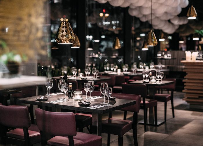
Mikoto is a restaurant located in Stuttgart that focuses on merging modern and classic technique and cuisine. The identity illustrates it perfectly with traditional patterns introduced in a subtle style, brush strokes artfully placed, and beautifully reserved typography.

Designed by ADDA Studio

The Forktales Podcast™: Interviews with restaurant industry leaders and visionaries

Restaurant and advertising industry headlines and thinking

Reviews of restaurant experiences from around the globe 

Reviews of our favorite design, business, & restaurant books

Our favorite typography and fonts

Inspiration in your inbox

Get the latest inspiration in your inbox every Monday morning, for FREE!

"*" indicates required fields

This field is for validation purposes and should be left unchanged.

Delicious Bits in your Inbox!

Get the latest and greatest content delivered to your inbox for free!

"*" indicates required fields

This field is for validation purposes and should be left unchanged.