The interior experience is quite easily a major moment of truth for a restaurant brand. All roads lead to what happens inside the four walls. It’s easy to see why so much time and consideration is spent thinking about consumer journeys and emotional experiences in this moment.
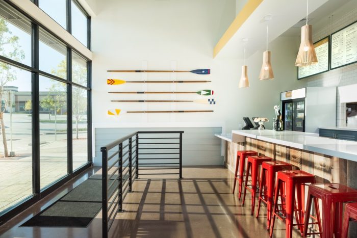
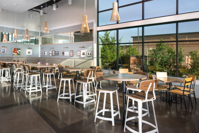
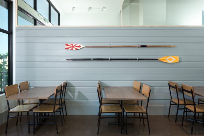
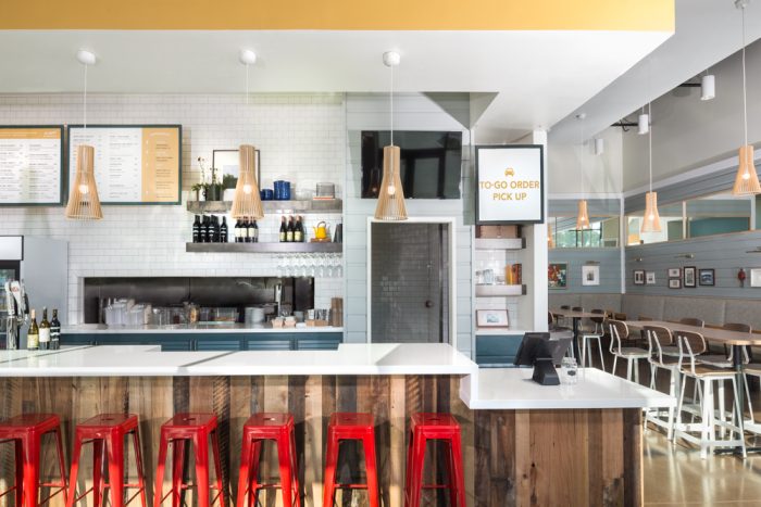
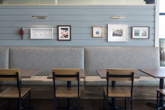
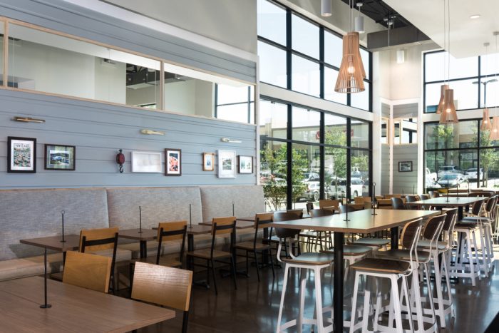
East Hampton Sandwich Company, although carrying a rather forgettable name, has an interior experience that’s fresh and calming while being semi-playful and approachable. The cleanness of large planes of white and cool grays compliment the wide open space where natural light plays a major role.
Fast casuals can be hustle and bustle, but design such as this helps make that easier and less stressful. As a result, East Hampton Sandwich Company’s look is one that you’ll want to experience again and again.
Designed by Studio 11
