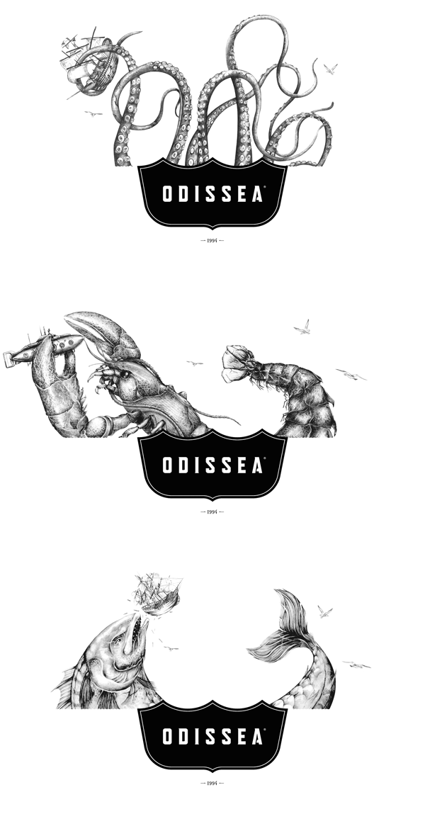
I was strolling through the folder where I store projects I intend to share. It dawned on me that I had some stuff from years ago that never posted. Maybe I got excited about a new project I found, or simply forgot to post. Either way, there it sat patiently waiting for me to give it its just due.
This is Odissea, a seafood brand with a semi-classic, semi-quirky identity. The visual metaphors take their cues from the metaphoric name, a nod to Homer’s epic. With that inspiration the design team crafted a bifurcated packaging aesthetic that joins classic illustrations of sea monsters with photographic depictions of the actual food product. This visual split creates a natural layout for the typography and brand elements making the packaging suite look fresh, clean, and intriguing. All things you want with seafood.
Designed by The Brandlab™ in Peru


