Belle’s Hot Chicken restaurant branding

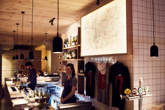
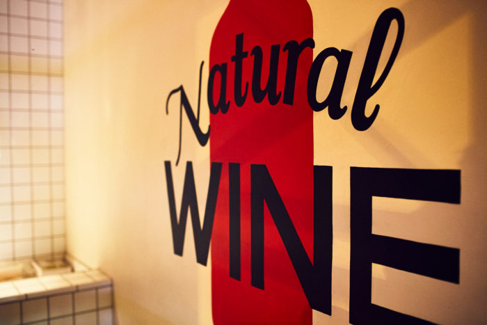
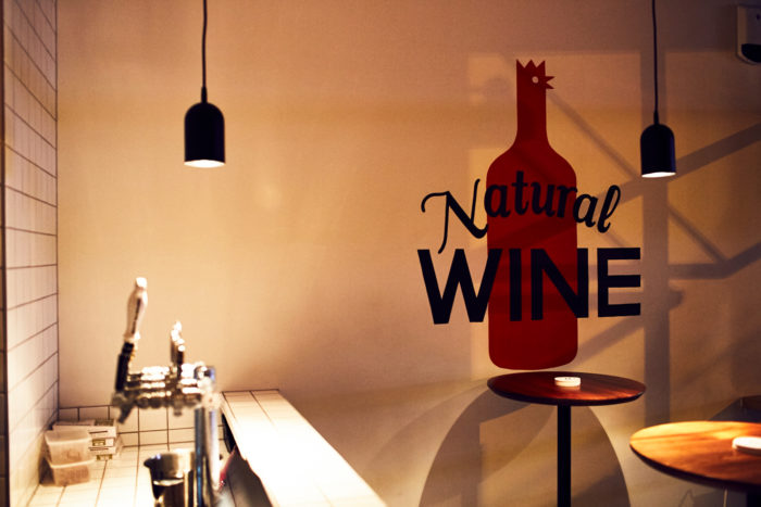
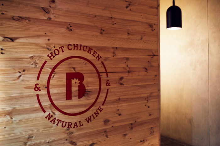
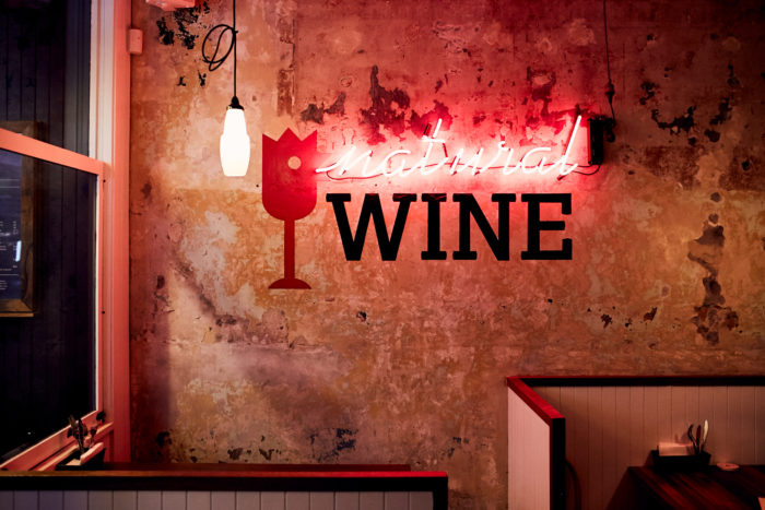
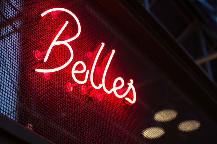
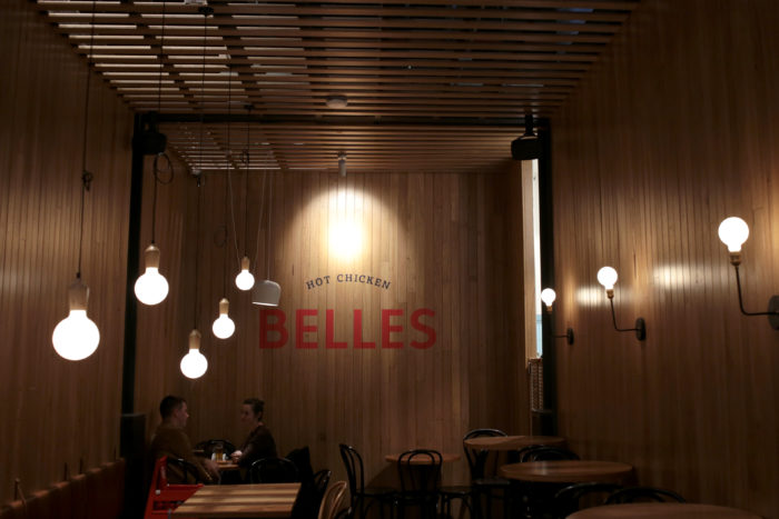
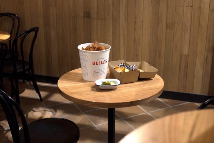
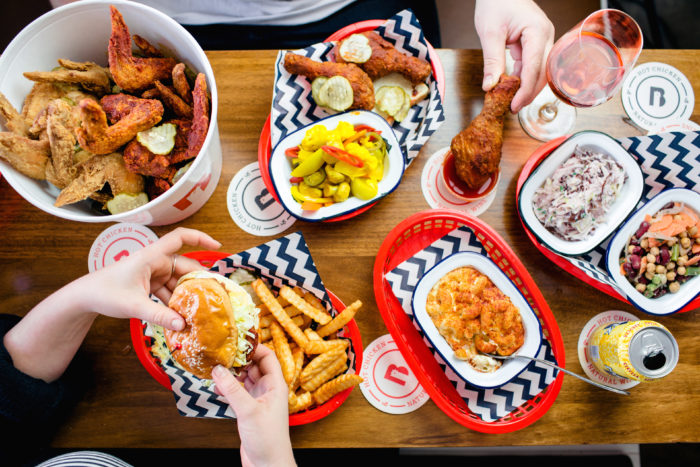
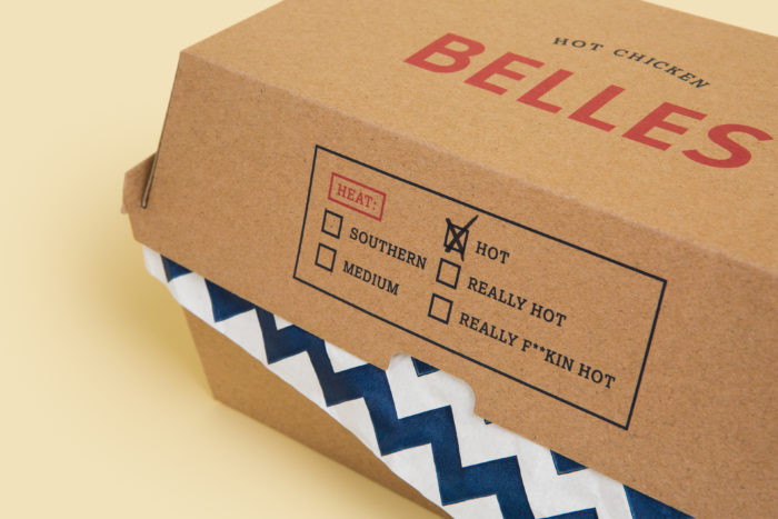
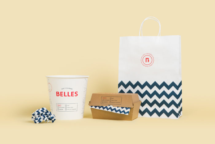
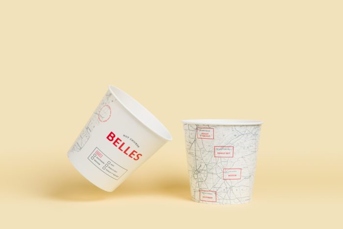
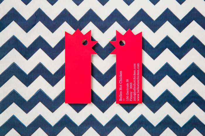
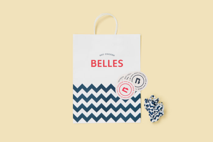
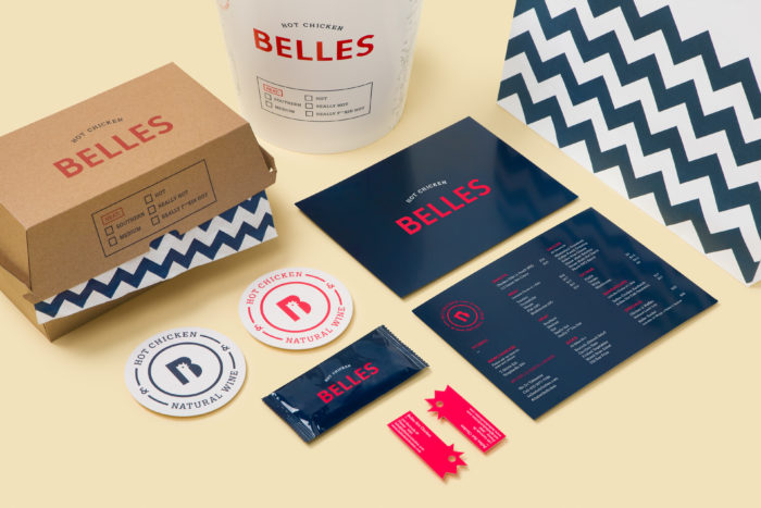
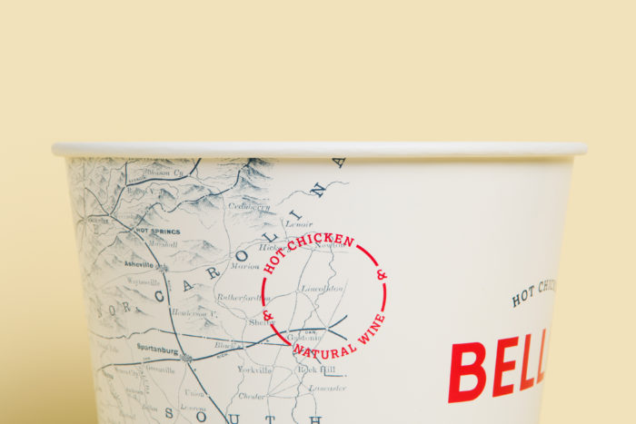
Nashville-style hot chicken is … well … really hot right now. Belle’s is the latest concept to hit the world – Australia specifically – with a rock star identity and brand design. The brand creates a mix of classic screenprinting feel with fresh twists. Neon elements interact with the space in fun, new ways, and the packaging puts the brand on the map. Quite literally… it’s a map. Finally, the identity is supported by a Charlie Brown-style zigzag pattern that serves as visual anchor for the brilliant typography and touch points.

Designed by Erica Boucher
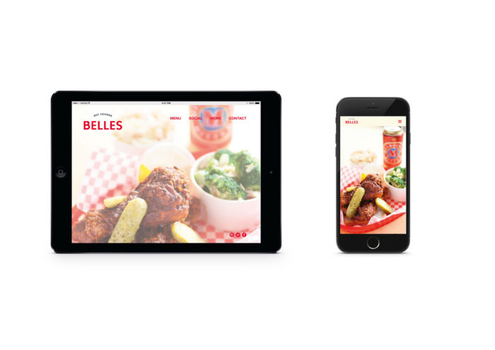
Website build by Hectare Design
Photos by Foliolio Al Bloom / Jessie Prince
The Forktales Podcast™: Interviews with restaurant industry leaders and visionaries

Restaurant and advertising industry headlines and thinking

Reviews of restaurant experiences from around the globe 

Reviews of our favorite design, business, & restaurant books

Our favorite typography and fonts

Inspiration in your inbox

Get the latest inspiration in your inbox every Monday morning, for FREE!

"*" indicates required fields

This field is for validation purposes and should be left unchanged.

Delicious Bits in your Inbox!

Get the latest and greatest content delivered to your inbox for free!

"*" indicates required fields

This field is for validation purposes and should be left unchanged.