
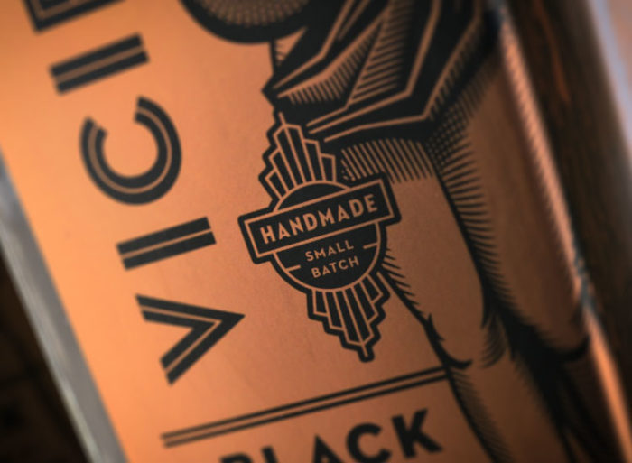
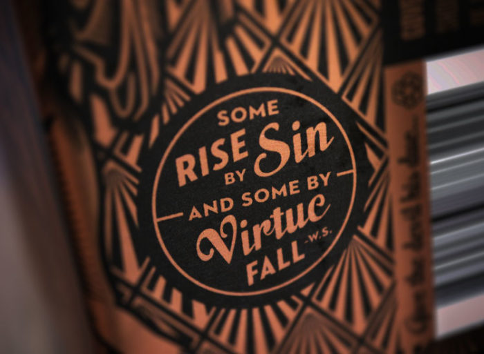
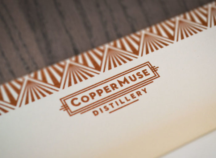
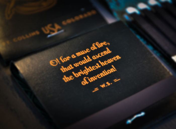
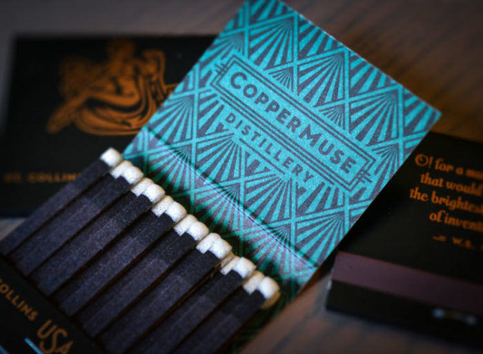
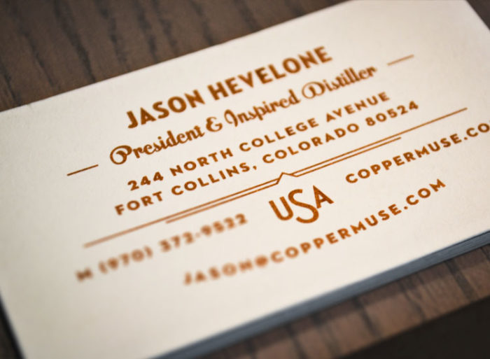
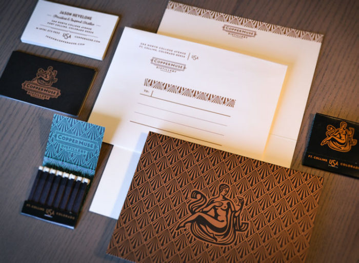
We pulled together the full suite of work for Copper Muse Distillery’s branding, packaging and identity. The team at Emrich Co has been killing it with this brand down to the very last drop.
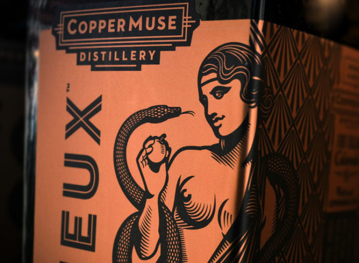
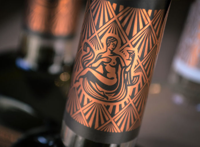
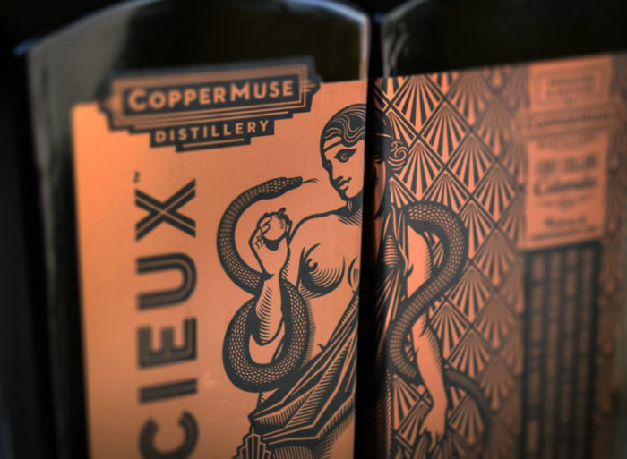
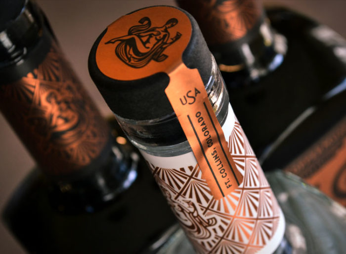
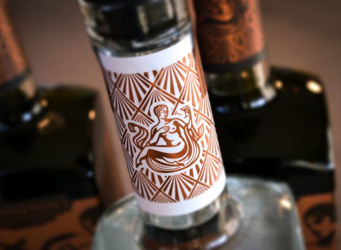
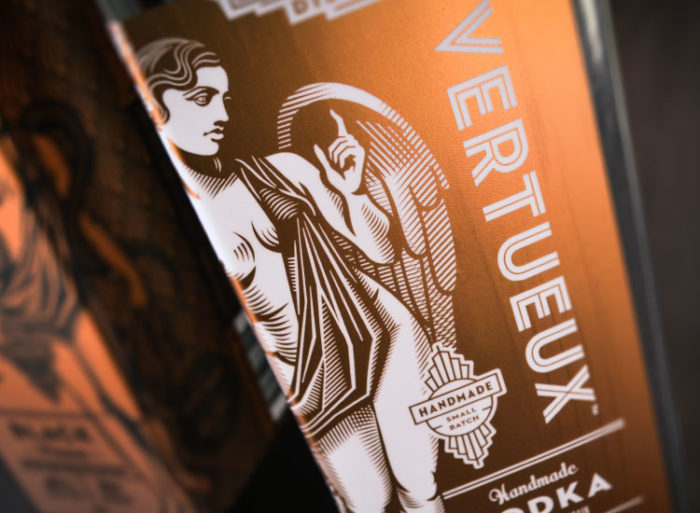
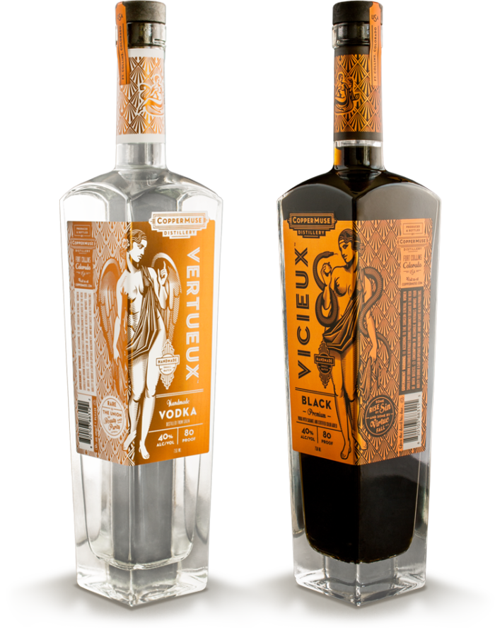
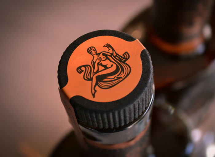
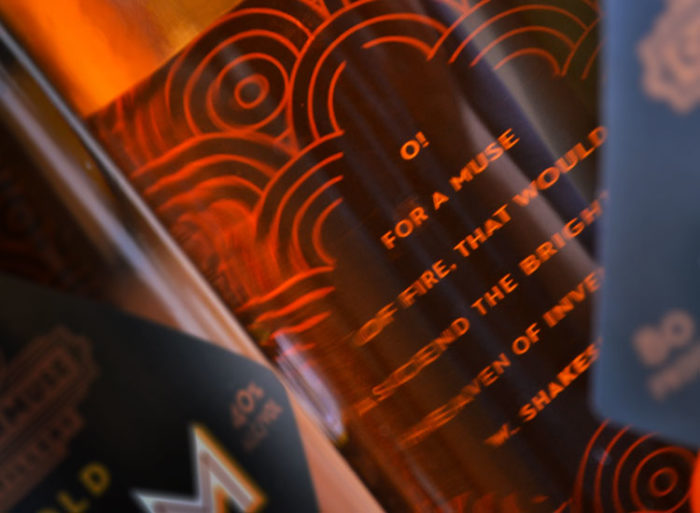
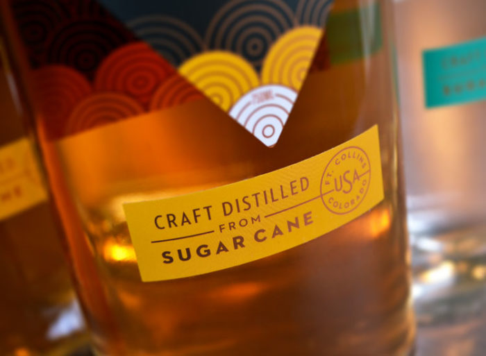
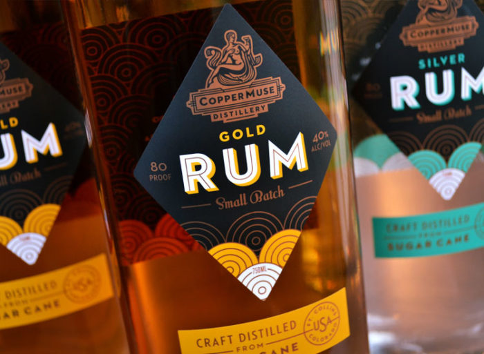
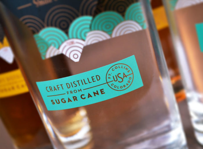
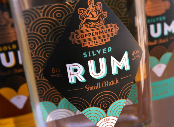
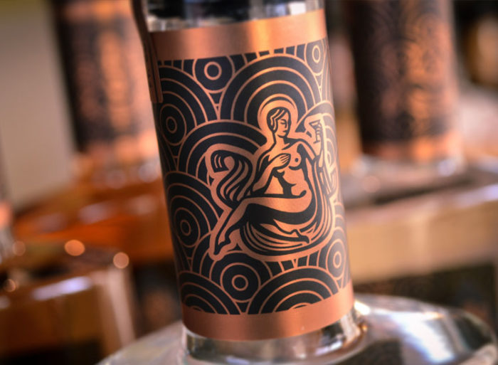
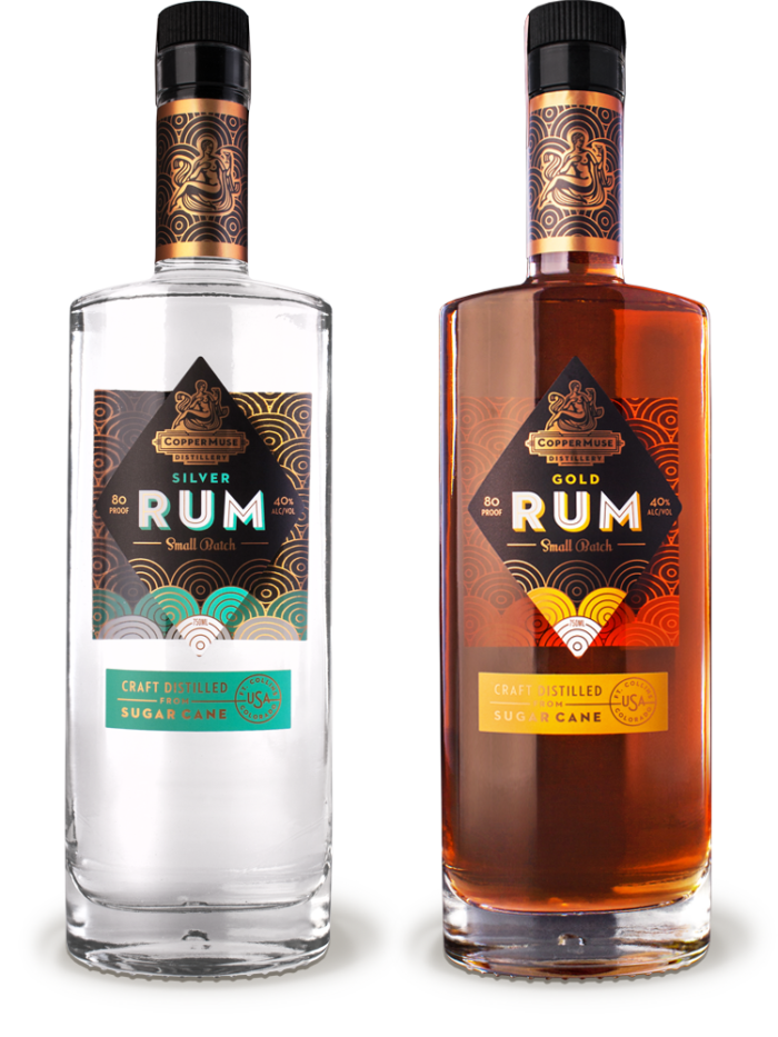
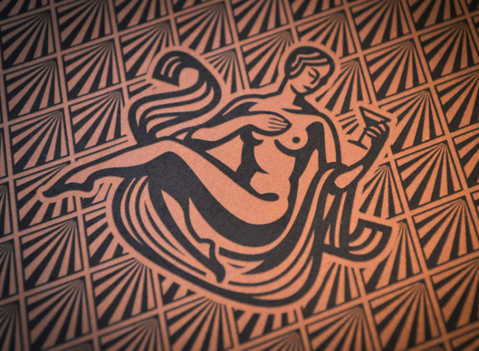
The brand is spearheaded by the copper muse herself. A beautiful female that nods to Greek and Roman era representations of muses. She is found holding a martini glass in most instances, but changes slightly depending on the liquid. Set in copper foil overtop an Art Deco era pattern, the muse carries the brand across many different spirits and styles.
From vodka through rum, the brand flexes and flows without breaking down its core identity aesthetic. This fluidity is perfection as the distillery’s brand becomes robust with every addition, but never weakens. It only gets stronger.
Designed by Emrich in Indianapolis, Indiana USA

![]()


