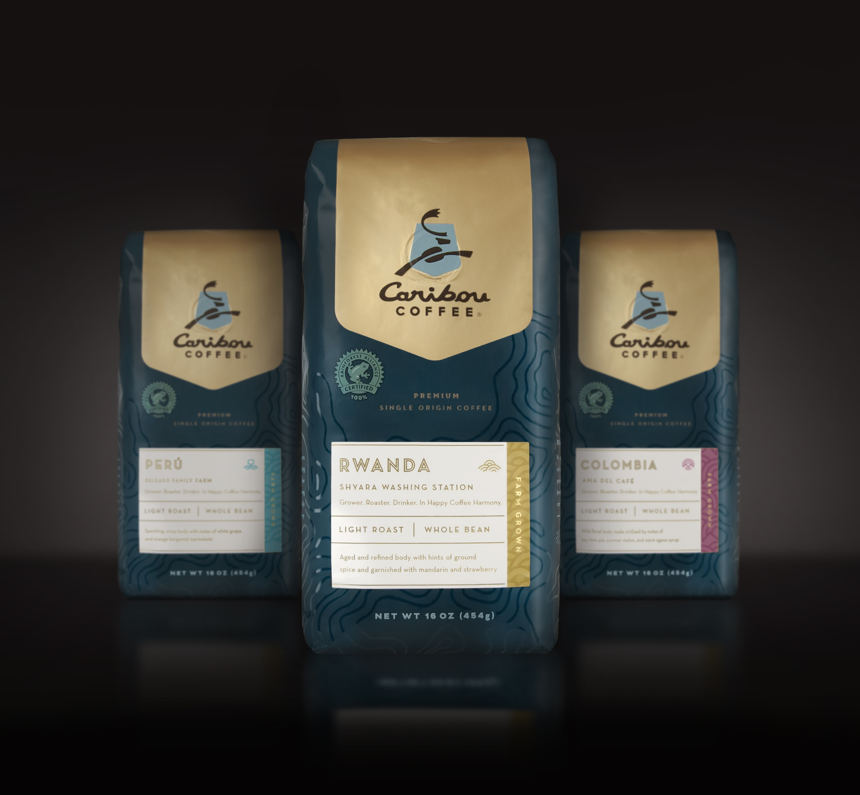
Sleepy Mondays call for more invigorating coffee branding. Usually, I like to focus on smaller companies/brands calling out the great work that they do, but today I want to feature one of the bigger contenders in the coffee market; Caribou Coffee. Caribou provides come of the best single origin coffees available anywhere, using sourcing methods that honor relationships between themselves and coffee farmers around the world.
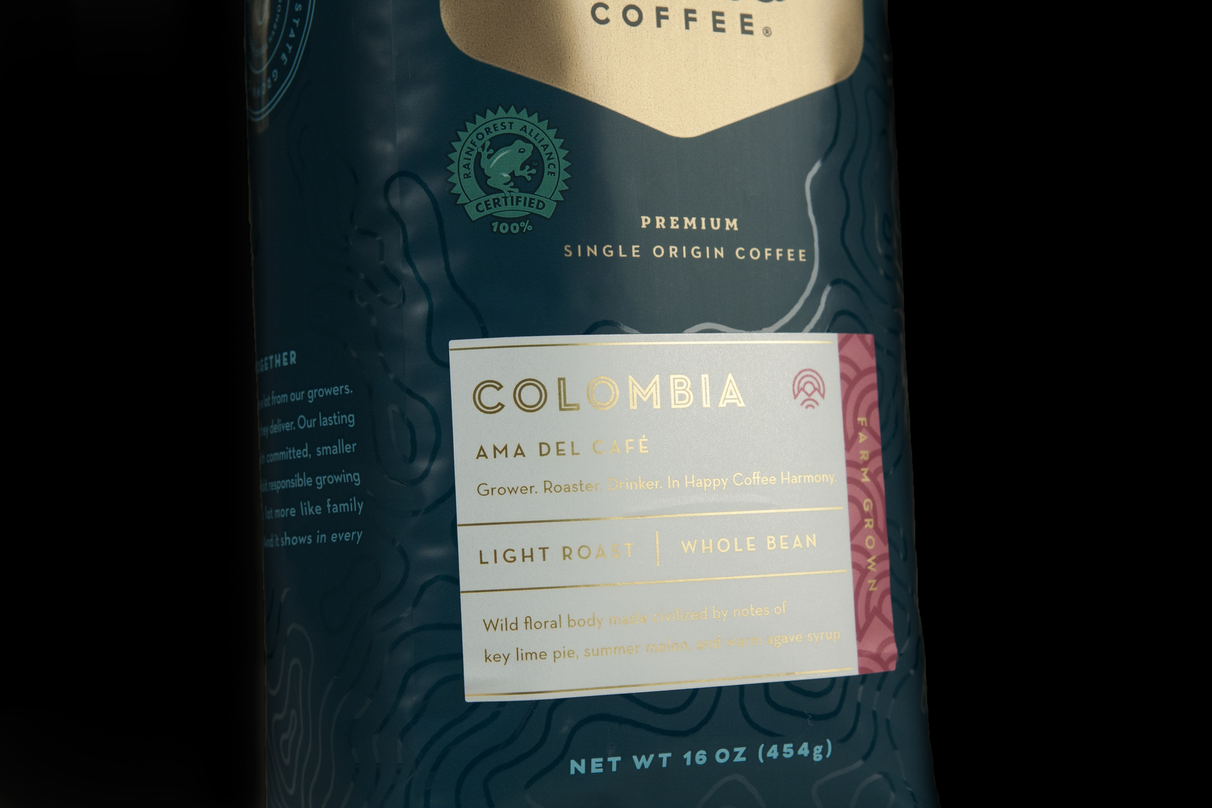
With third-wave coffee makers elevating consumer expectations, Caribou asked Cue to extend the brand’s offering into this super-premium coffee segment. The packaging for these coffee beans is super luxe; spot gloss topographical maps mark the importance of location in the growth of these beans, and each label features a lovely gold foil treatment. I also enjoy the individual tags/illustrations that give attention to the individual farms that the beans were sourced from. I wish the topographical maps were also personalized to the location to add that additional conceptual layer, but you can’t have it all.
Branding and Packaging by Cue.


![]()


