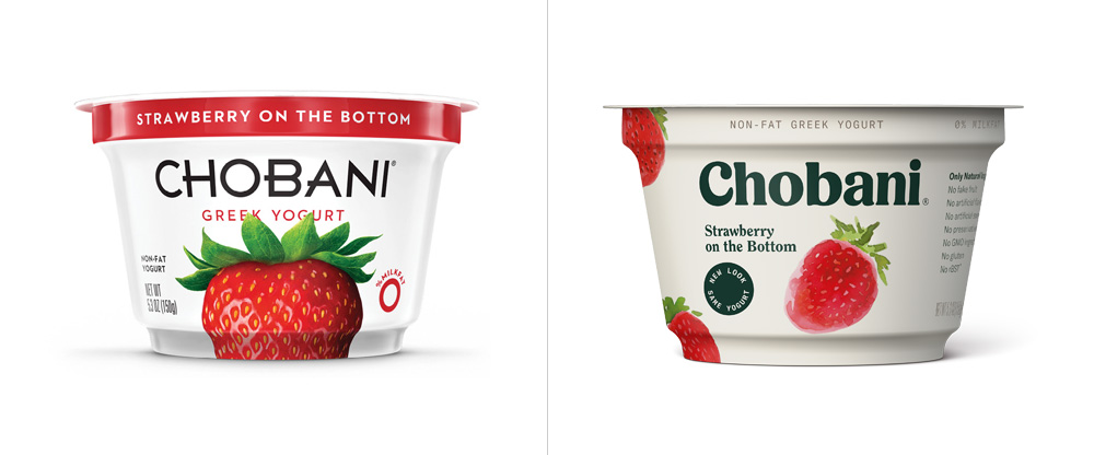
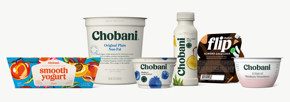
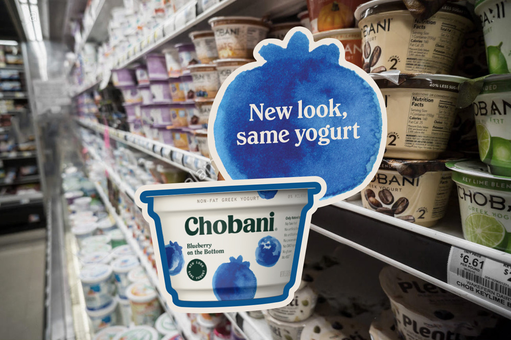
Even if you don’t eat greek yogurt, you know Chobani. It’s a brand that really brought greek yogurt into the mainstream, and its clean look inspired a slew of other budding greek yogurt brands to emulate its ‘fruit on white’ look. Seriously, you look at the yogurt case at any supermarket, and more than likely you’re going to see a plain, almost hospital-white package with a picture or hyper-realistic illustration of fruit on it, and some sort of stripe with the color of that fruit to represent the flavor. It was a sea of sameness, and from that sea Chobani has rebranded itself to stand out and lead the way once again.
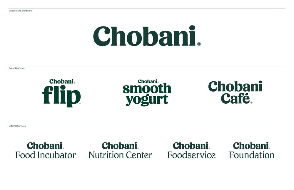
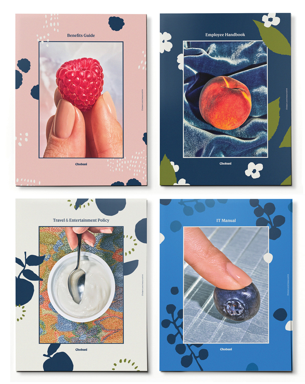
I, personally, am on the fence about whether I like this rebrand. I understand why they did it; Chobani is trying to position itself away from Greek yogurt. For a while, they’ve been attempting to break into other markets; offering bottled pre-made smoothies and yogurt-based vegetable dips to appeal to the non-yogurt eater. This rebrand positions them in a place that makes them seem like a time-tested and trusted health food brand; they’ve dropped ‘Greek Yogurt’ from the main moniker altogether. It has a very retro-heavy 70’s feel, from the curvaceous new wordmark to the over-saturated product photography. The models in their new shots and in their tv spots even feature patterns and dress styles from that time, maybe to harken back to a simpler time, before kale and superfoods and free-range products clogged up our supermarket shelves. It’s definitely nostalgic, but not overwhelmingly so. To me, the photography and tv spots feel like Wes Anderson-meets-Norman Rockwell.
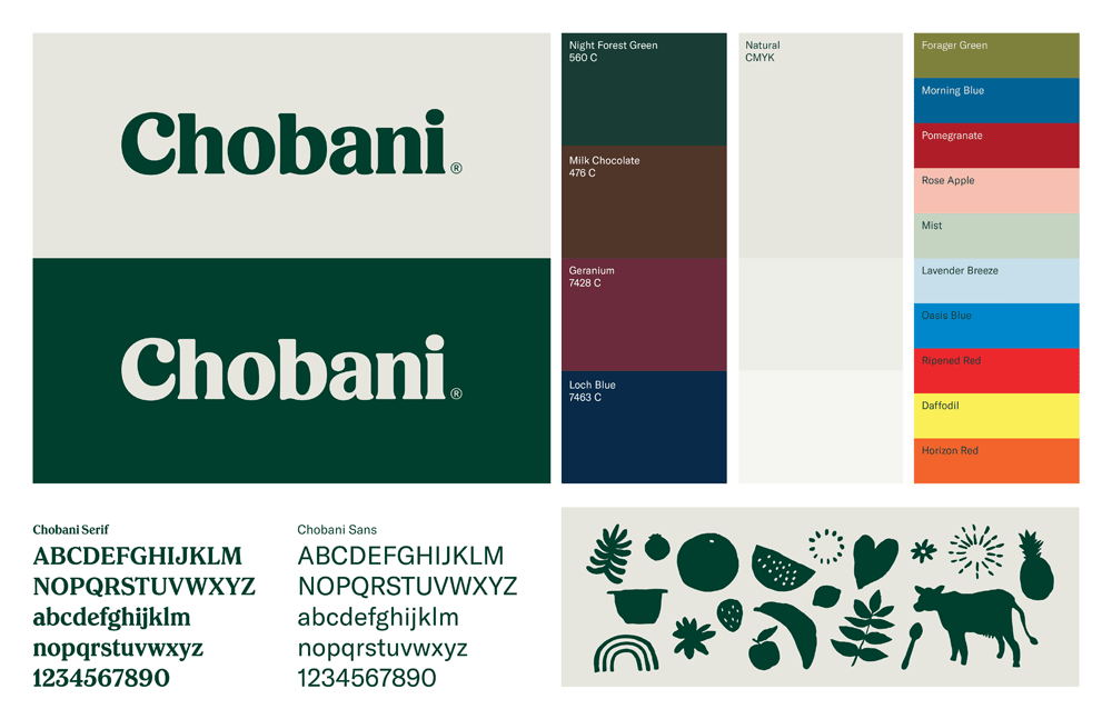
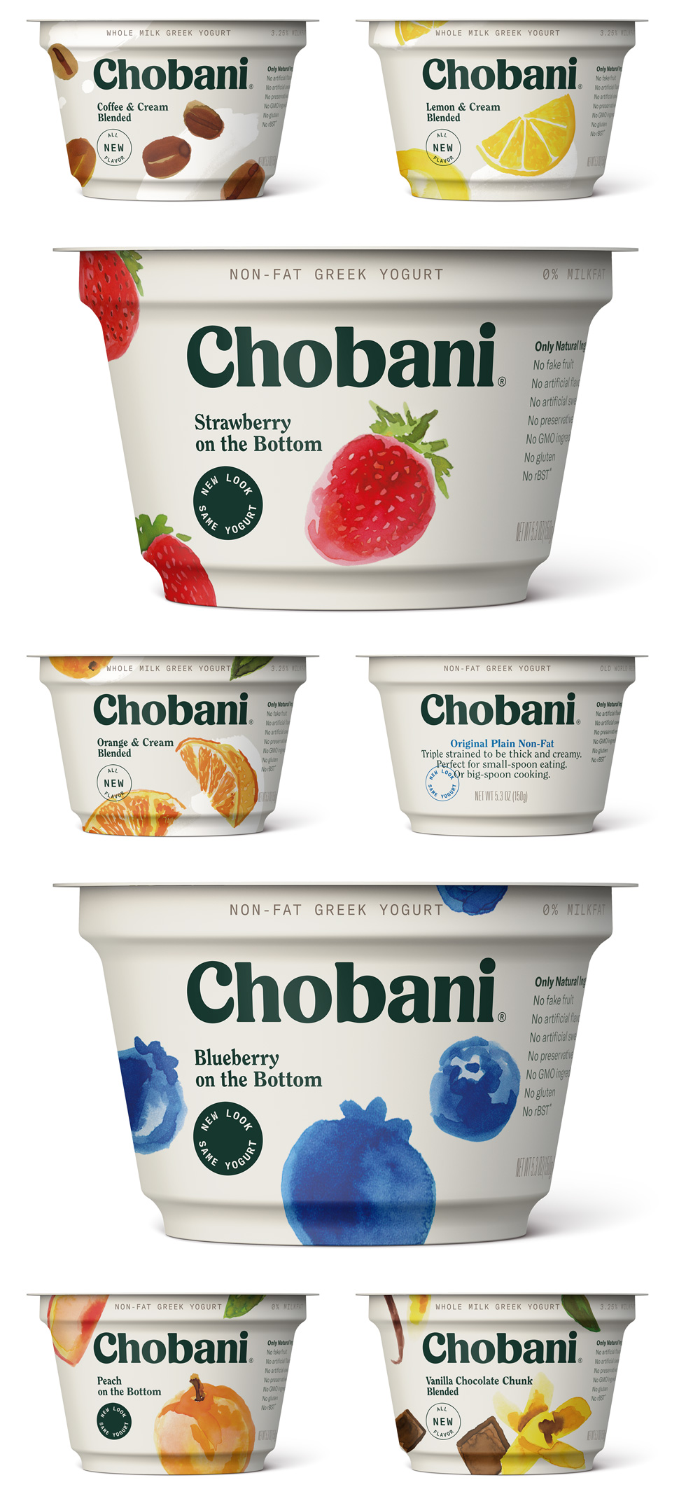
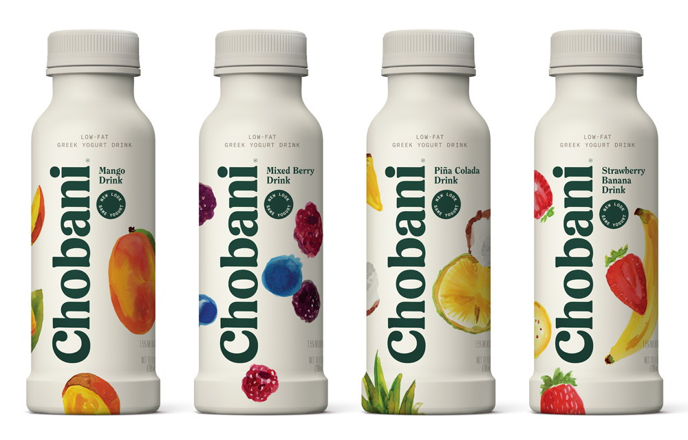
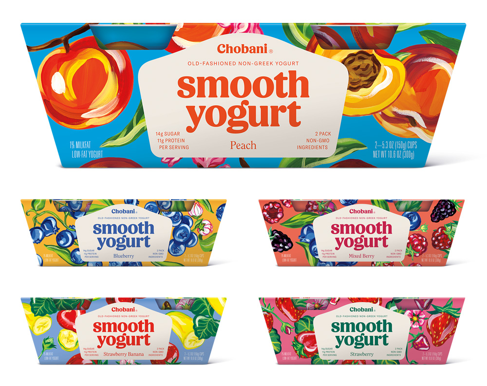
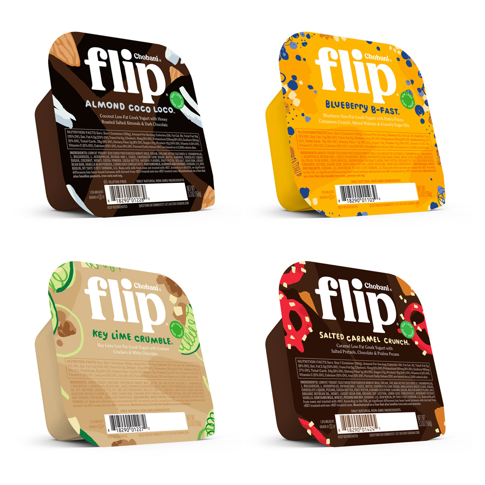
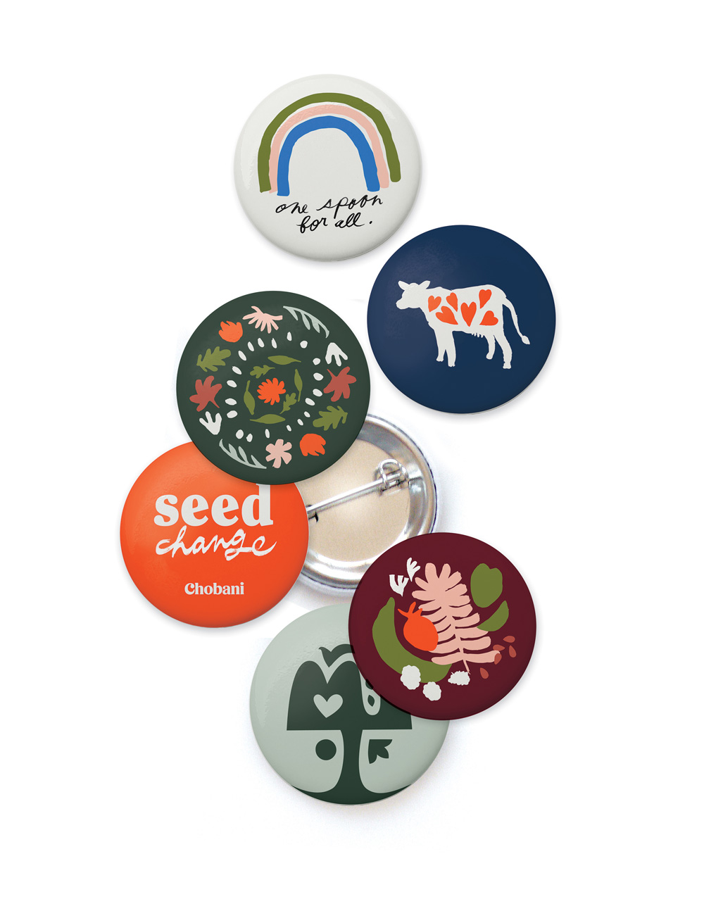
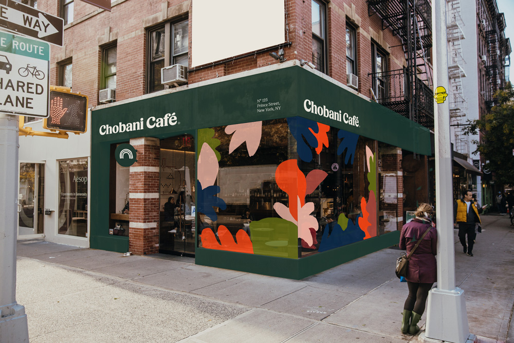
Additionally, they’ve opted to represent their flavors across several of their product lines with illustrations instead of photos. Here it gets a little muddy for me, as the style isn’t consistent; marketing collateral features a Matisse paper-cut style, the individual yogurt cups have a watercolor treatment, their smooth yogurt has bright and expressive brushy art, and their Flip line falls somewhere in between. It’s nice to see the change in packaging and it’ll definitely stand out among their competitors, I would just love to hear some of the reasoning behind the different styles for the different products.
I think eventually I’ll come around to love this rebrand, as Chobani is a great company and they continue to set the standard in this category, but for now, I can admire and respect the effort, strategy, and overall great work that went into an overhaul this large.
What do you think about the new look for Chobani? We’d love to hear your opinion!
Design for the rebrand was done in-house, led by Chief Creative Officer Leland Maschmeyer.

