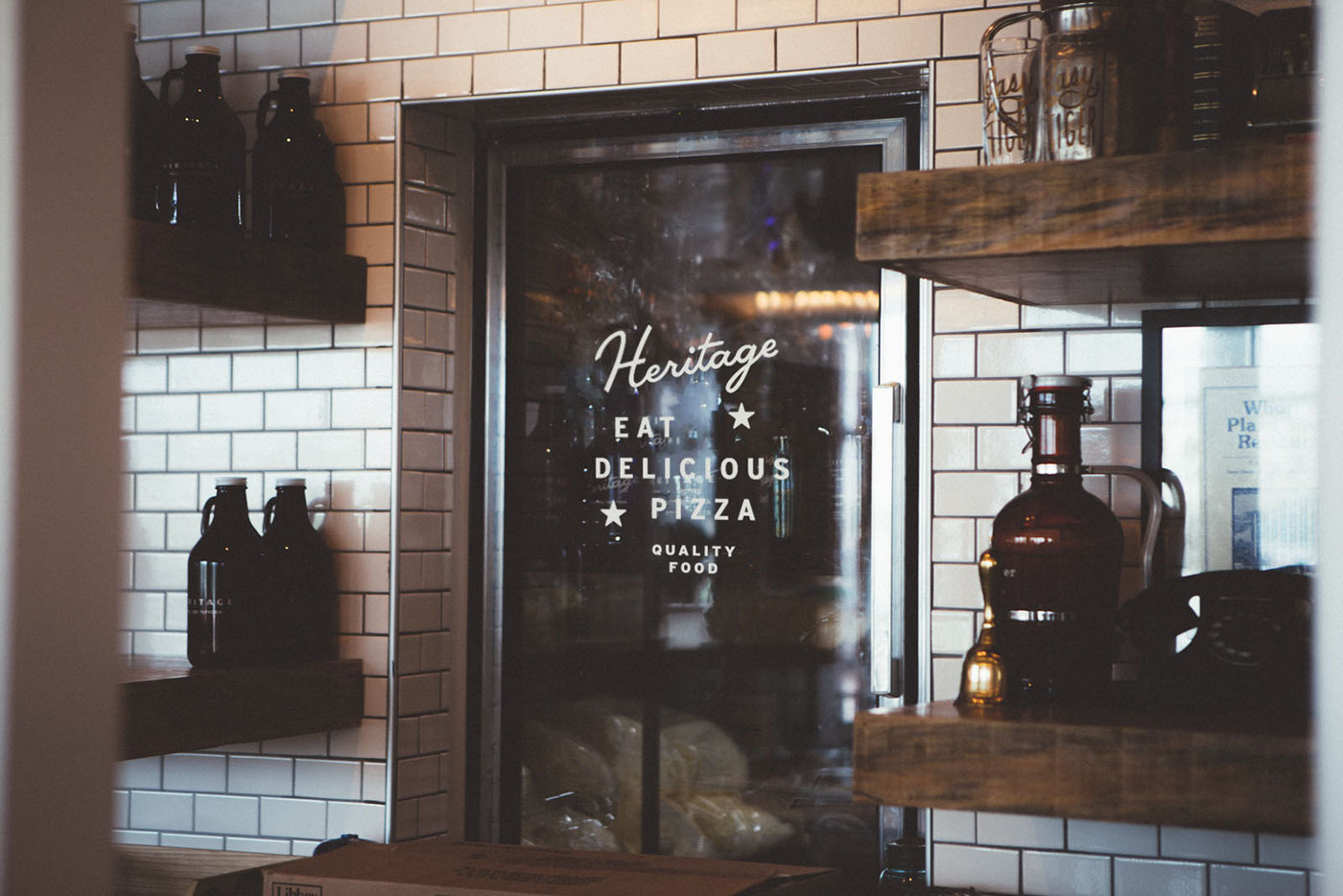
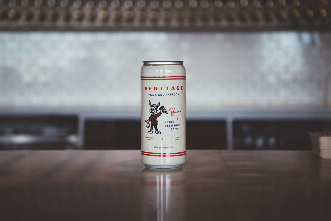
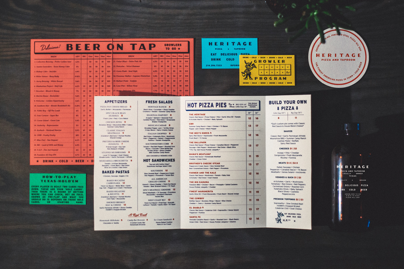
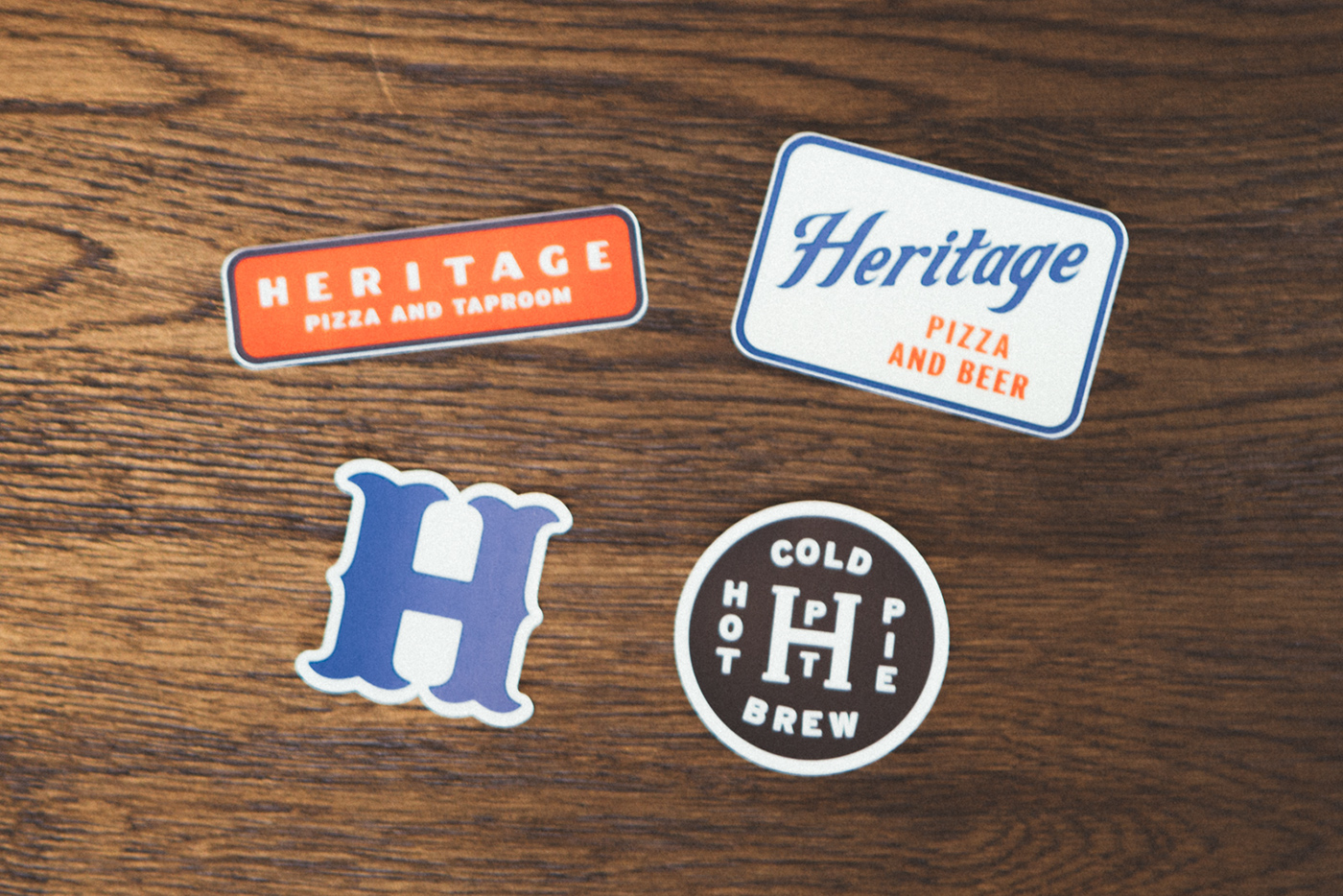
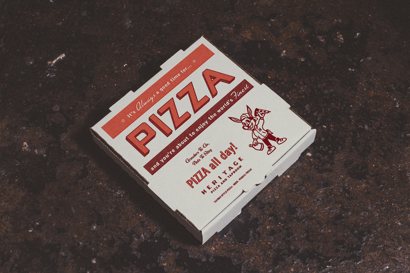
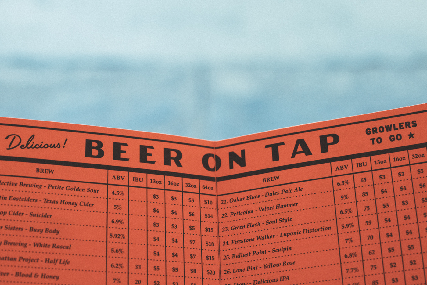
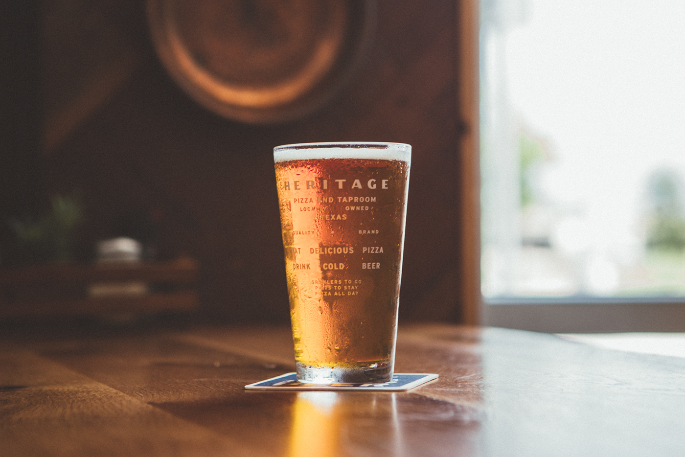
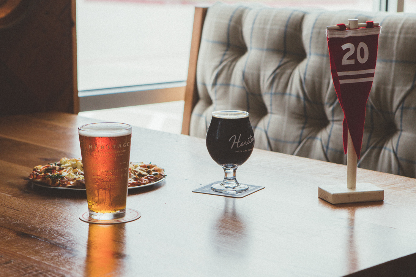
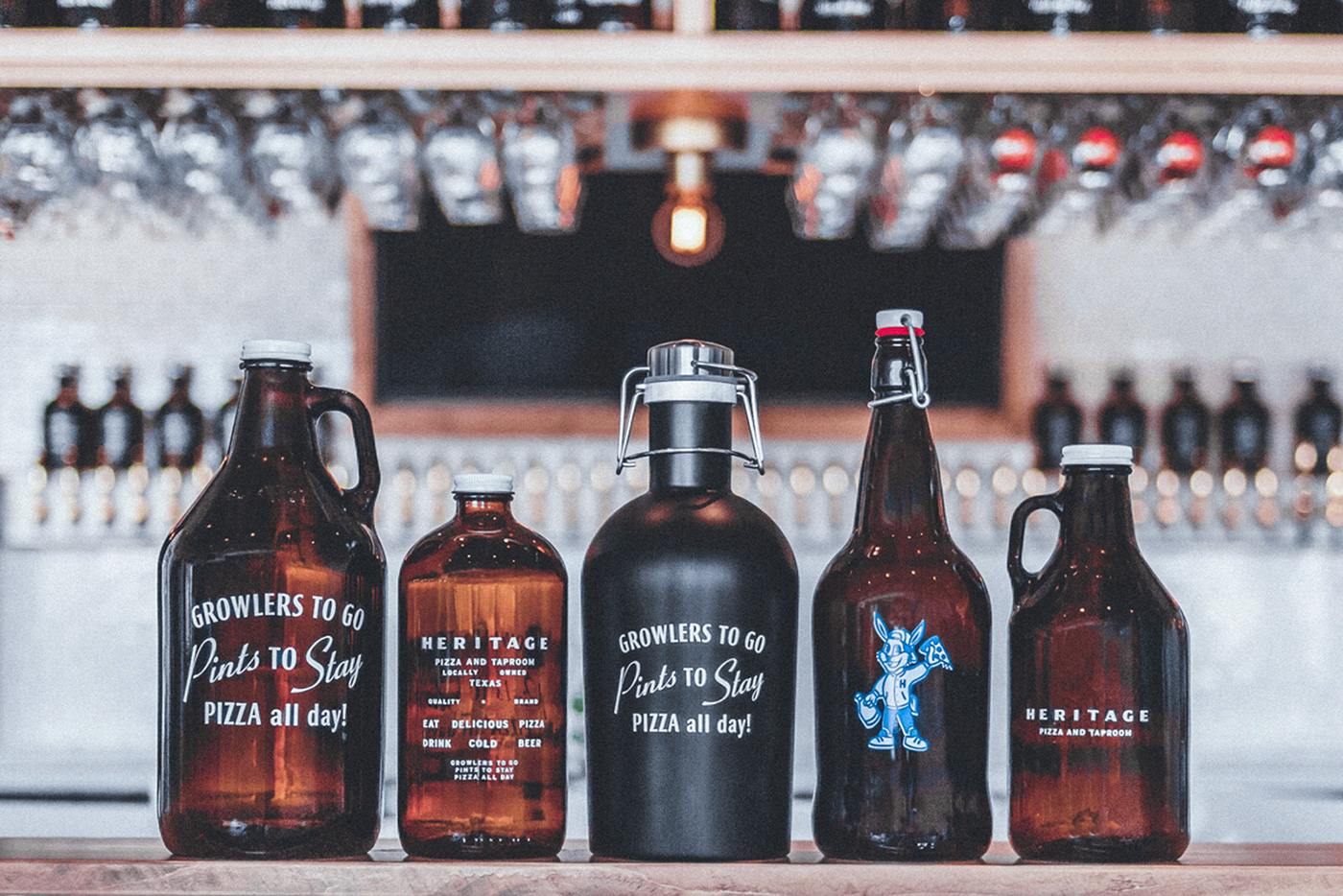
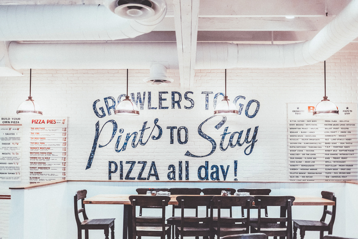
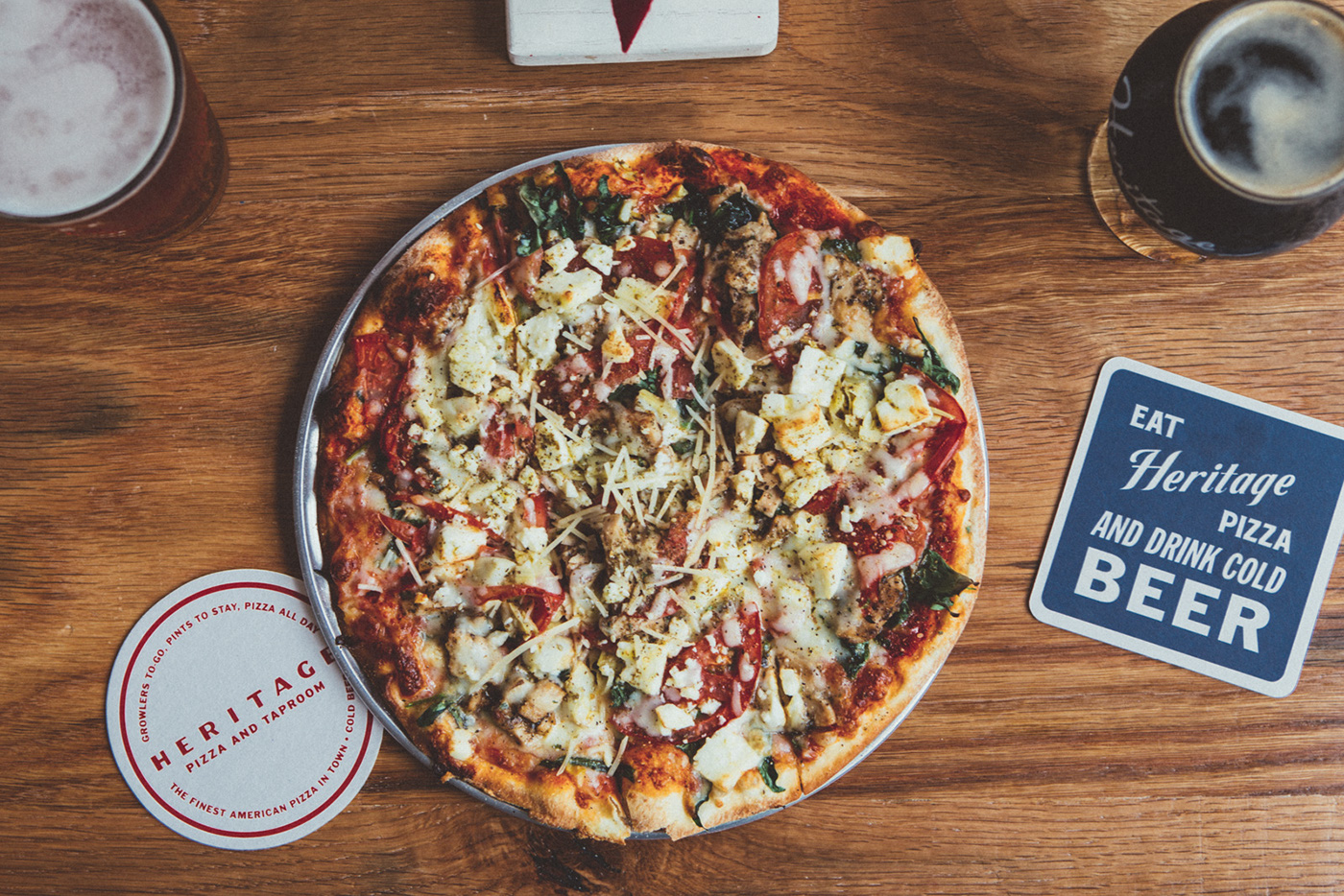
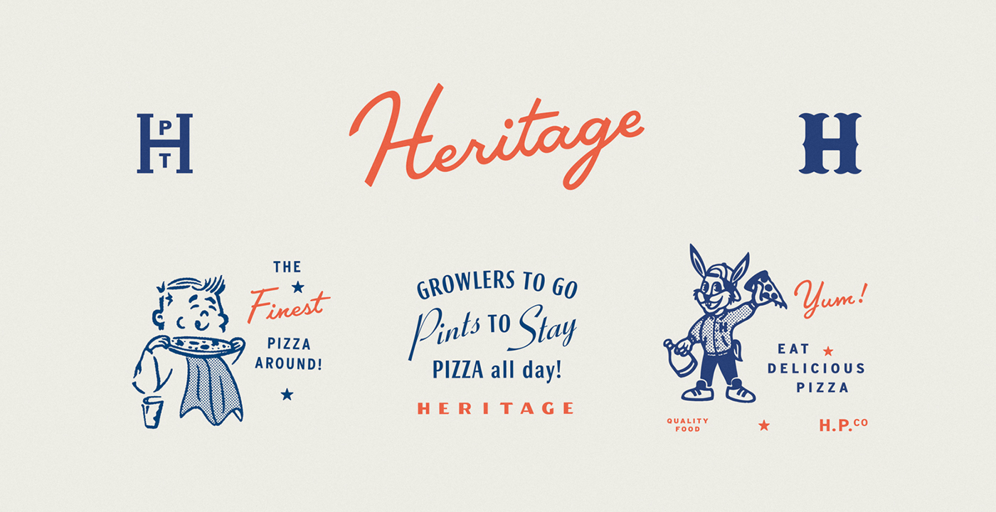
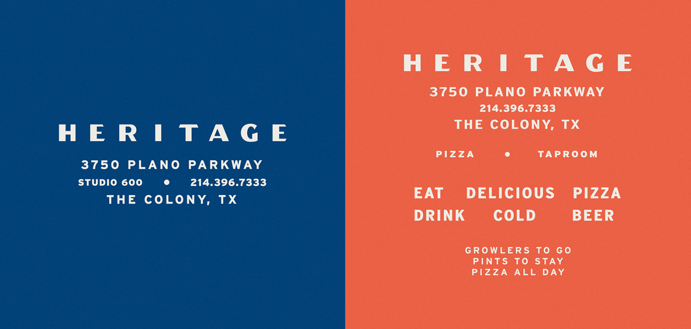
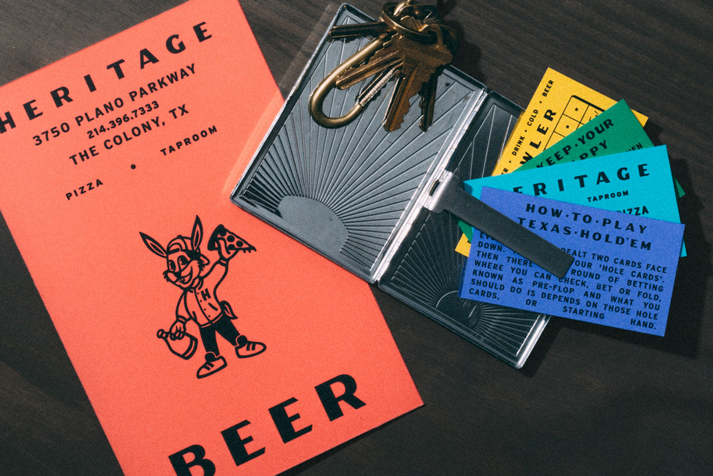
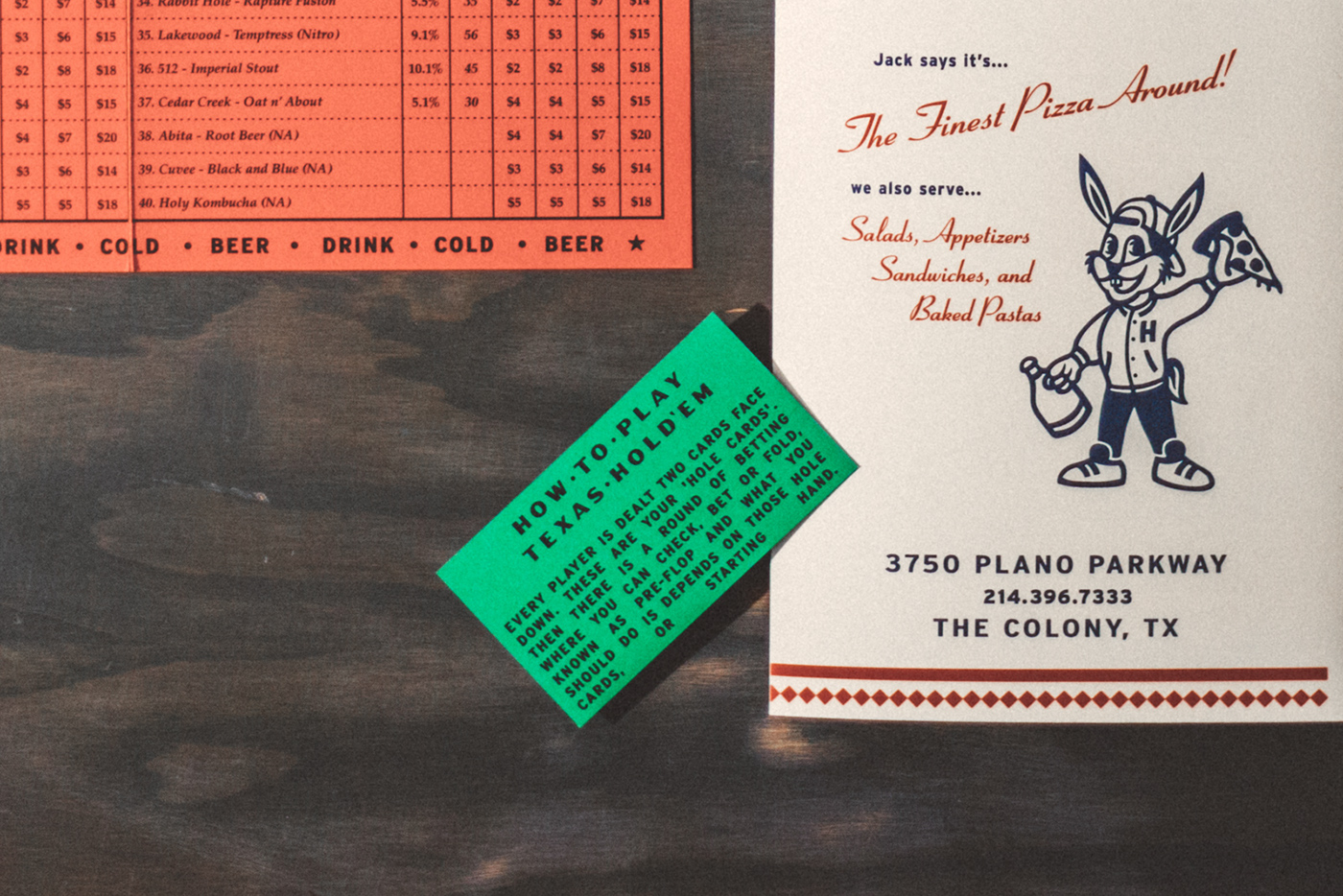
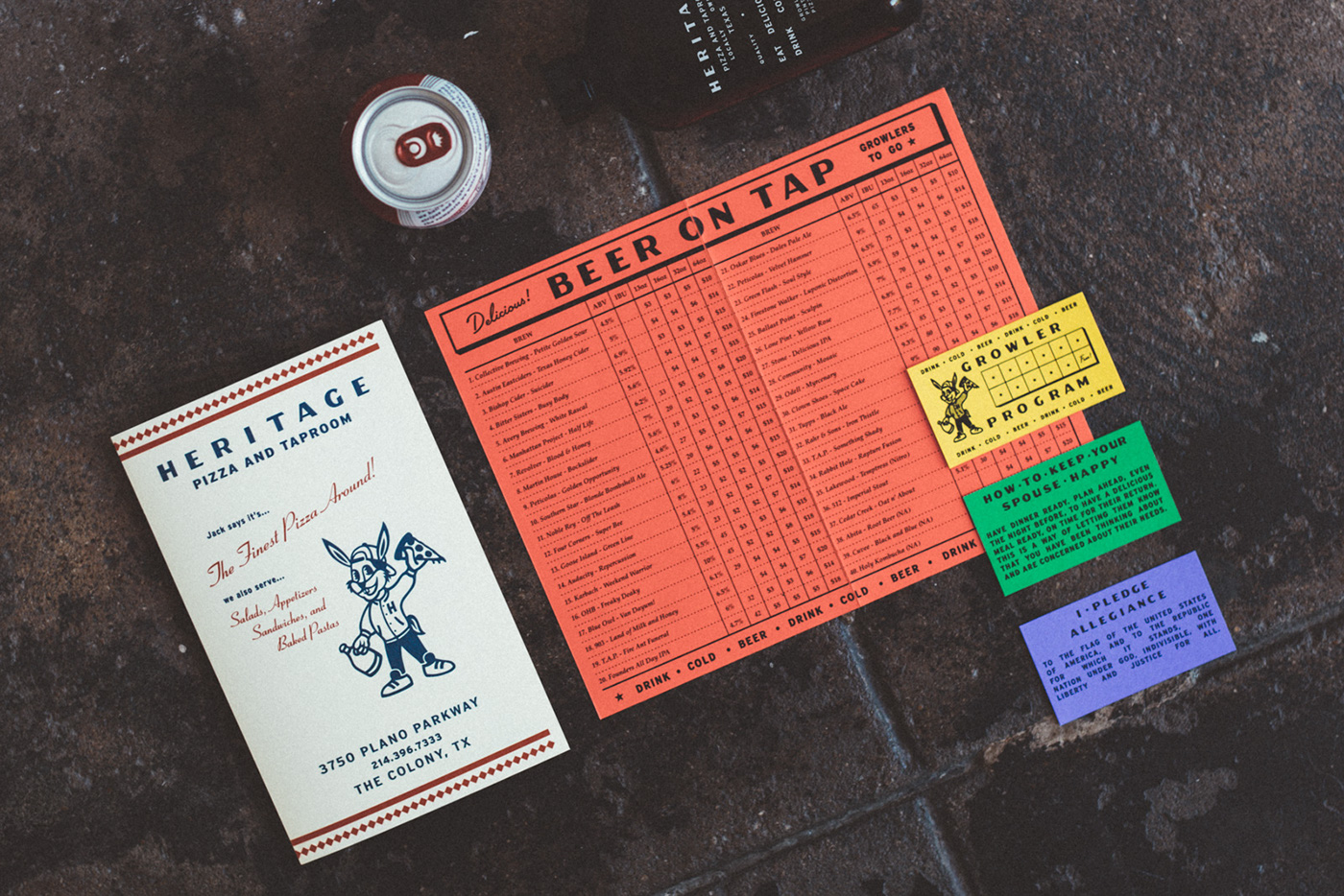
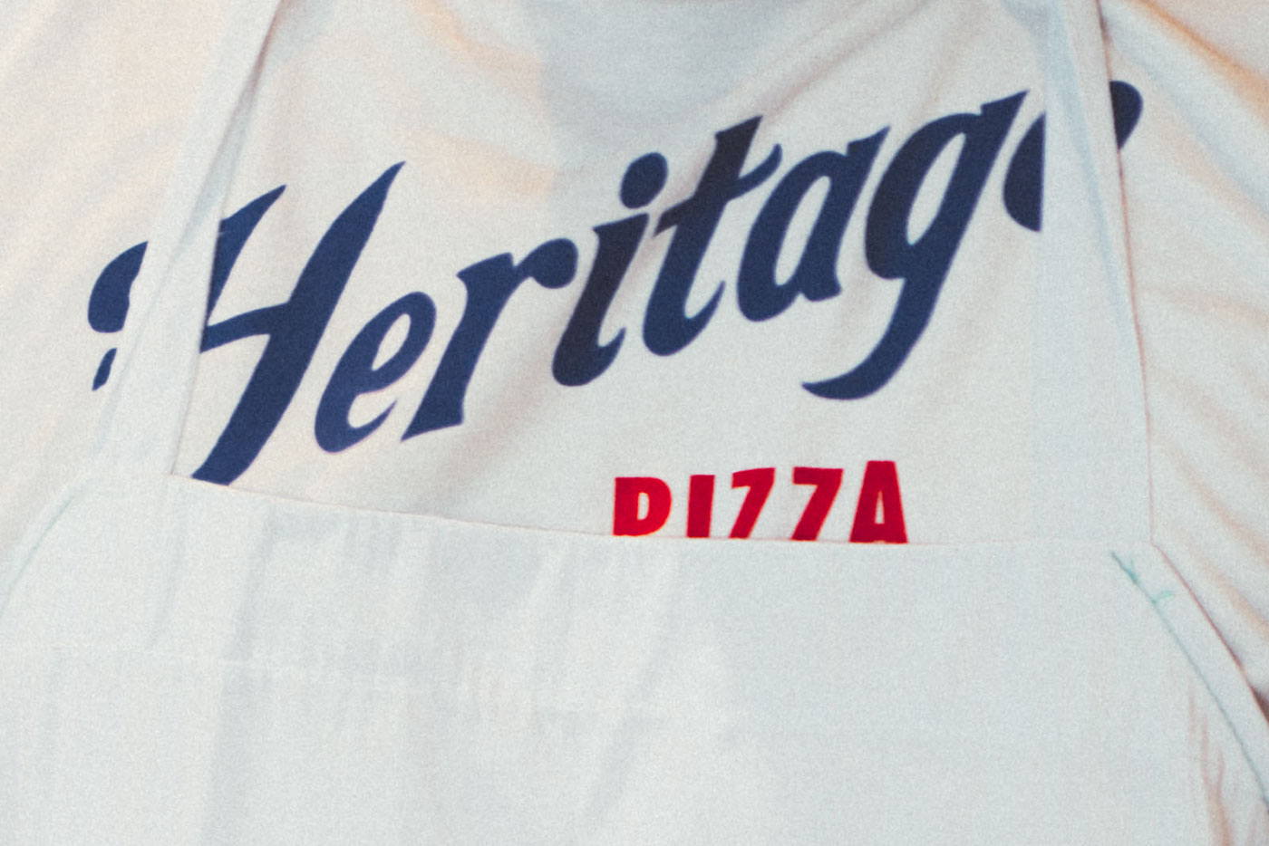
With Heritage Pizza’s branding, Tractorbeam was presented with the challenge of creating a brand that felt like a 1950s pizzeria, without resorting to retro, kitsch, or vintage tropes. They decided the way to do that was to draw inspiration from mid-century marquee signage, pizza boxes, and slogans to create the branding system (and boy is it a large and thorough system at that) you’ll see below.
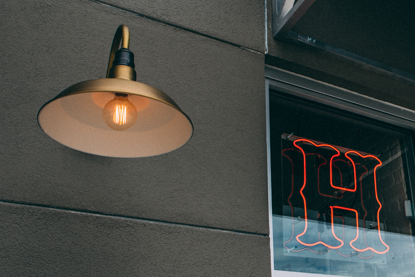
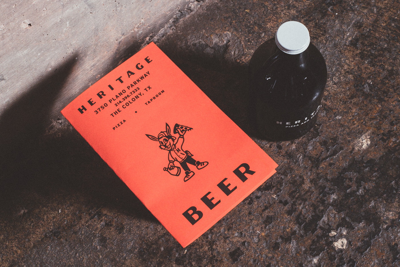
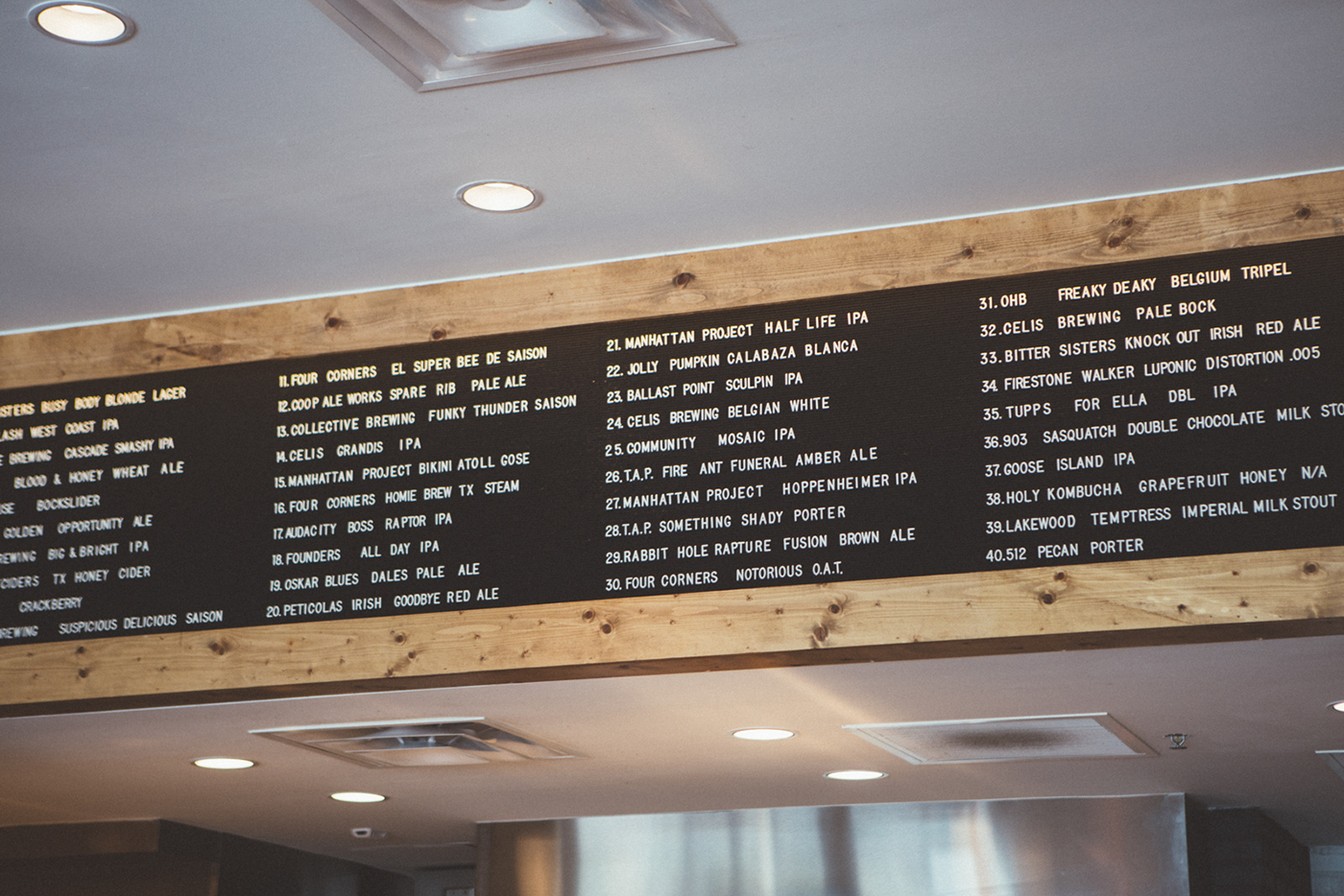
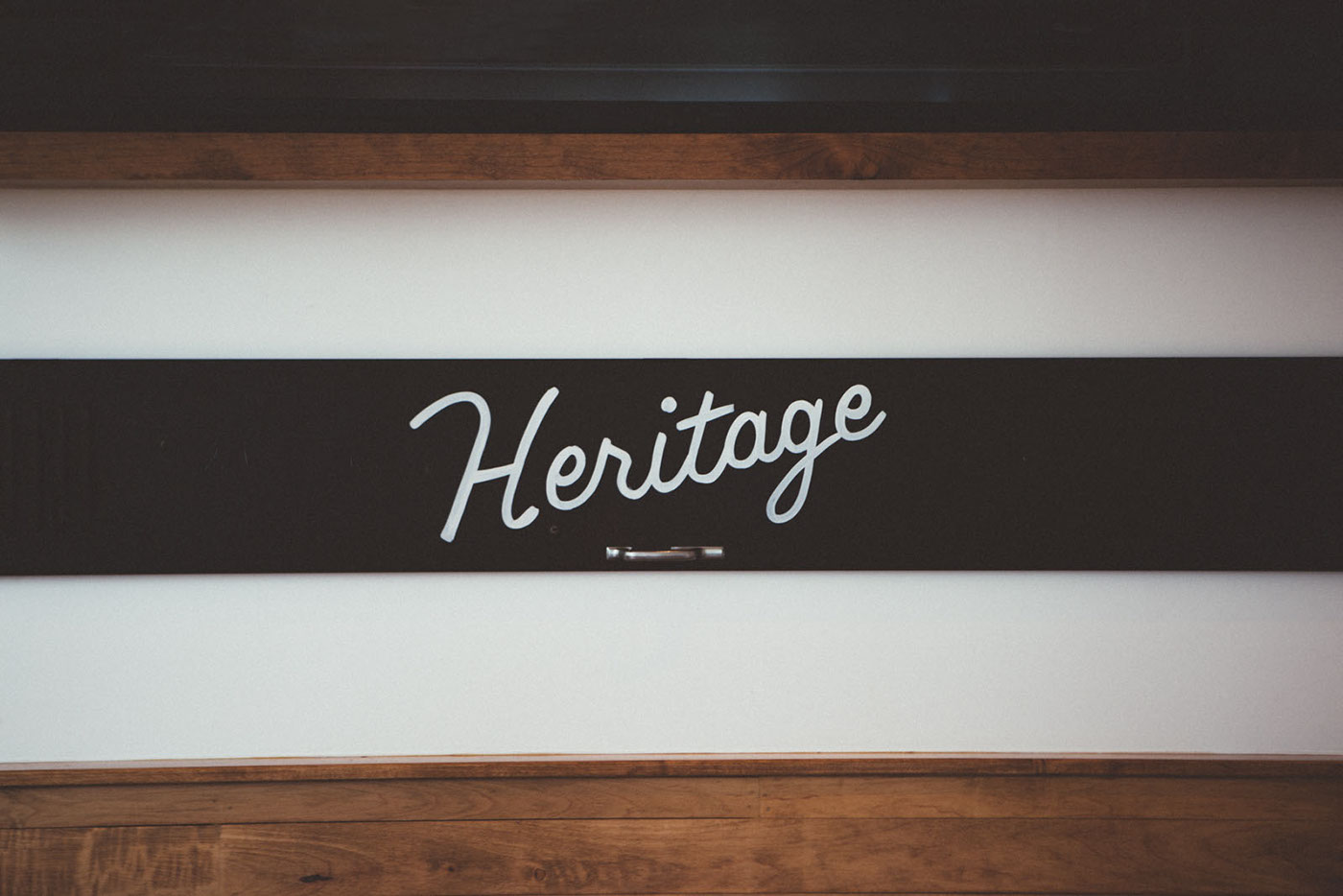
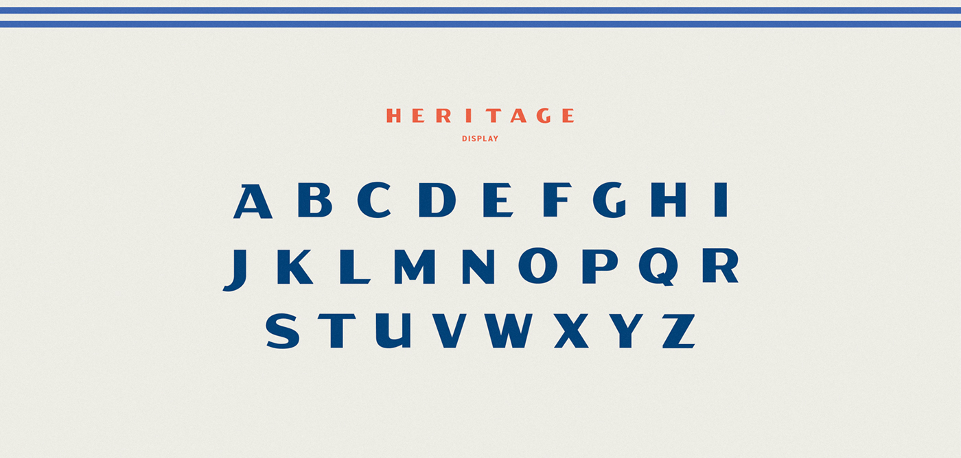
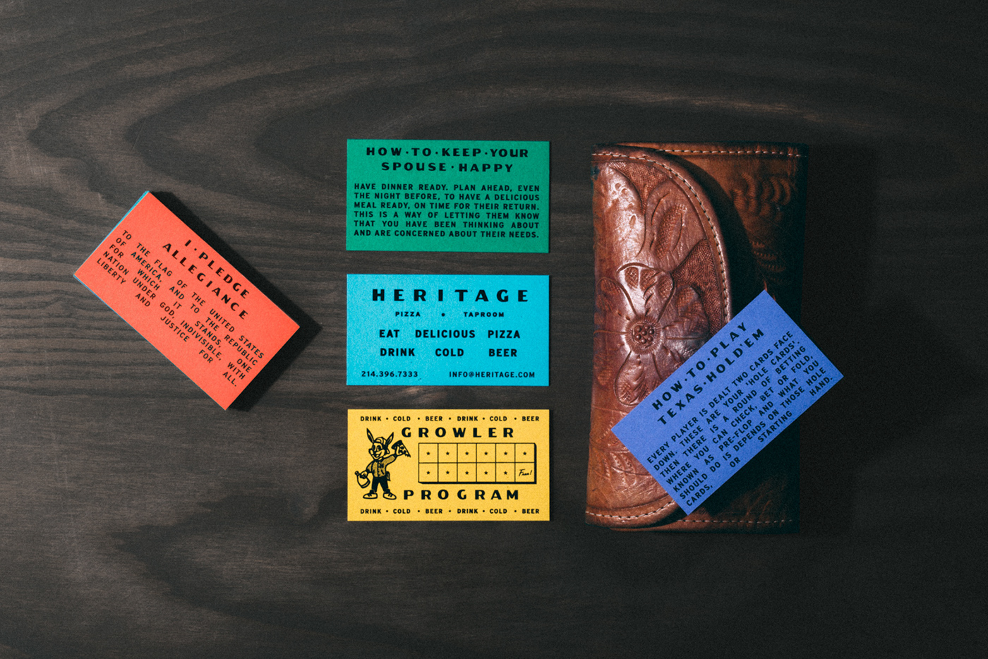
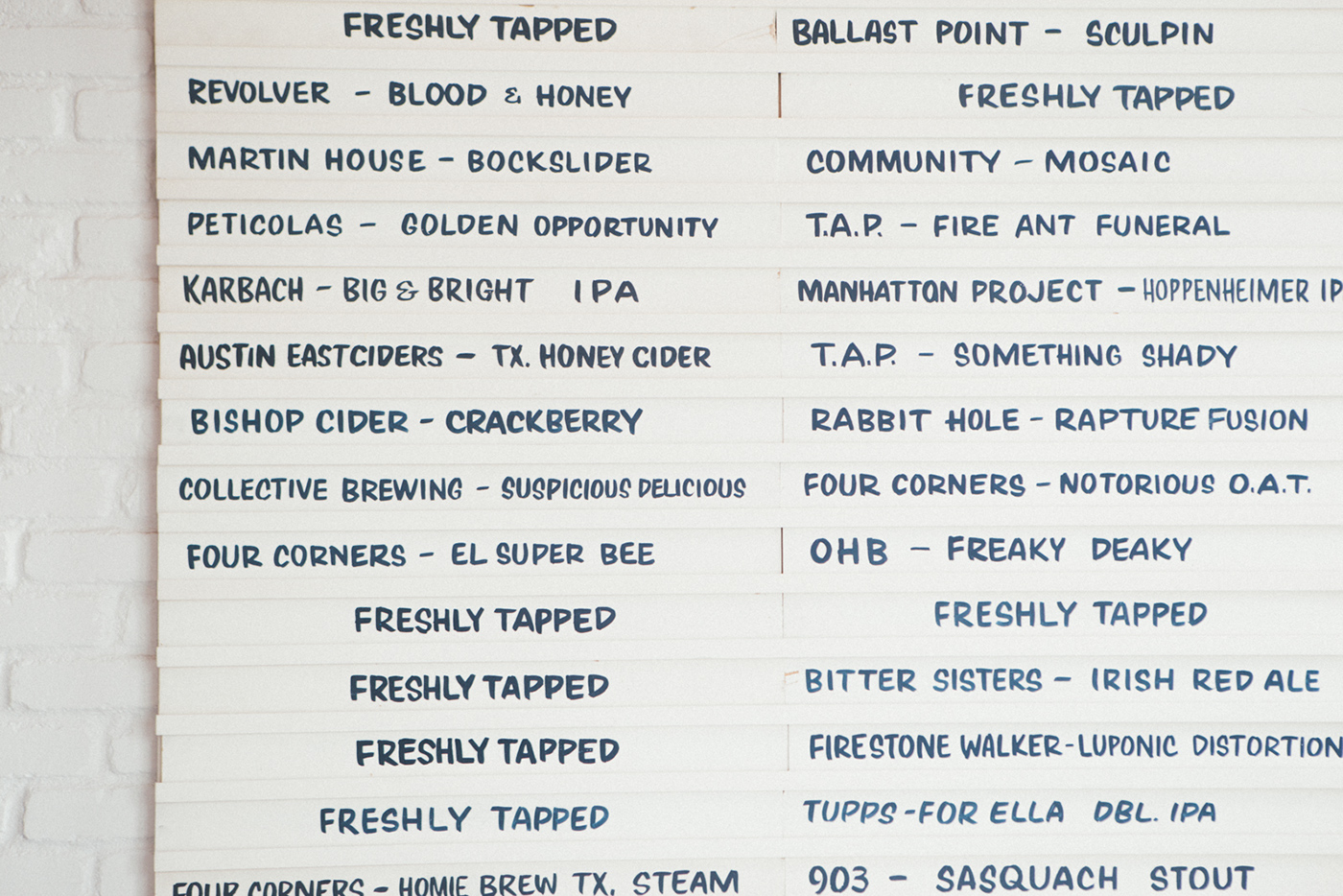
The first thing I have to address here is the type. Tractorbeam did a phenomenal job making Heritage Pizza feel textured and rich with using mostly type alone. The different lockups and custom typeface created for the brand are delightfully throwback, but the colors and materials of the interior bring it into the modern day. The copywriting on some of the collateral pieces is a nice touch to bring home the themes of unadulterated honesty and optimism that they wanted the brand to convey. I also appreciate the simplicity of a lot of the brand touchpoints; only using black ink on the printed materials, for example, and letting the bright colored paper act as the differentiator, the simple neon sign, the single slightly-ornate H monogram, it all just works really well together. Way to inject a sense of, well, heritage, into a business that has only existed for less than a year.
Branding Identity System and Interiors by Tractorbeam.
