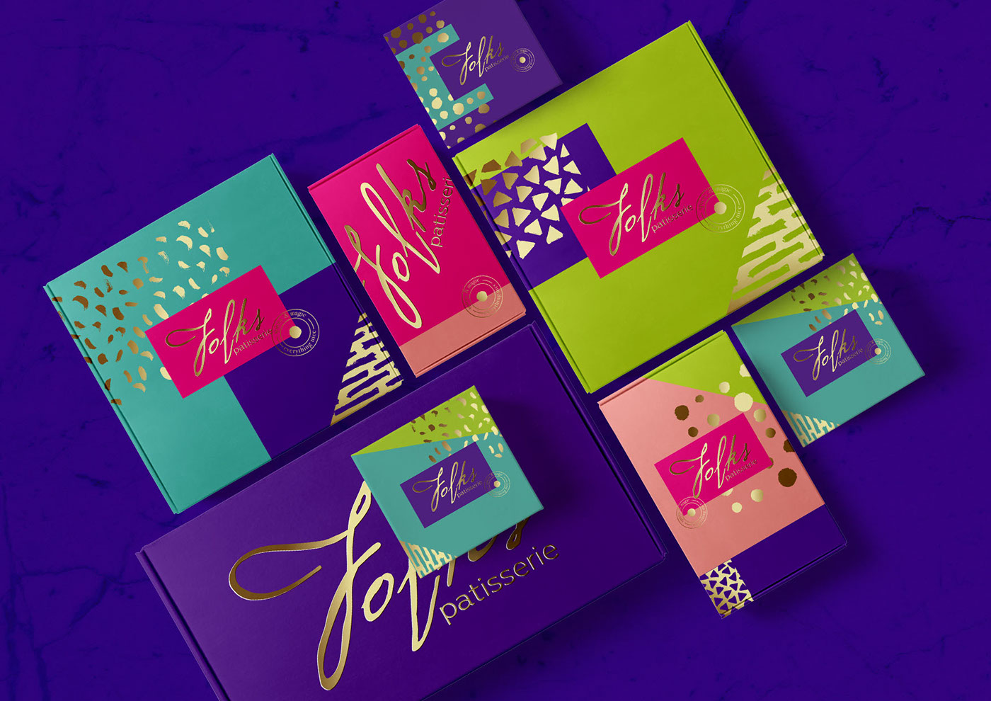
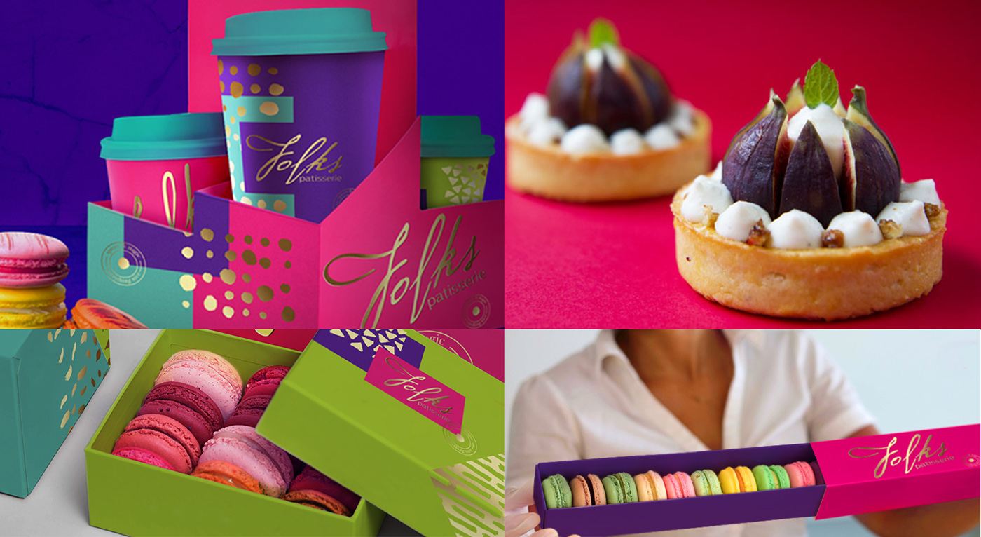
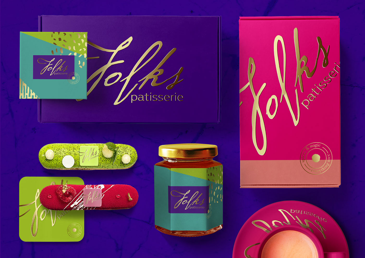
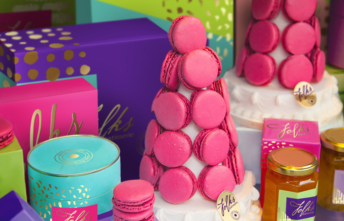
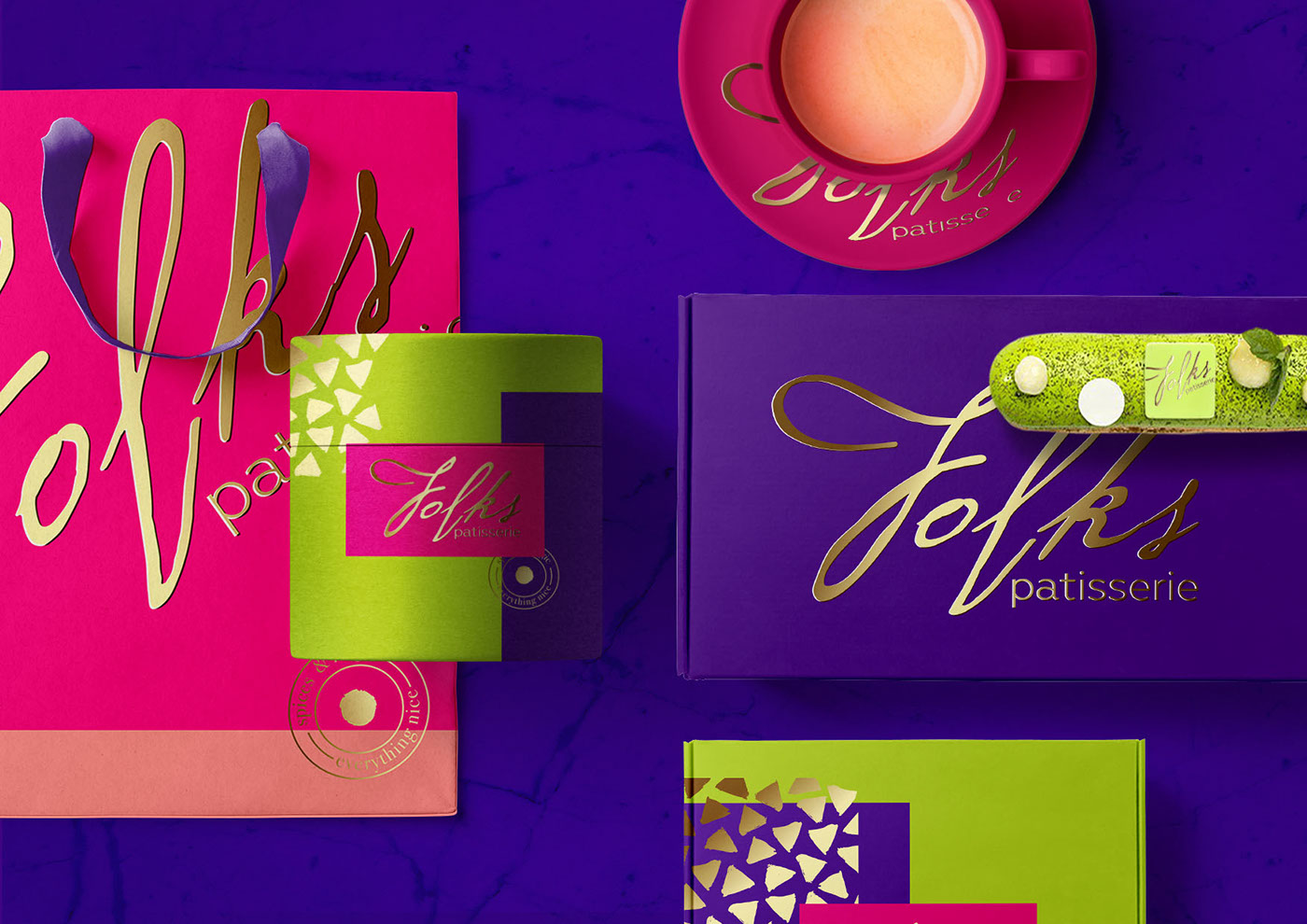
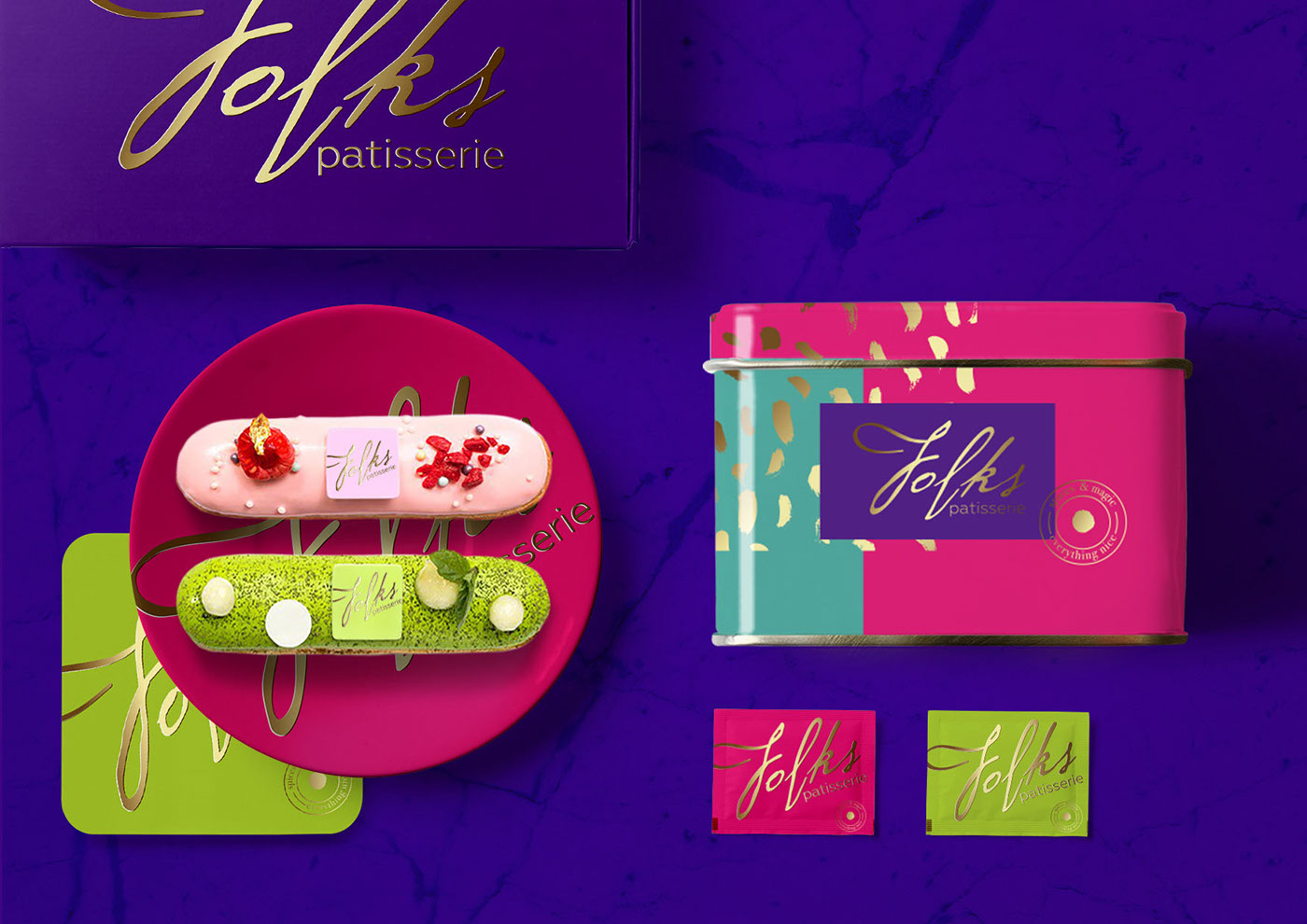
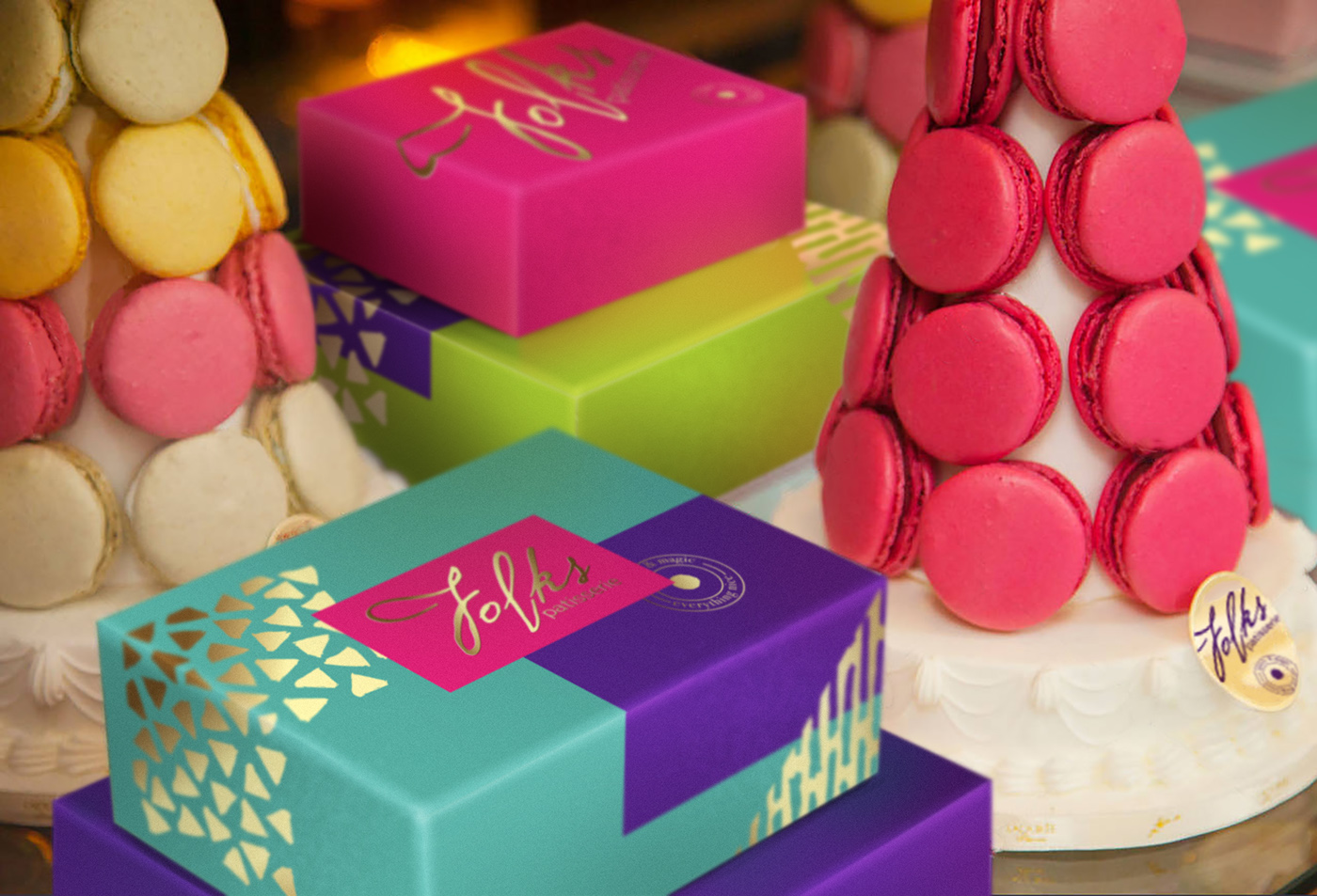
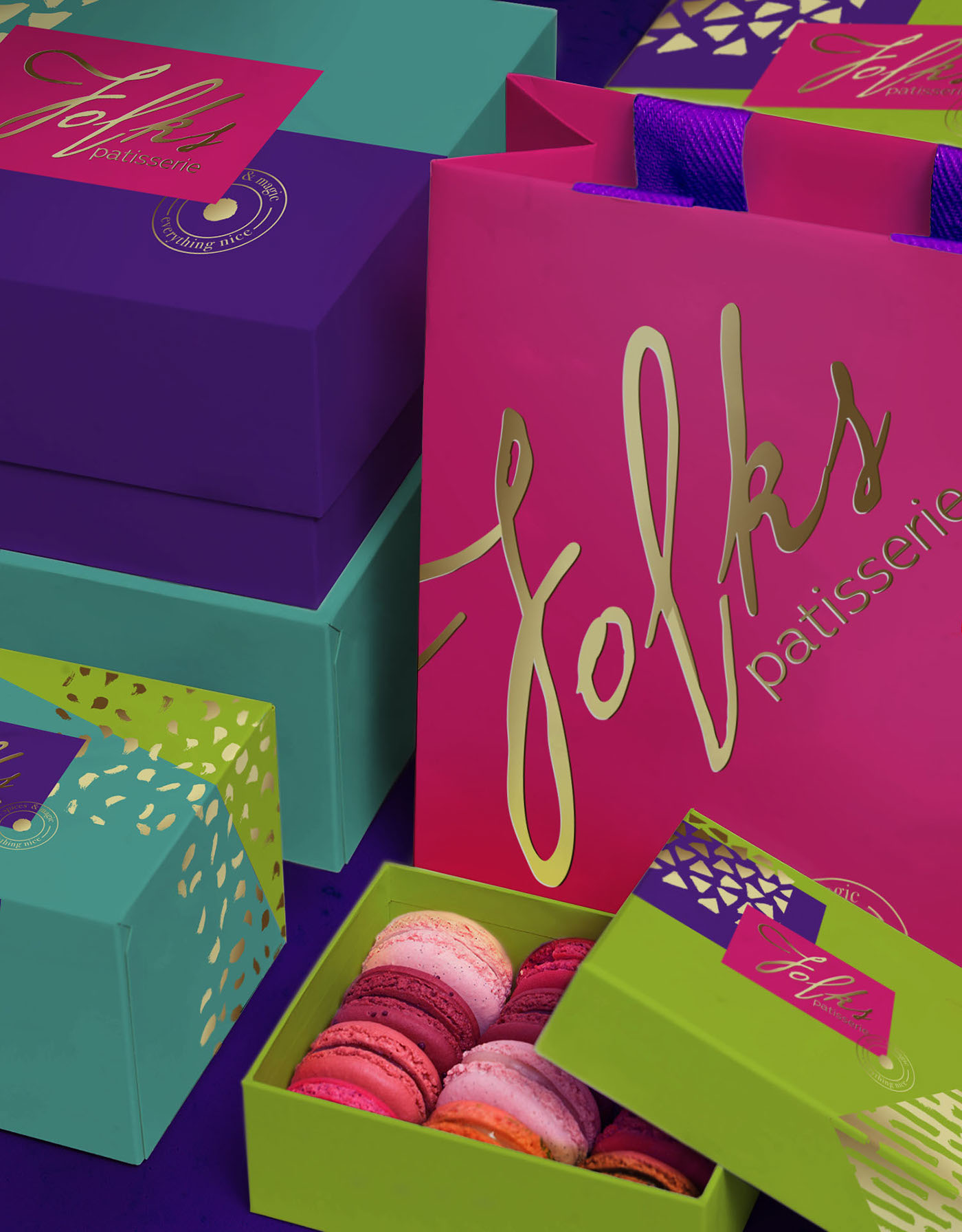
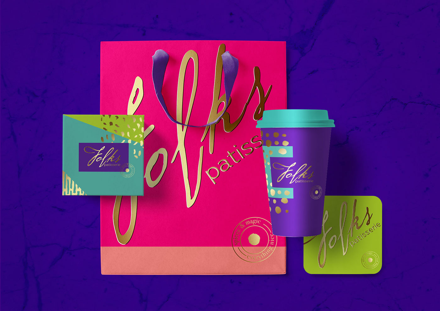
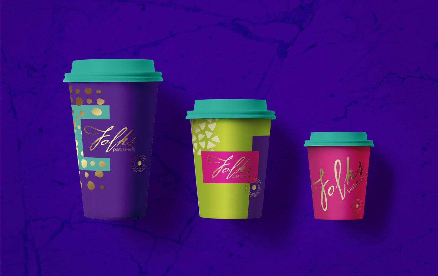
The word ‘patisserie’ brings up images of ornate and delicate pastries, settled in white tissue paper in a very cleanly designed package. Folks Patisserie, based in Russia, shuns that notion and is vibrant, whimsical and just as ornate as the pastries they serve.
I particularly enjoy the interaction between the bright geometric shapes that make up the backgrounds of the packages and the hand-drawn gold patterns. The wordmark for the patisserie is also hand-drawn, tying those elements together nicely. The wordmark also has tons of personality, working well as a large element on packaging and even on a very small scale, as an element on the pastries themselves. Overall, I love the Mad Hatter tea-party quality to this packaging set.
Identity and Packaging Design by Olena Fedorova.