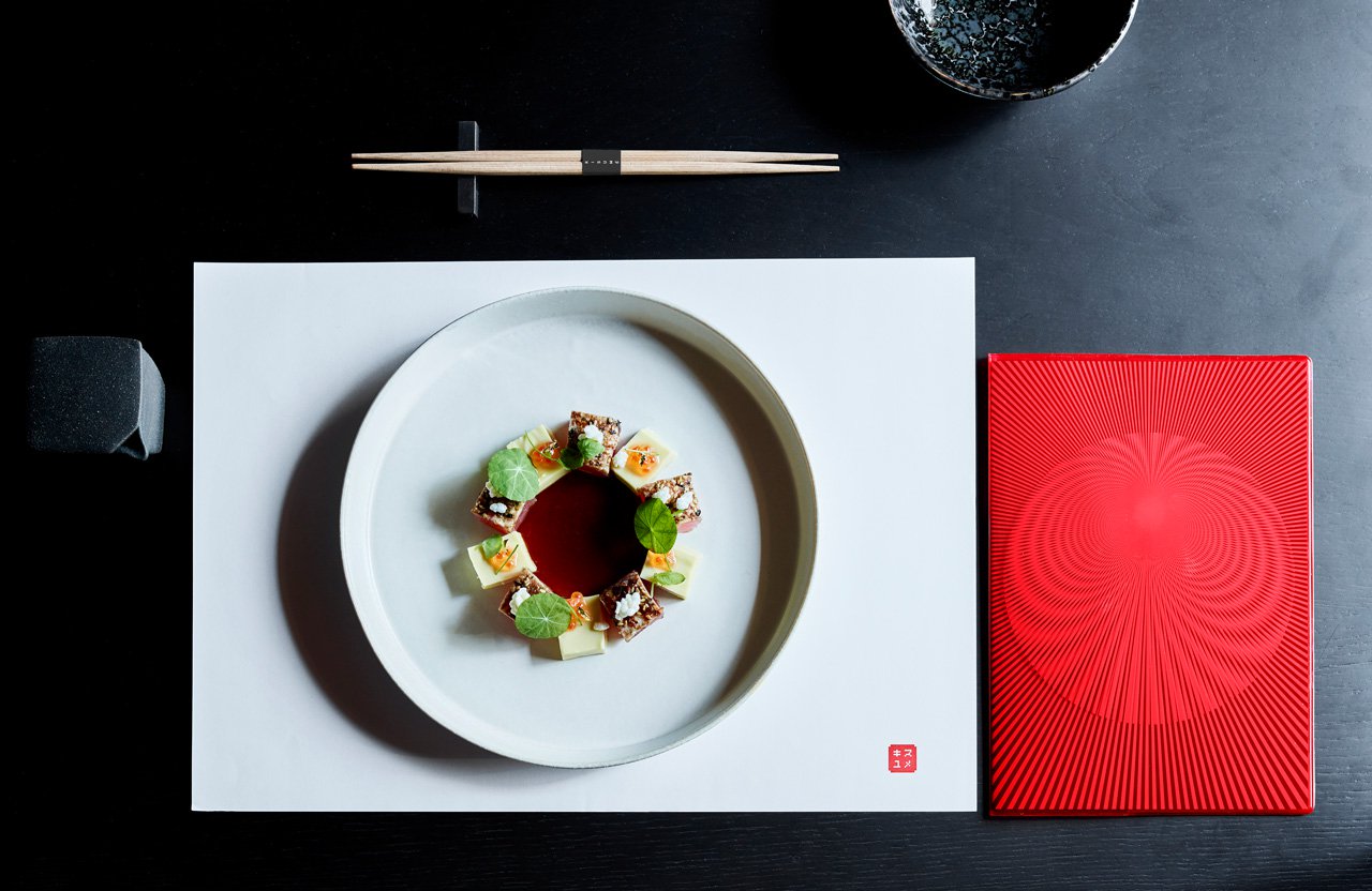
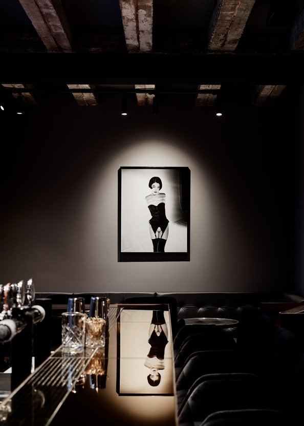
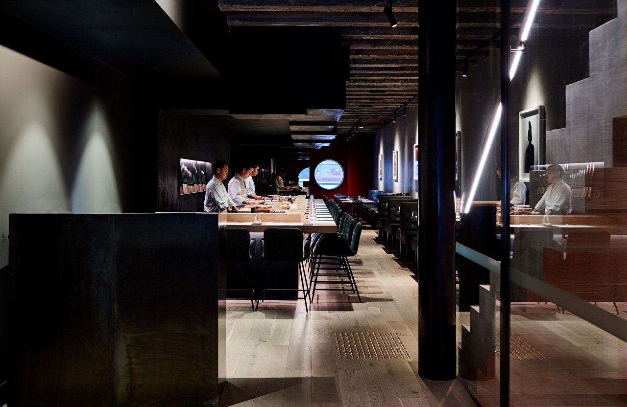
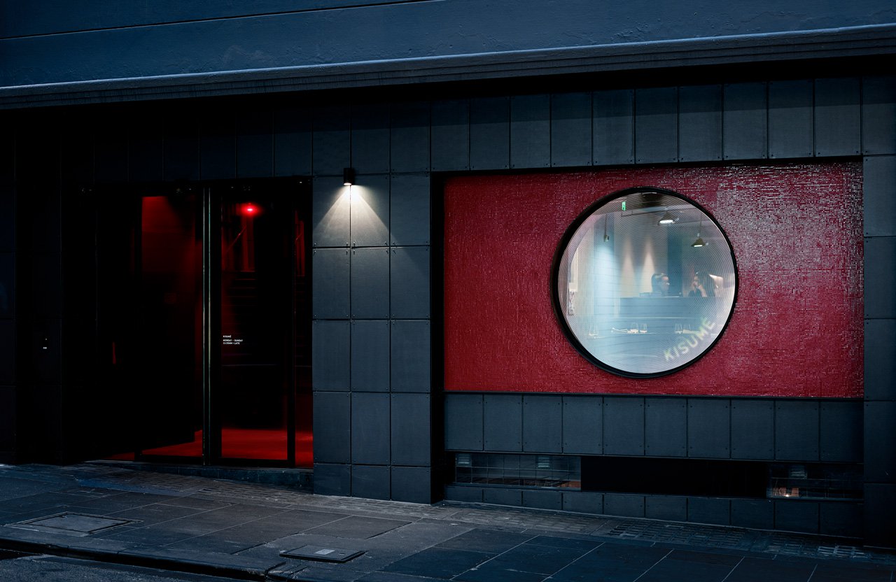
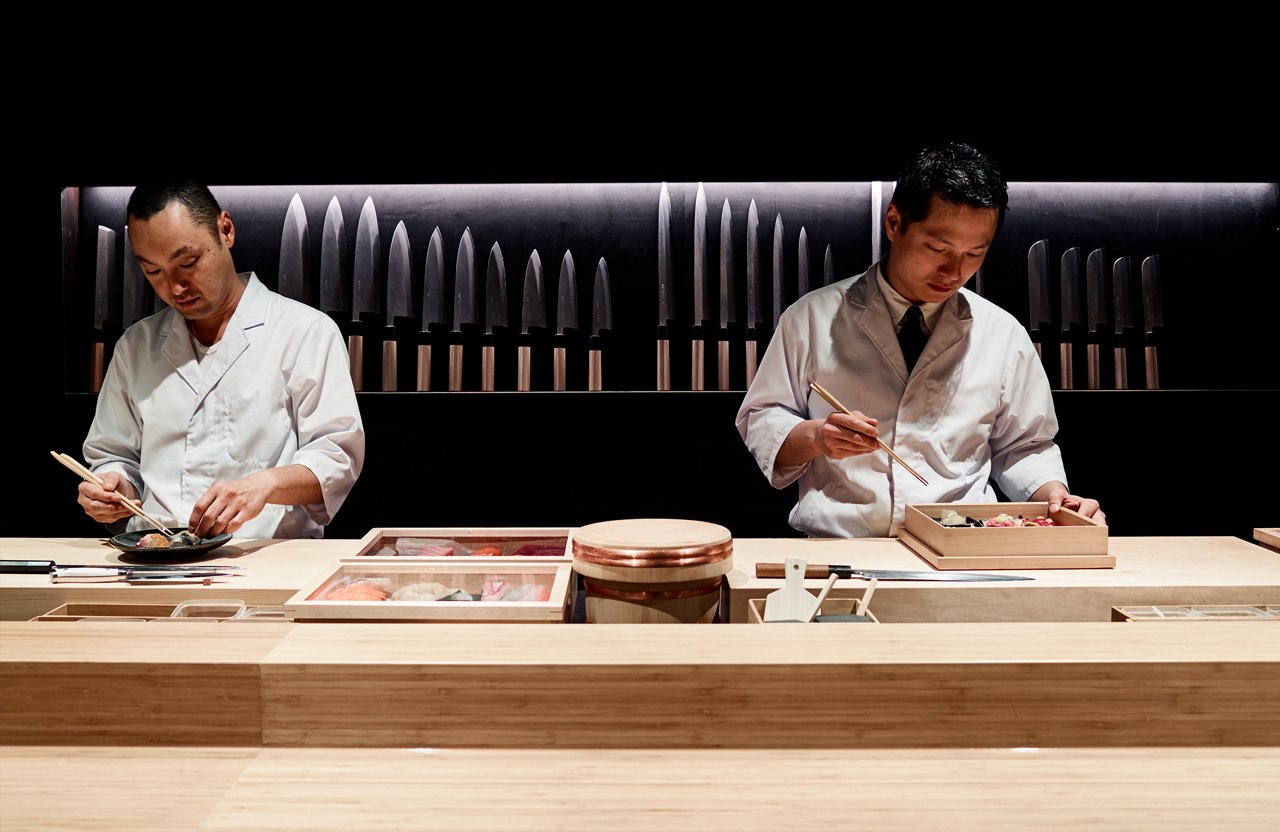
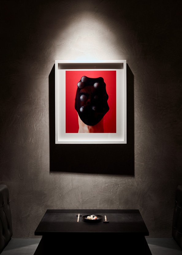
Kisumé is unconventional, slightly twisted and artfully executed. It immerses guests in an unconventional view of Japanese traditions, and mixed with a beautiful and sophisticated interior (by Wood March Architecture), the end result literally and figuratively warps that view.
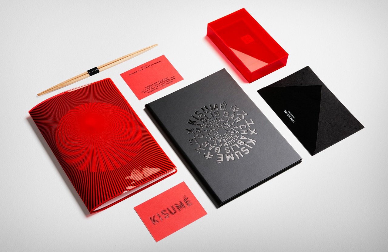
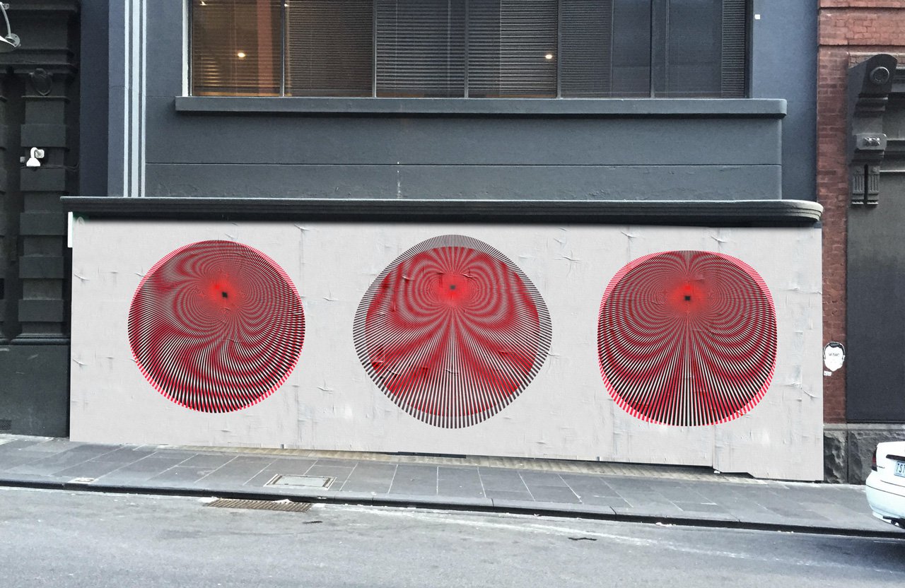
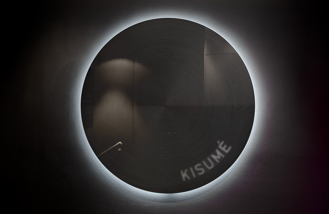
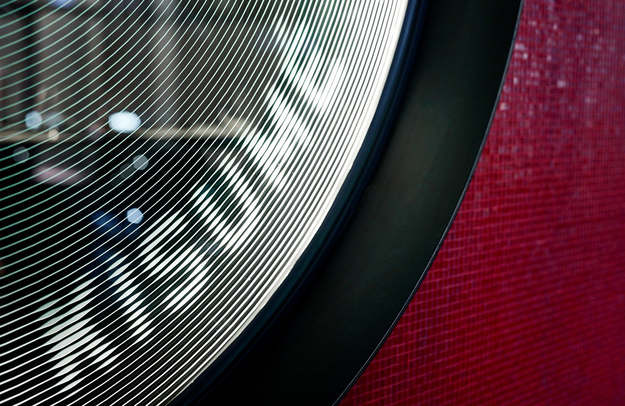
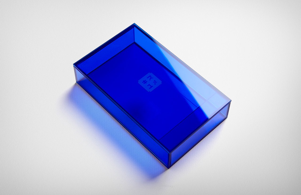
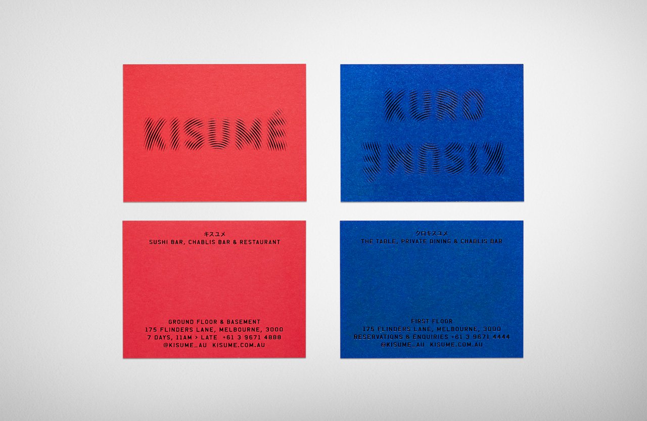
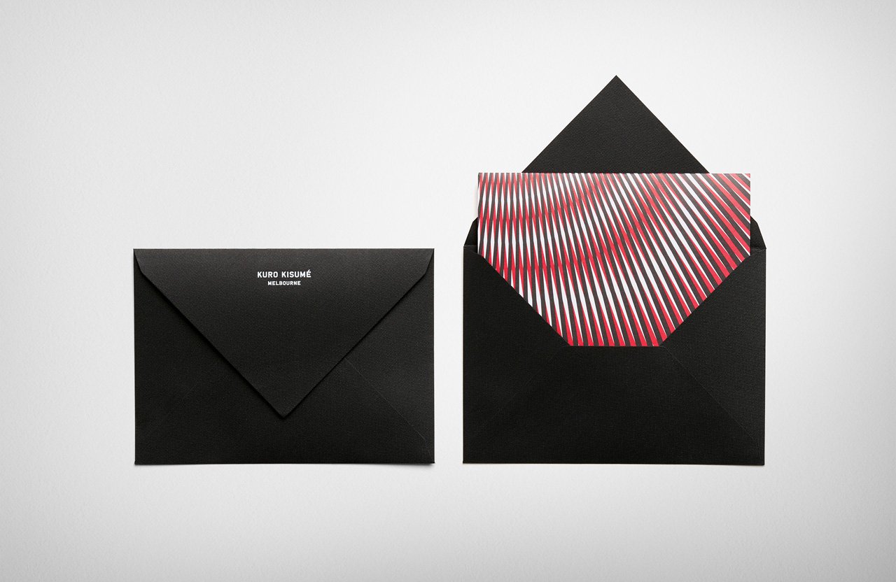
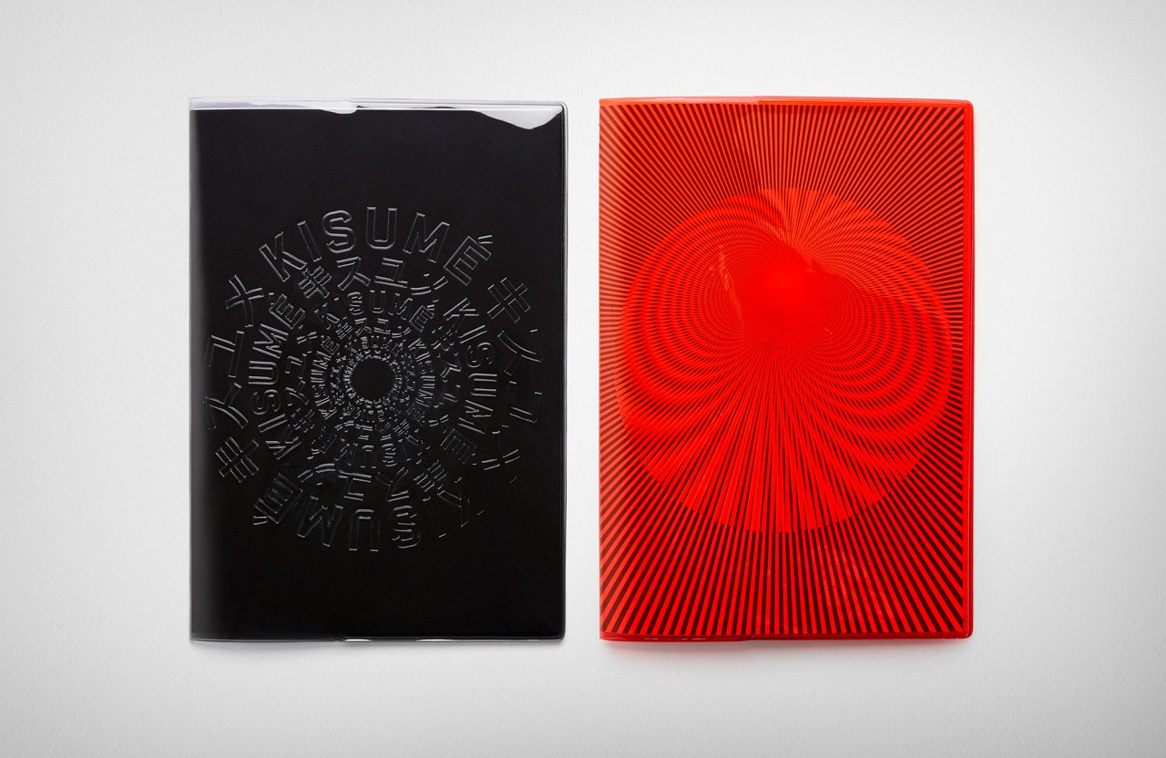
The overall design is stark, relying heavily on materials; bright acetate boxes and menu covers, spot glosses, and textured prints give everything a subtle Blade Runner or Ghost in the Shell vibe. While the color red and circles are played out cliches in Japanese restaurants, these typical tropes are used in interesting new ways; the red sun of the Japanese flag is literally warped by this undulating pattern that vibrates if you look at it for too long. This pattern is also applied to the logo and other pieces of print collateral, tying everything together and suggesting movement and energy in sharp contrast to the starkness of the space and other pieces.
Kisume Identity, Collateral and Website Design by Fabio Ongarato Design.