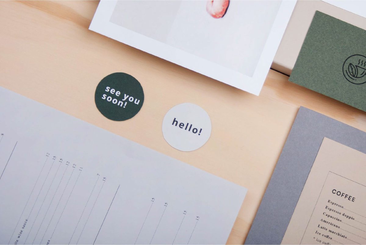
Nothing is better on a Monday than a heaping cup of joe. This Monday morning we’re focusing on an elegant Swedish coffee and bistro called Paprotka. Paprotka gives a little pep through their strong typographic elements and their delicate color palette. Their menu is direct and simple, it’s admirable when a coffee shop can get rid of the fluffy stuff and minimize their menu content. Paprotka is approachable and does a great job at paying close attention to detail.
This lovely brand identity was created by Agata Jeziuska


