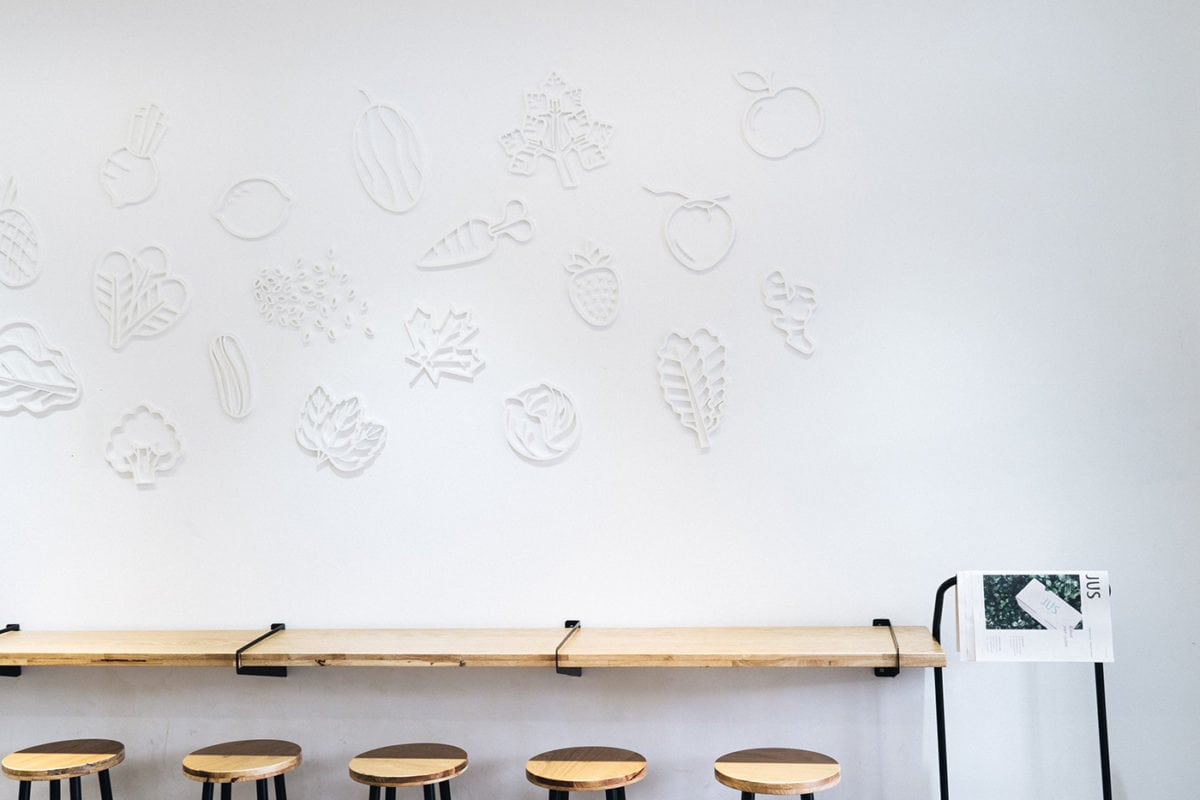
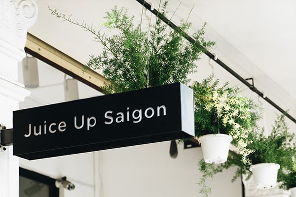
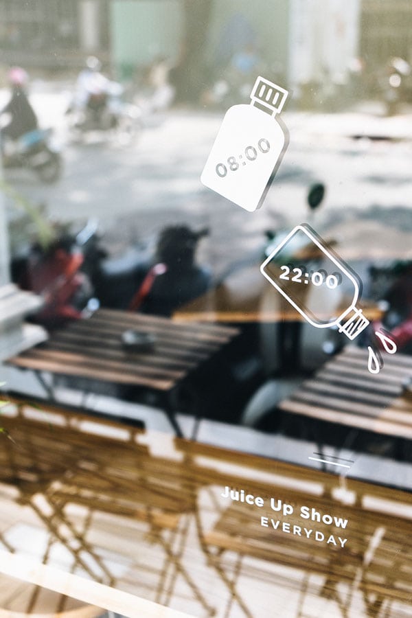
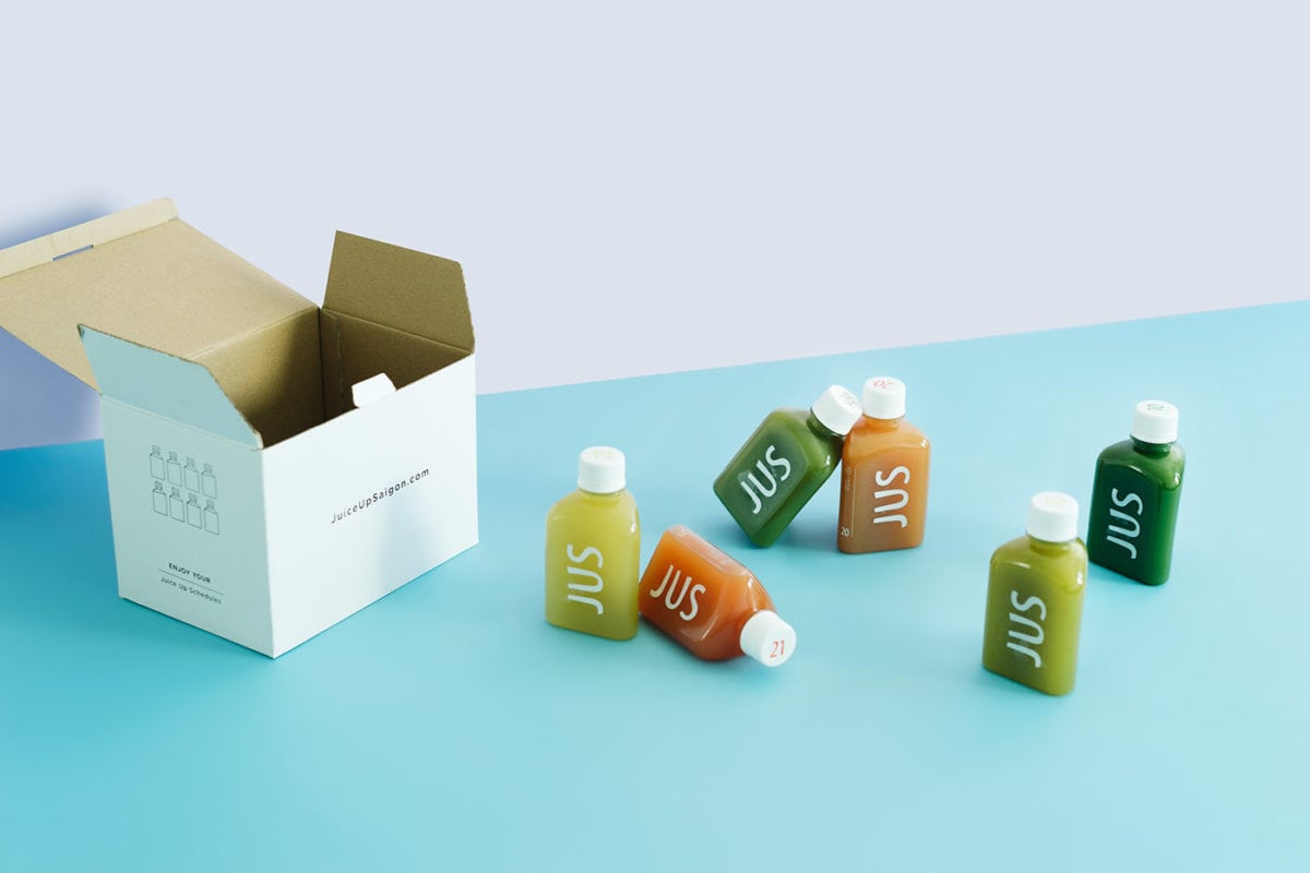
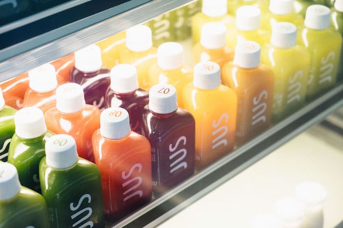
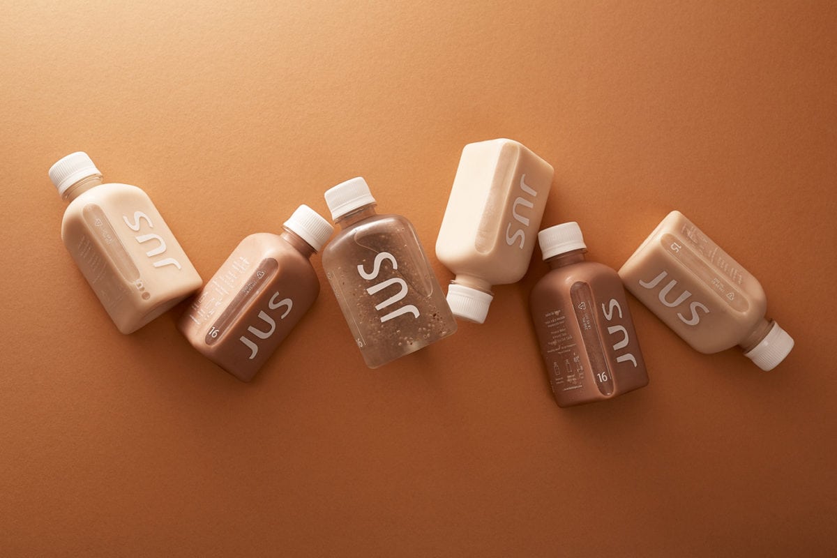
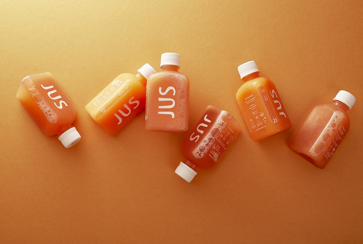
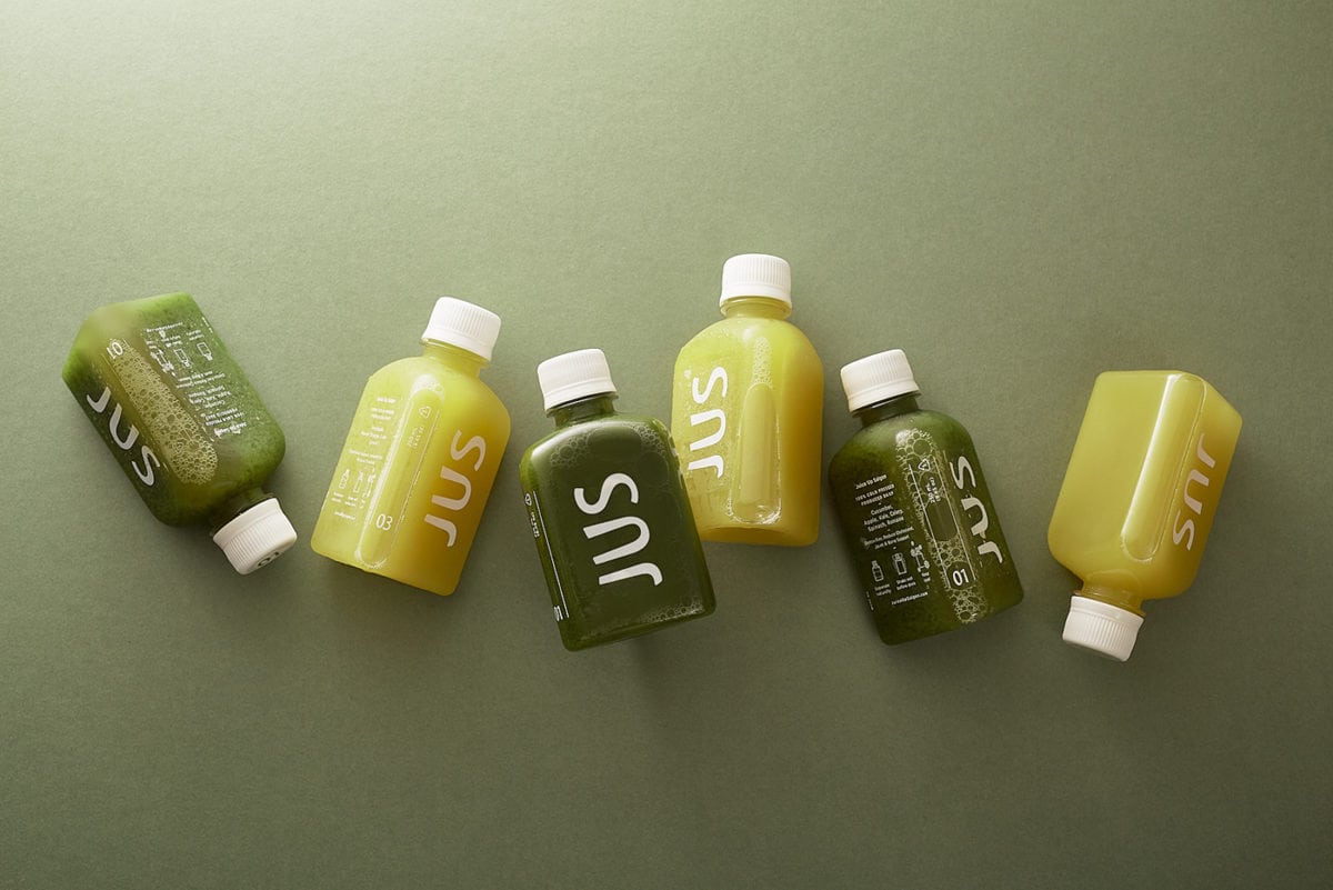
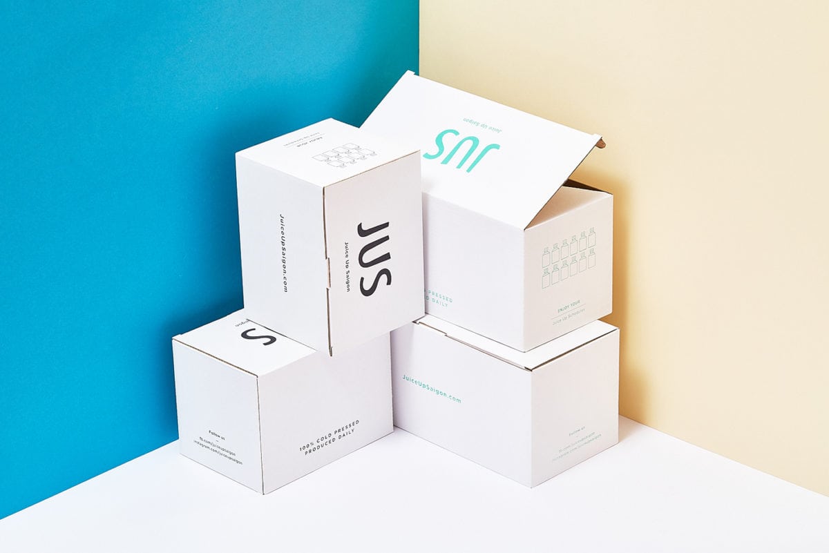
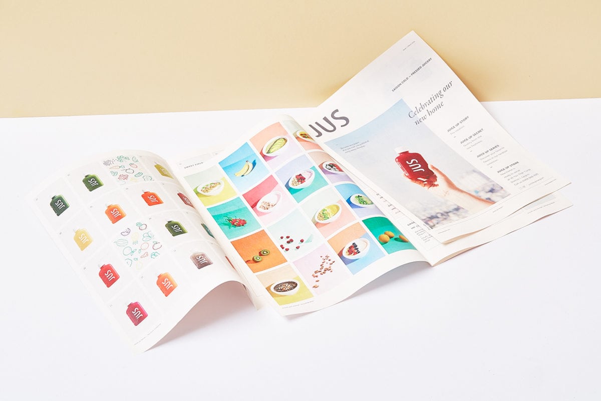
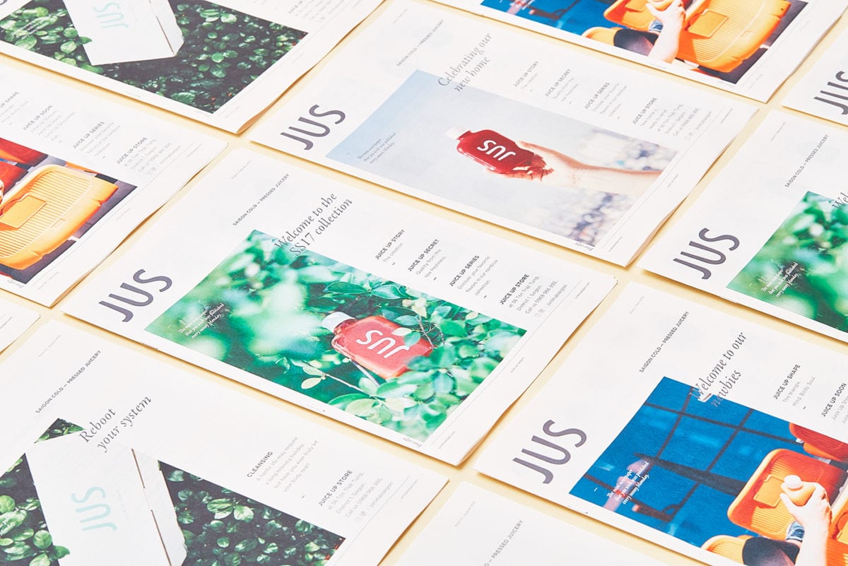
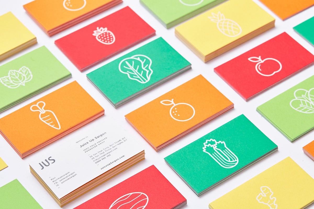
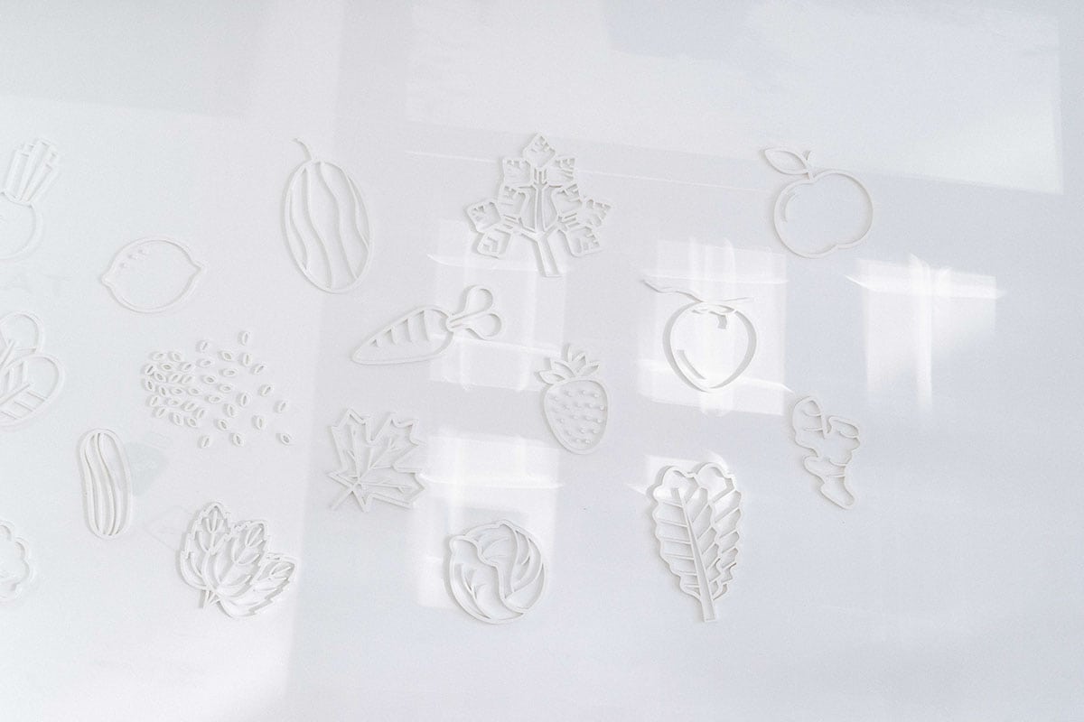
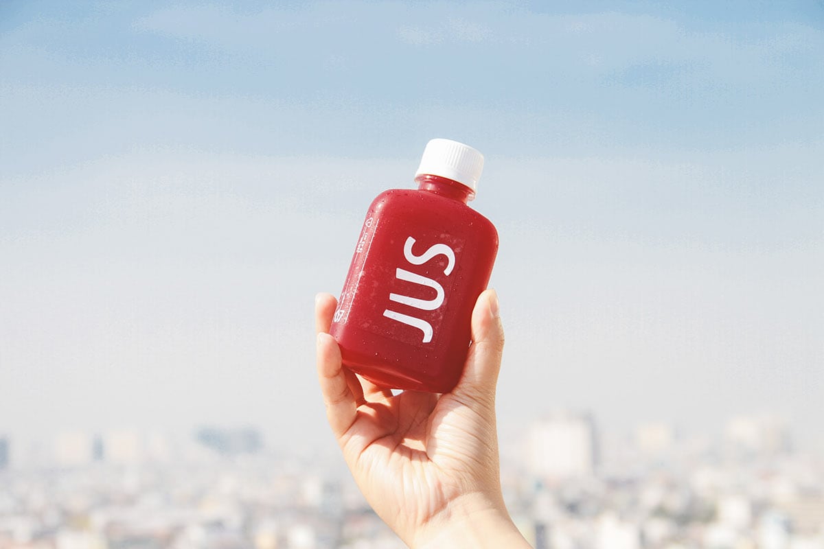
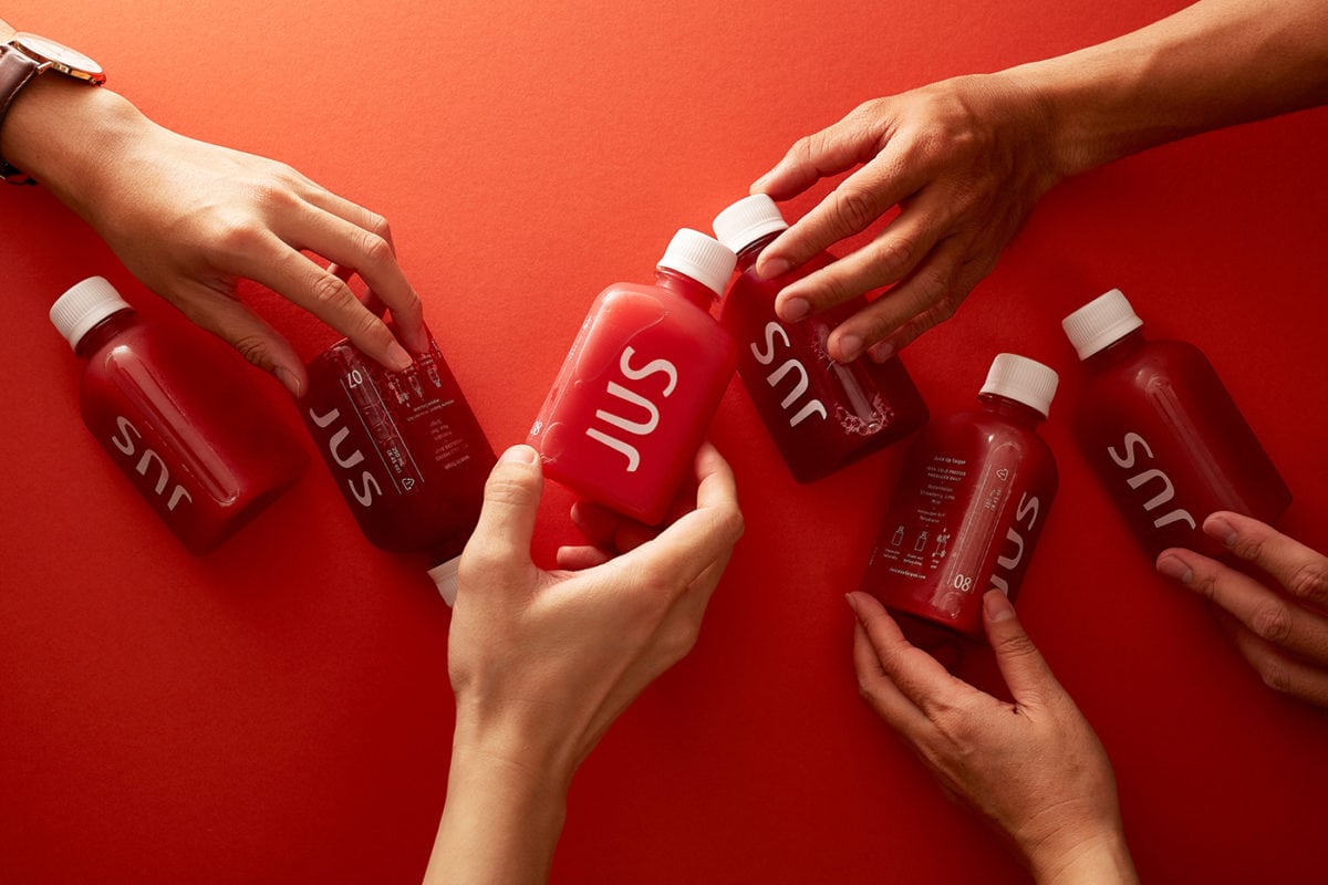
JUS (Juice Up Saigon) is a raw cold-pressed juice company based in Vietnam. They feel their juice is a simple and practical way to care for the health of one’s mind, body, and spirit, and this trinity of heath is represented in their three-sided bottle. The logo is drawn organically, referencing the natural and imperfect ingredients that make up their juices. Their packaging is clean and simple; nothing more than a clear wrap with white text, really showcasing the vibrant colors of the cold pressed juice. The rest of the visual identity combines the bright colors of the products with an illustrative set of icons that shares the name illustrative quality of the logo. Bright, colorful, clean and modern; these four words can summarize the rest of the look. From product photography to packaging to editorial styling, JUS is a lighthearted and fun brand that really lets the juice do the talking.
Juice Up Saigon Branding, Packaging & Art Direction by M – N Associates.
