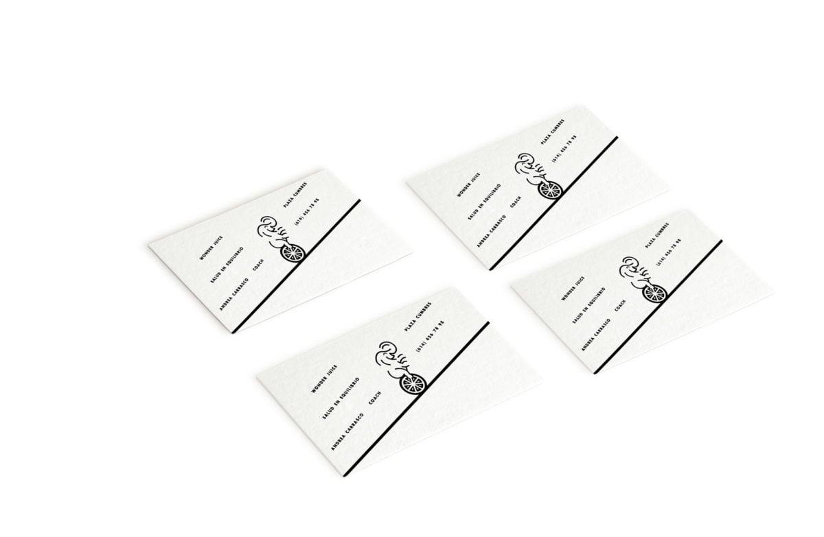
So you’ve heard of needing to eat fruits for a balanced diet, right? Well what if those fruits were balanced…on circus animals. Wonderjuice takes this playful perspective with their brand, featuring simplified illustrations that mirror the simplicity of their product. Their look is simplified in other ways too; a monochromatic palette, simple, geometric san serif typography, plenty of white space, the usual. All these visual cues that usually make a brand cold, however, are instantly made personable by the use of the animal/fruit illustrations.
The Forktales Podcast™: Interviews with restaurant industry leaders and visionaries
Restaurant and advertising industry headlines and thinking
Reviews of restaurant experiences from around the globe
Reviews of our favorite design, business, & restaurant books
Our favorite typography and fonts
Inspiration in your inbox
Get the latest inspiration in your inbox every Monday morning, for FREE!
"*" indicates required fields


