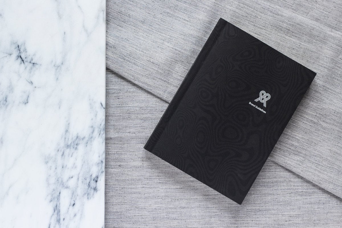
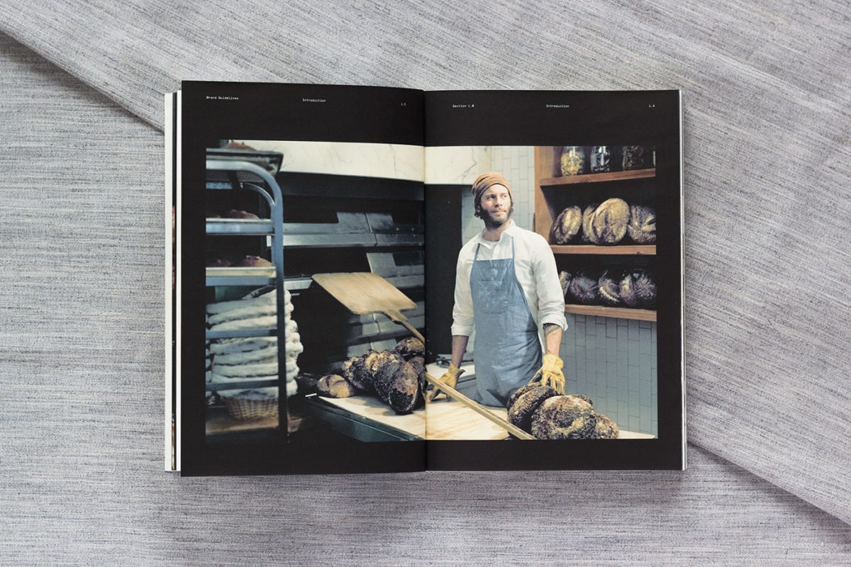
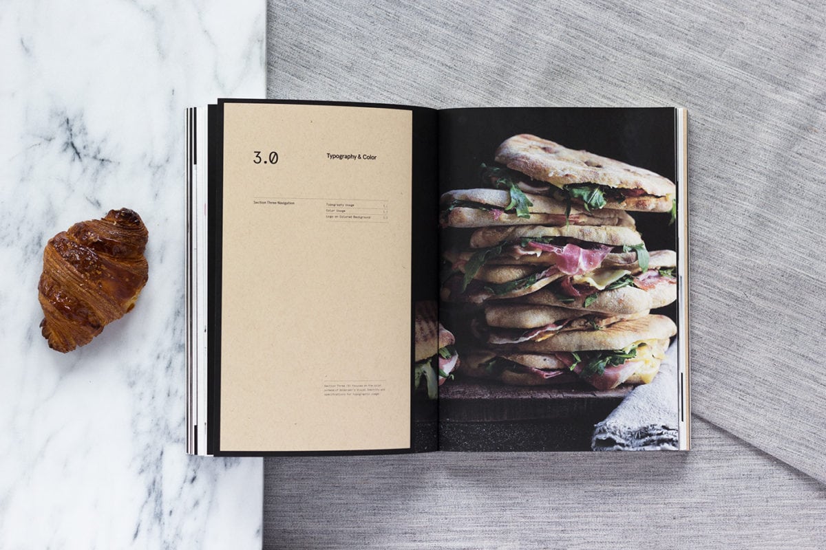
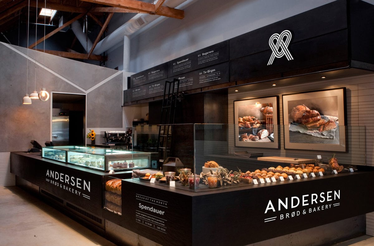
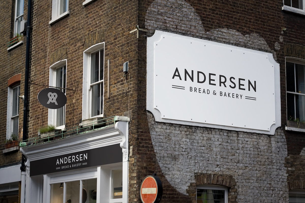
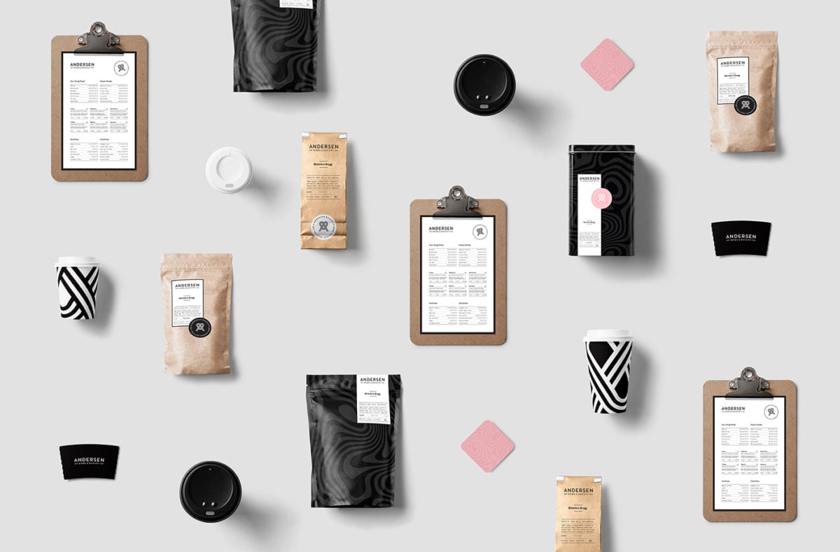
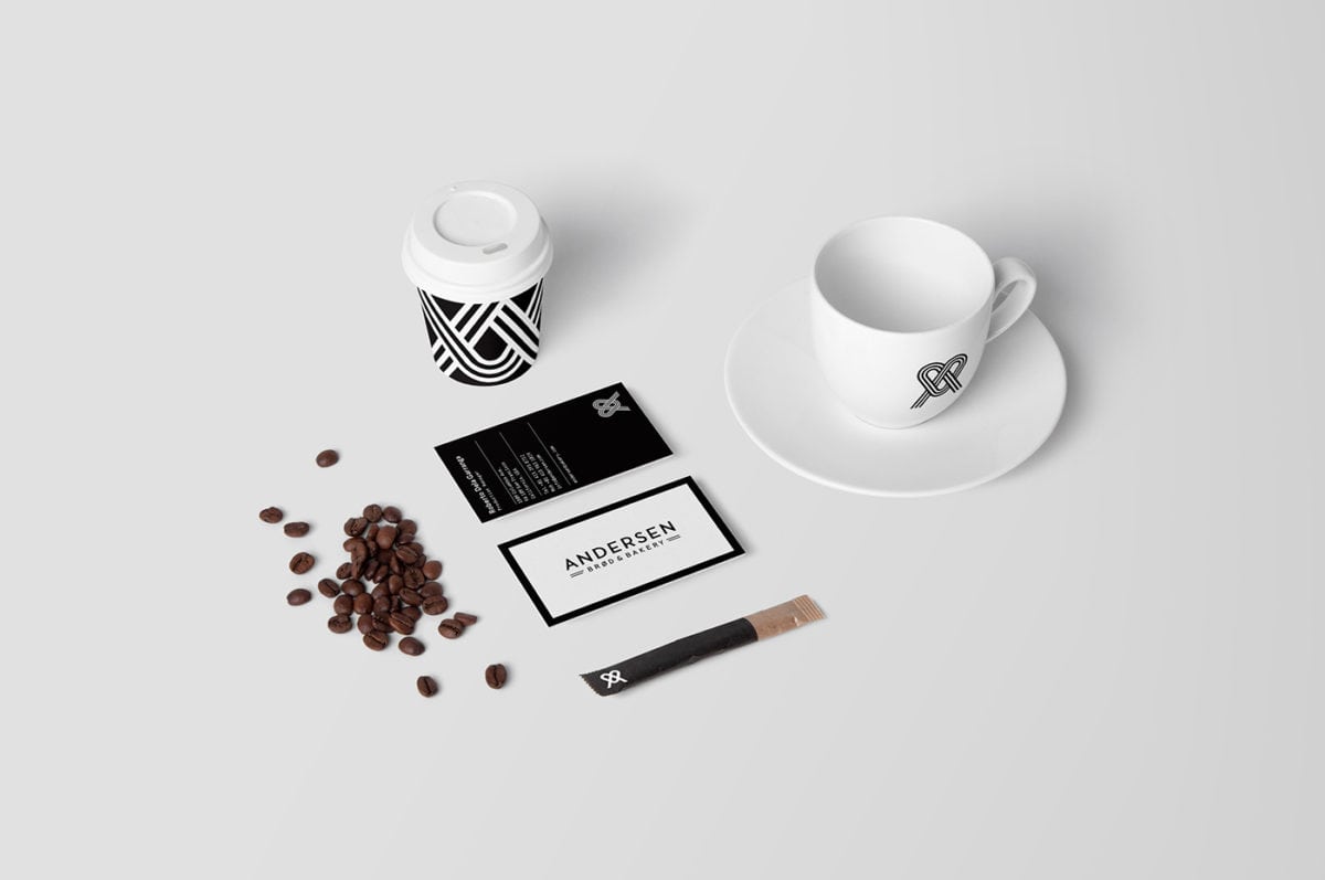
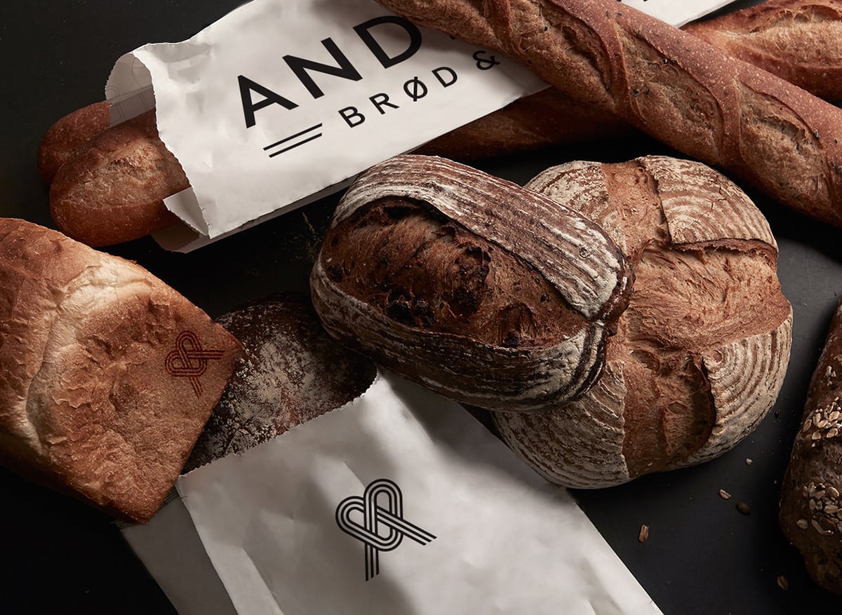
Contrast is the name of the game here. The Anderson Bakery brand utilizes strict grids, clean typography, and a very subdued color palette as a stark contrast to the raw photography of this bakery concept. The brand almost exclusively exists as a framing device to bring the products to the forefront with large, minimalist geometric color blocks as label-like containers for all things not photography.
On top of the excellent dichotomy between minimalist design and product photography, this brand is also more than comfortable living on its own with abstract, bread-inspired textures and smart use of cropping for the symbol lockup. While the assets may be a bit simplistic on their own, this brand concept demonstrates with excellence what could be done with a few cleverly utilized assets, beautiful typography, and color blocking to really elevate a retail experience.
Anderson Bakery Branding & Packaging Design by Jacob Bang.
