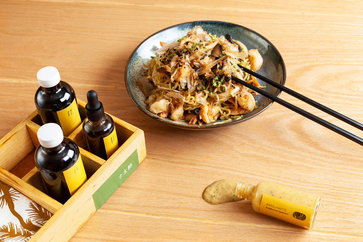
Kotaro is a Japanese restaurant in Cancun, specializing in ramen, baos and gyoza. It perfectly blends traditional Japanese motifs such as delicately illustrated cherry blossoms and an appreciation for well-crafted things, and imbues them with a distinctly tropical flair fitting for the Yucatan peninsula. The warm green used as the brands’ primary color is warm and inviting, like a warm cup of green tea or the shade under a palm frond. Warm wood tones, used throughout the interior and in the kraft paper used throughout packaging, bridges the gap between the associations of bamboo and of sand. Minimal open layouts across the menu and other printed touchpoints feel airy and light, and fun, slightly wonky typography keeps the brand from feeling stiff.
Kotaro Branding & Art Direction by Estudio Wikka.


