Mocktail Club Beverage Branding & Packaging by Design Army

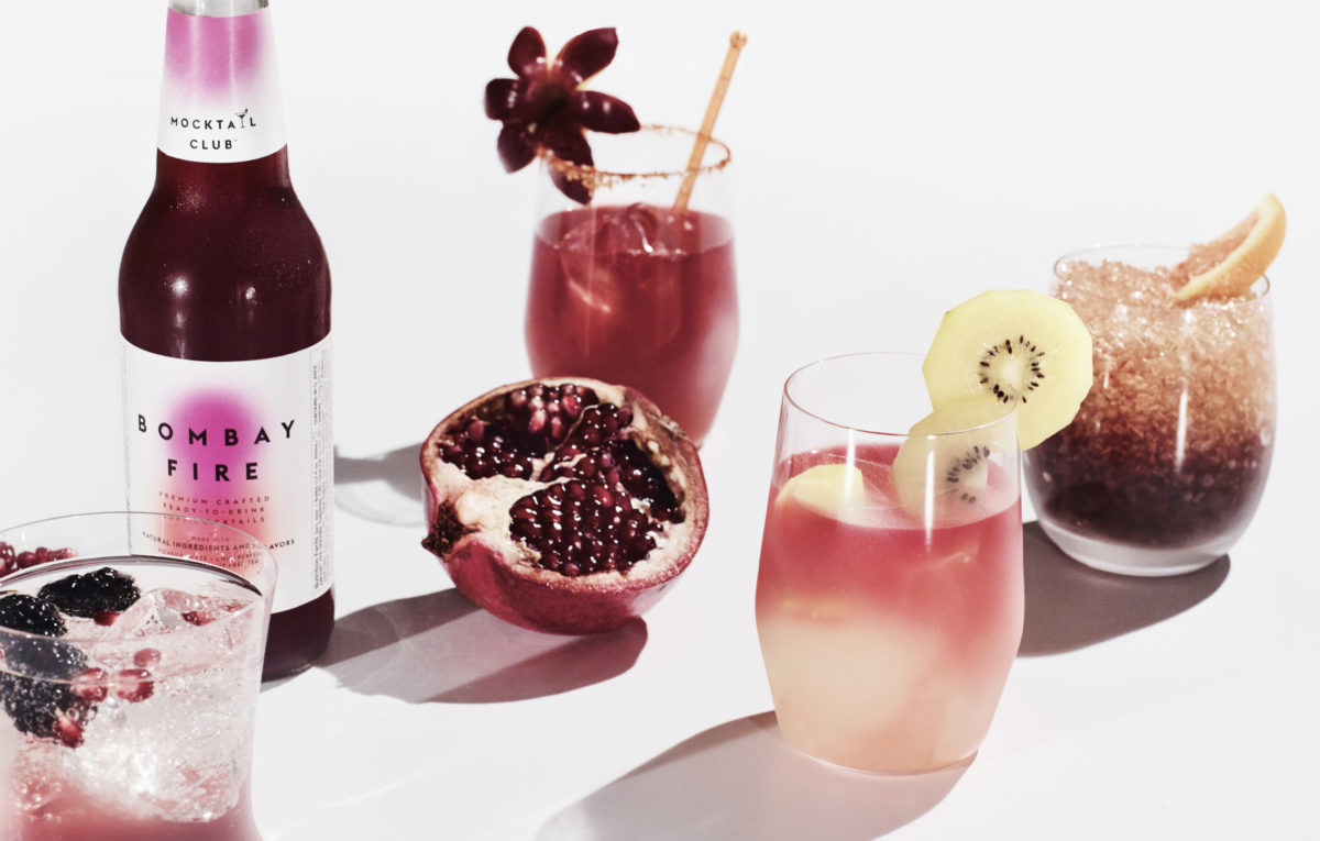
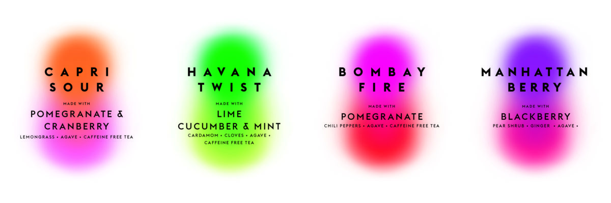
With the rise of live health monitoring, non-alcoholic drinks are on the up and up. Mocktail Club is capitalizing on this health-oriented trend with a modern art twist. The ethereal overlapping brand colors and the simple black sans serif typefaces create a light, airy aesthetic typically found in minimalist abstract paintings. This same direction sets their products apart from other similar products and visually groups them in the same family as their boozy counterparts.

Simple and vibrant. Mocktail Club by Design Army.


The Forktales Podcast™: Interviews with restaurant industry leaders and visionaries

Restaurant and advertising industry headlines and thinking

Reviews of restaurant experiences from around the globe 

Reviews of our favorite design, business, & restaurant books

Our favorite typography and fonts

Inspiration in your inbox

Get the latest inspiration in your inbox every Monday morning, for FREE!

"*" indicates required fields

This field is for validation purposes and should be left unchanged.

Delicious Bits in your Inbox!

Get the latest and greatest content delivered to your inbox for free!

"*" indicates required fields

This field is for validation purposes and should be left unchanged.