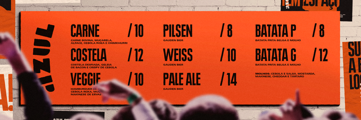
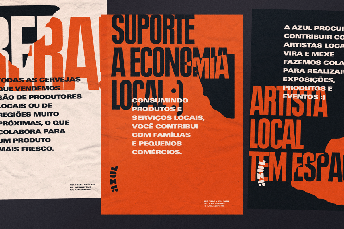
I tend to gravitate towards brands that play on an interesting, contrasting visual language or concept. I’ve always found the push and pull of disparate concepts to be engaging and alluring. With Azul, you get that right off the back. Azul means ‘blue’ in Portuguese, but you won’t find a drop of the color it’s usual calming and aquatic associations anywhere in this visual identity. Instead, I’d describe the visual identity as rough, choppy, churning, a sea of burnt oranges, warm blacks and creams composed of torn paper shapes. Some of the printed pieces feel highly industrial, due to the structured layouts of their typography. But, hands down, the most interesting part are the collages that makeup Azul’s promotional posters.
Azul Burger & Bar Restaurant Branding & Creative Direction by Thomas Austin.


