From Creamos Agencia case study:
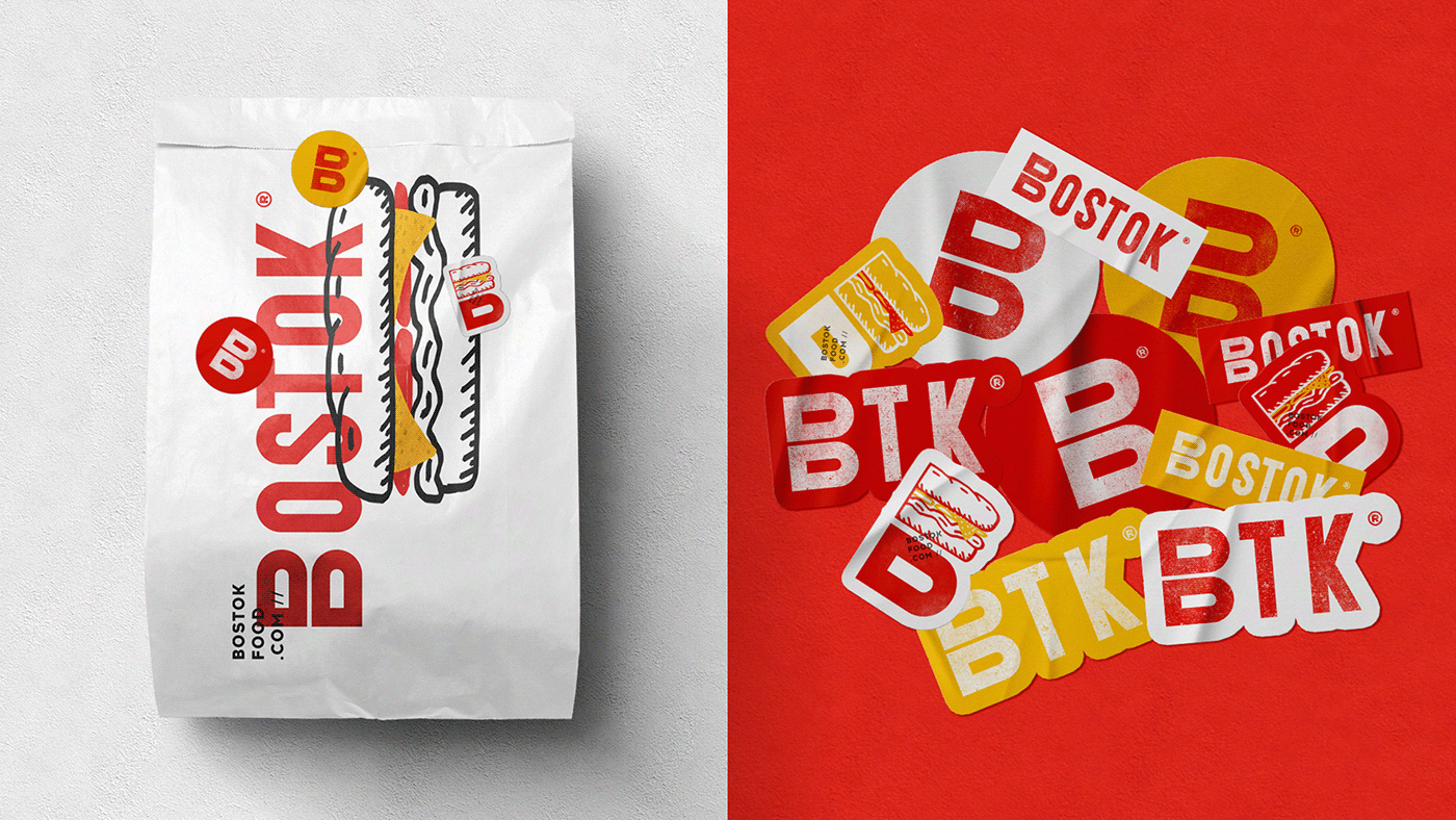
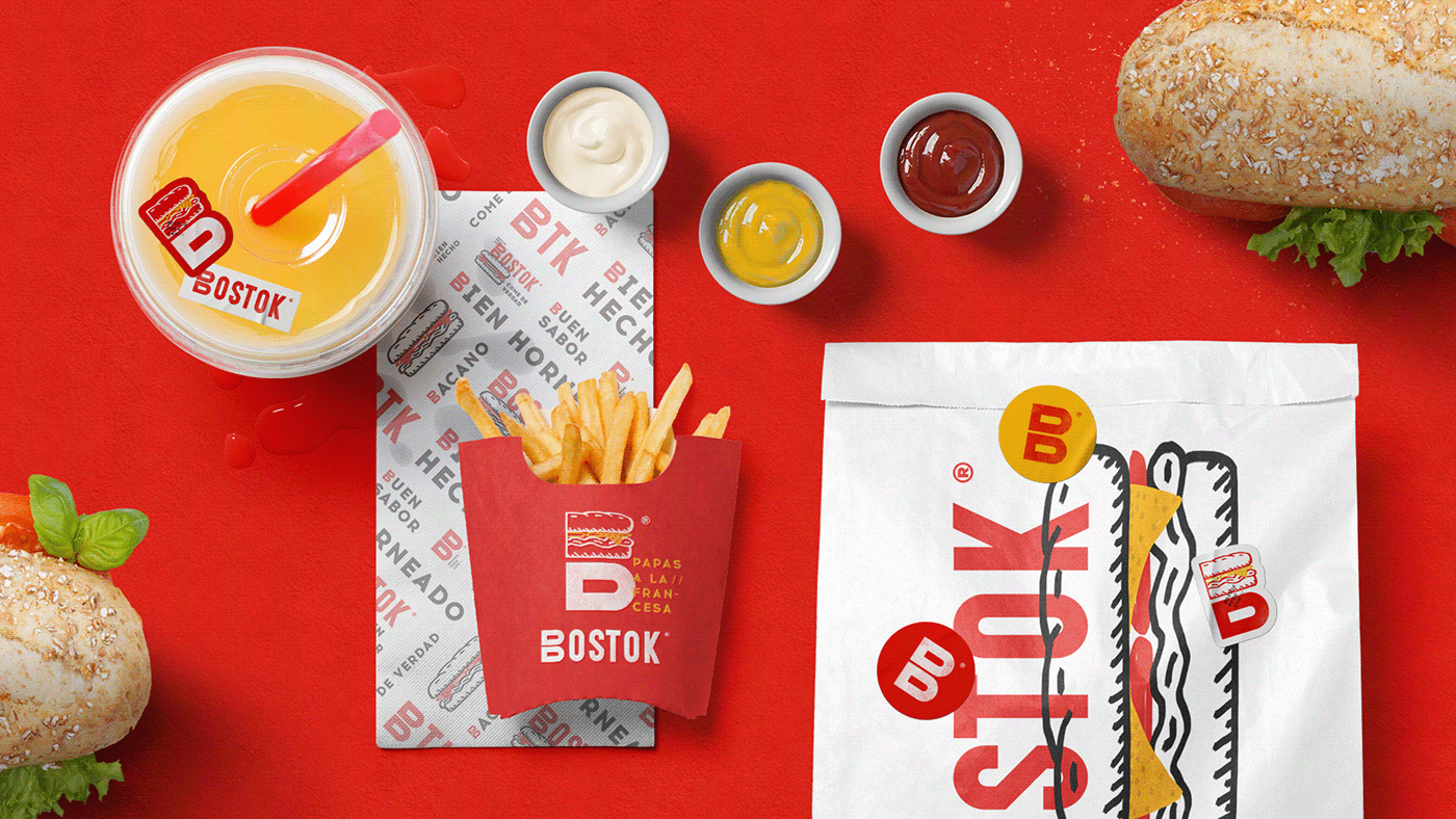
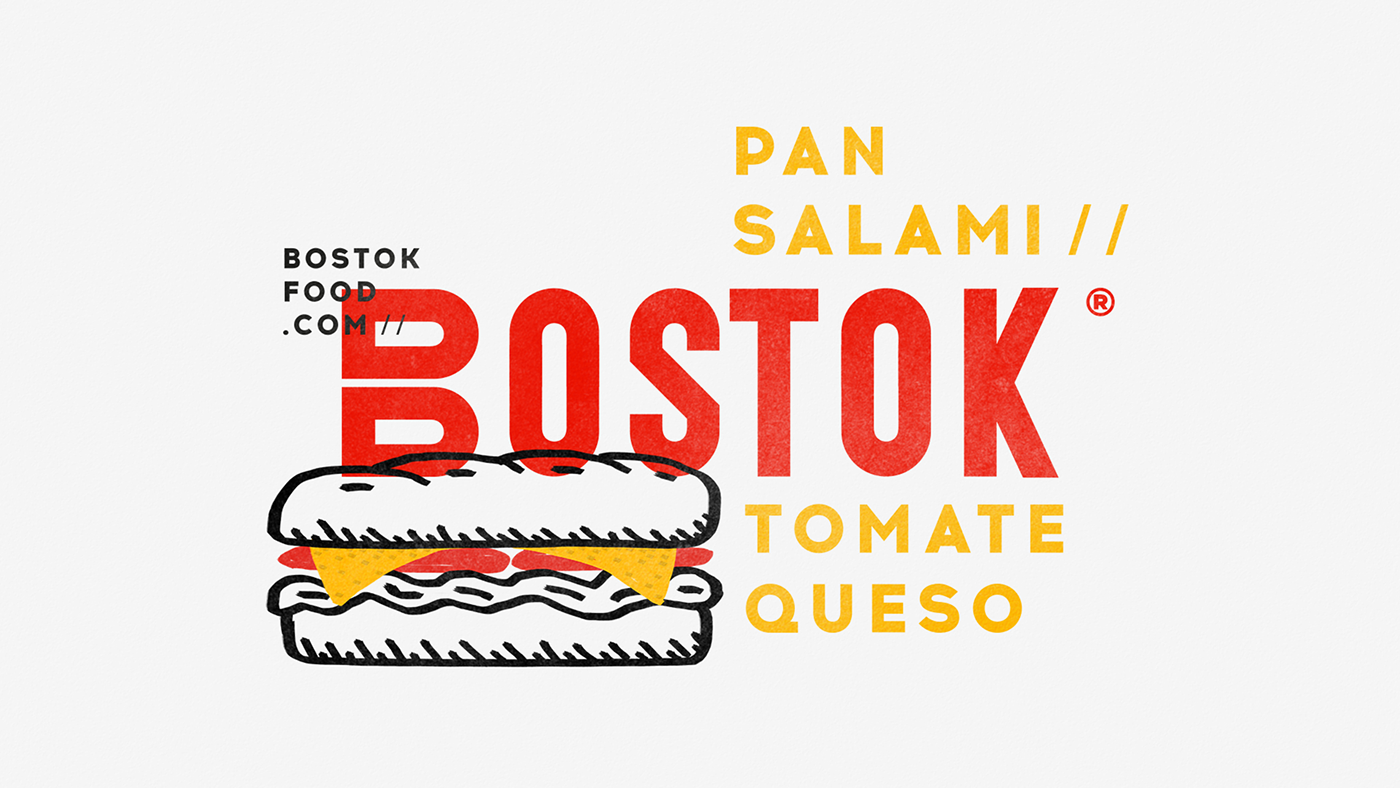
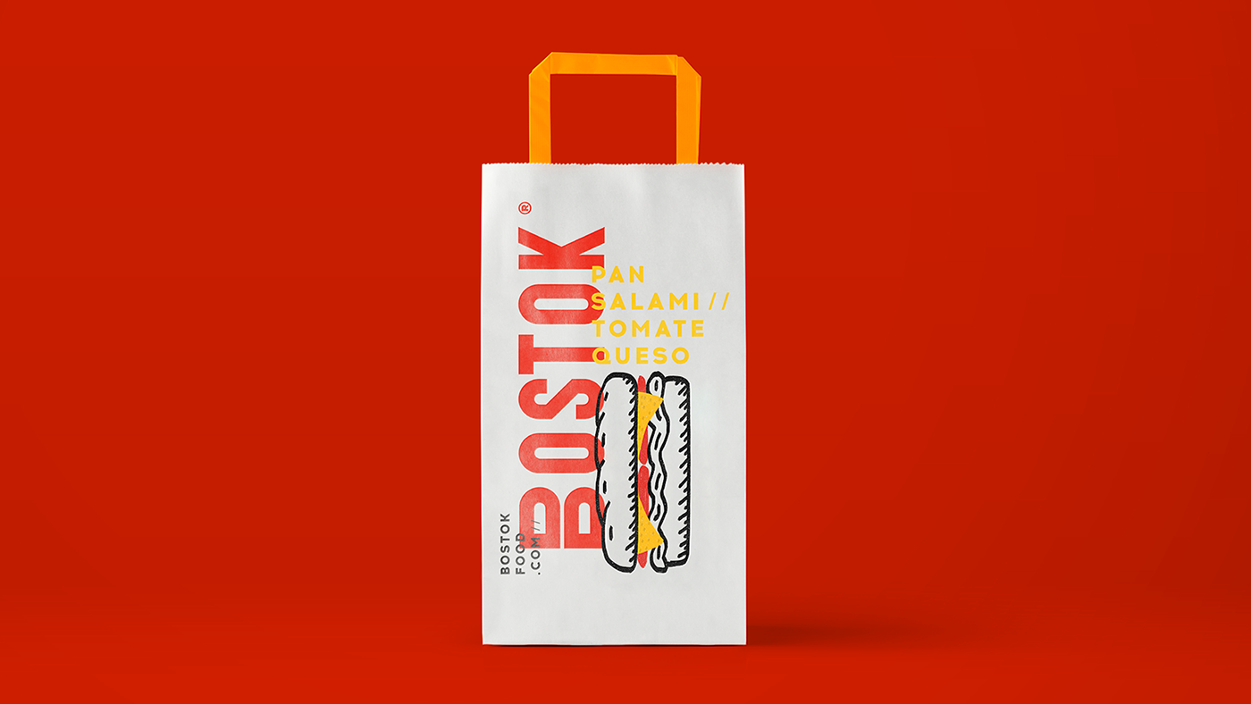
A new urban fast food brand, which comes to compete with the international model and its code of divided Sandwiches. Its name comes from the Soviet space program; because if the competition is a meter, Bostok is a rocket.
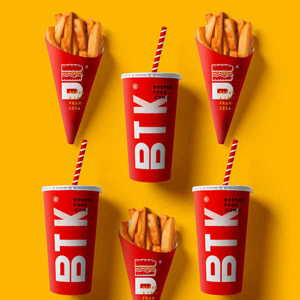
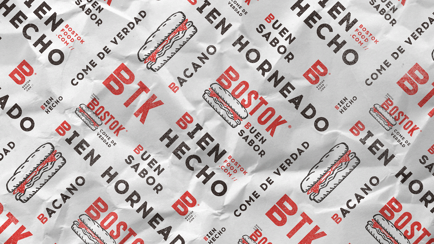
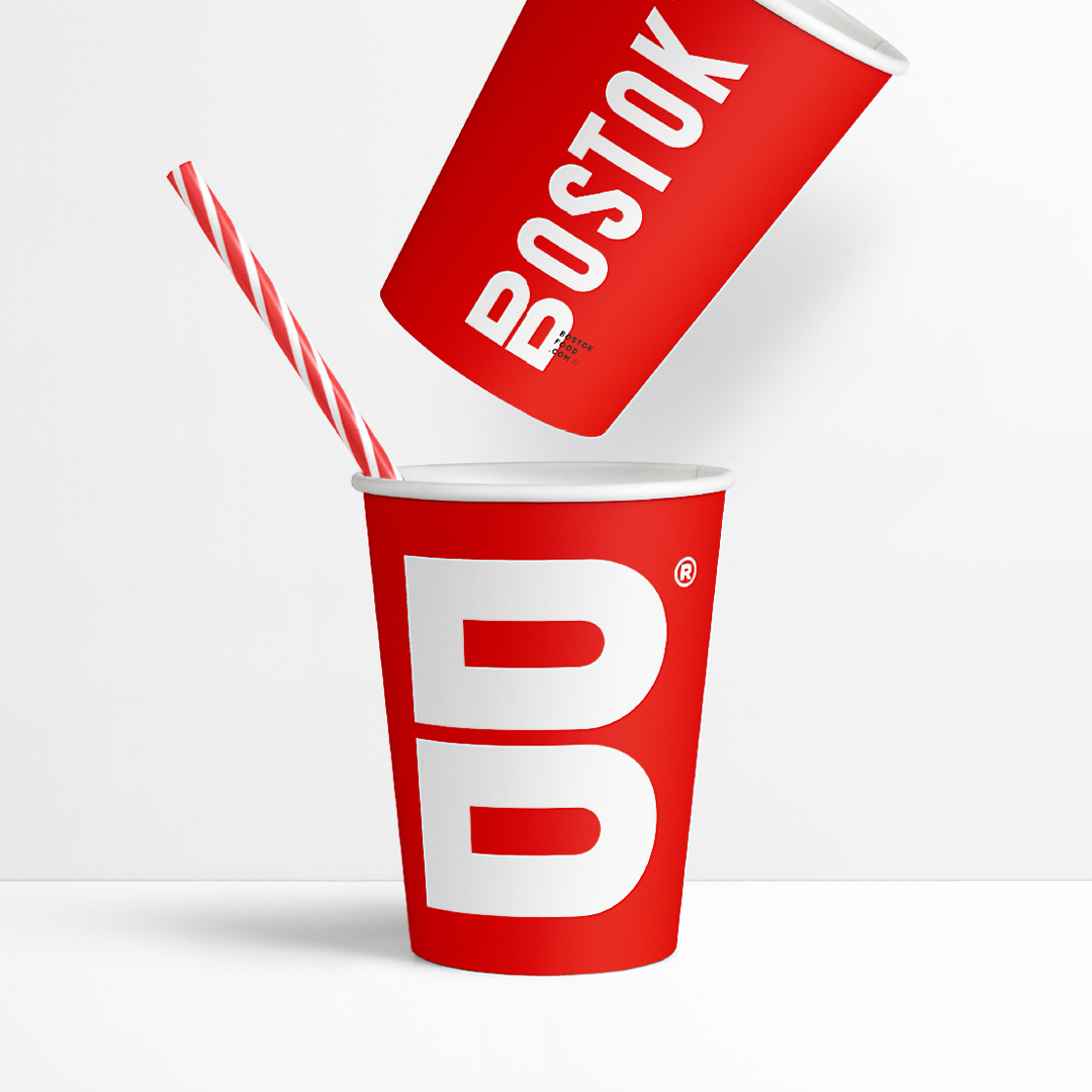
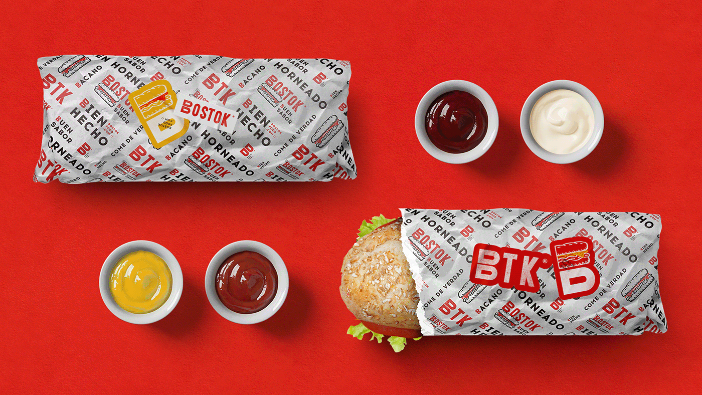
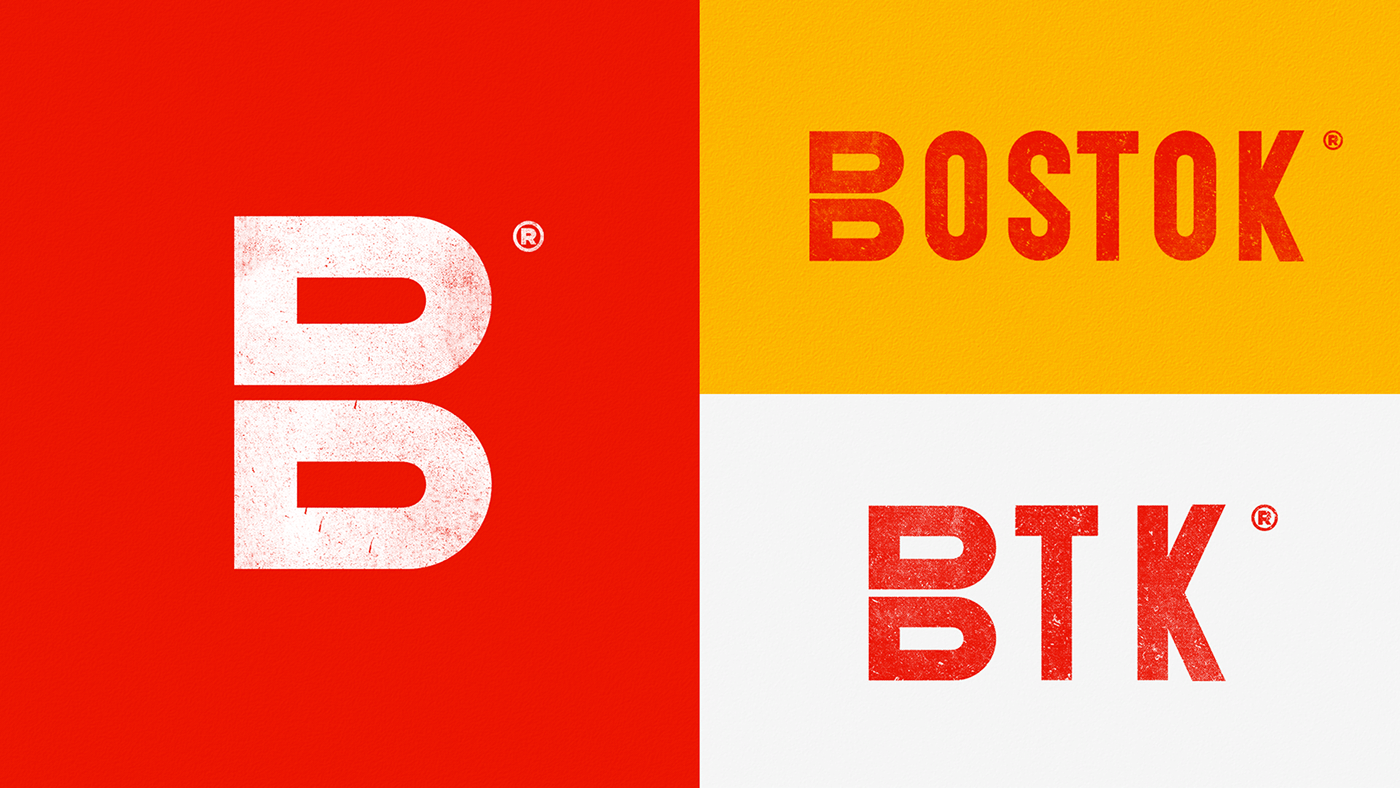
This is a lovely take on QSR branding, though I think there is a bit of a disconnect between the name, its origins, and the final brand. Bostok has a very dynamic energy to its visual identity, which could connect to the energy behind the rocket idea, but that is also a bit of a stretch to me. The urban inspiration of the identity, however, definitely comes across. The cacophony of elements and how they all interact haphazardly feels like a buzzing city.
Bostok Fast Food Restaurant Branding by Creamos Agencia.
