From eleyuve’s case study:
Naked & Sated is based on real food, without fats, sugars or additives. We banished the idea that eating healthy and well would leave you hungry. You would be satiated; you would enjoy a delicious meal without worries, a value that later became our tag line: eat without regrets.
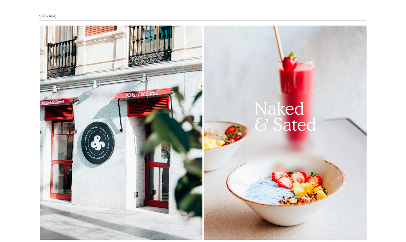
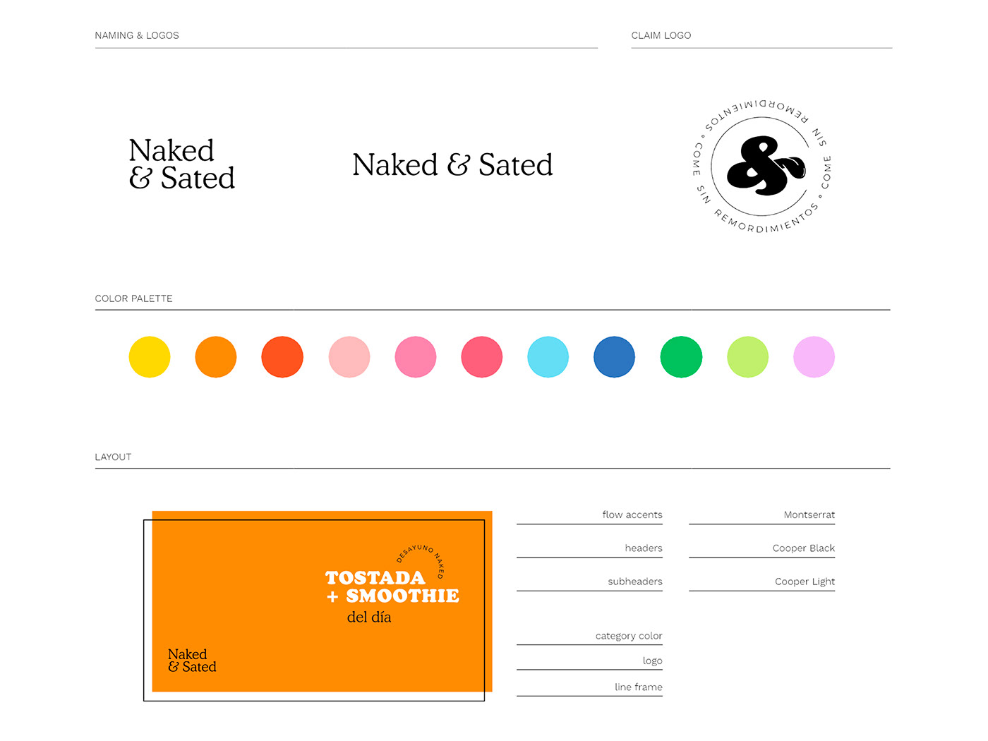
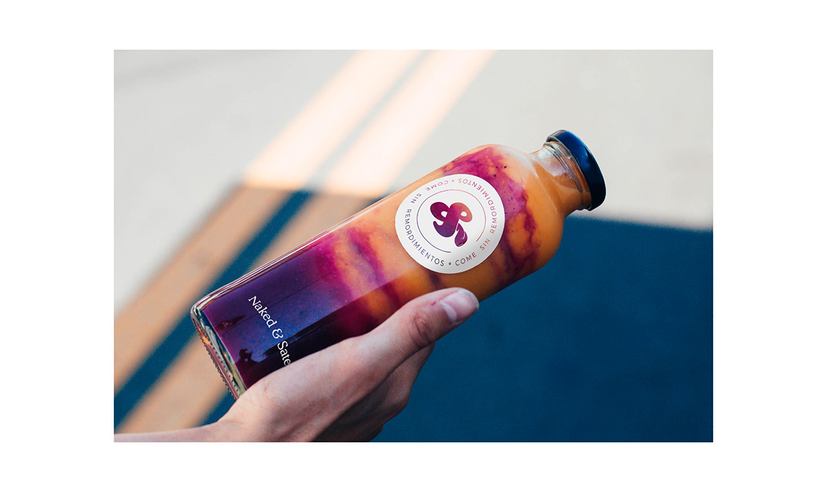
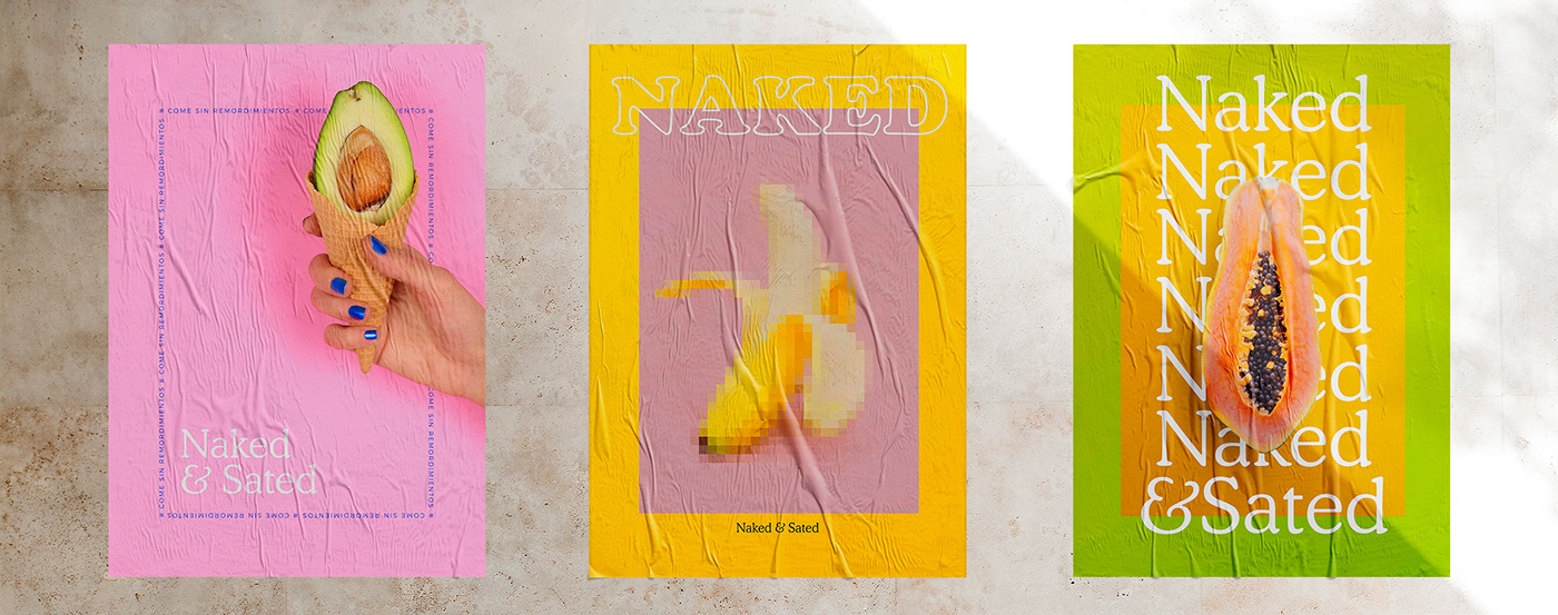
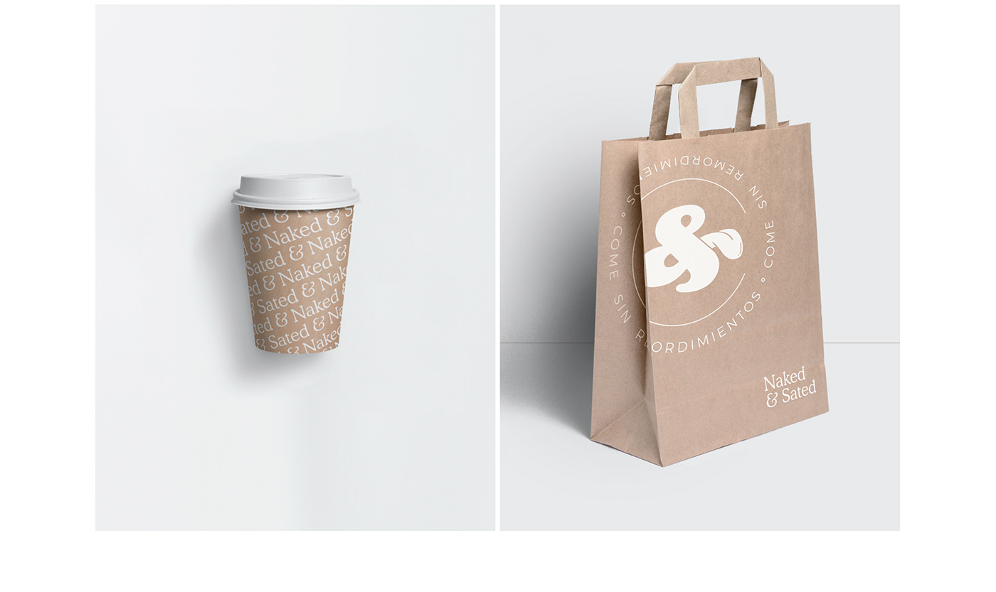
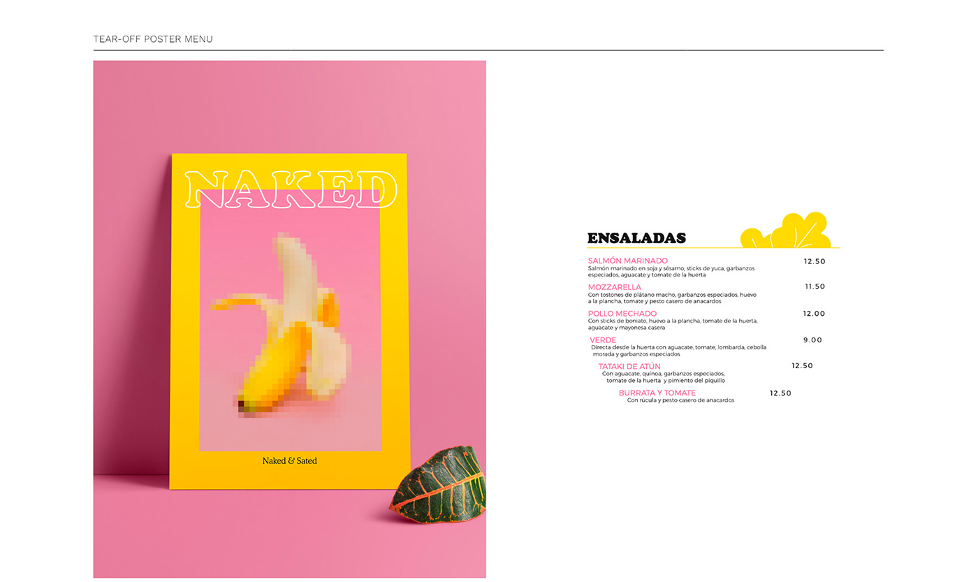
We created a visual identity based on the color of fruits and vegetables. We took advantage of the double meaning of the word Naked to
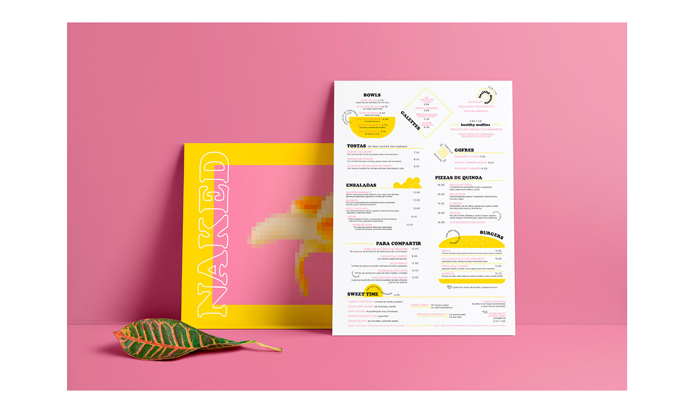
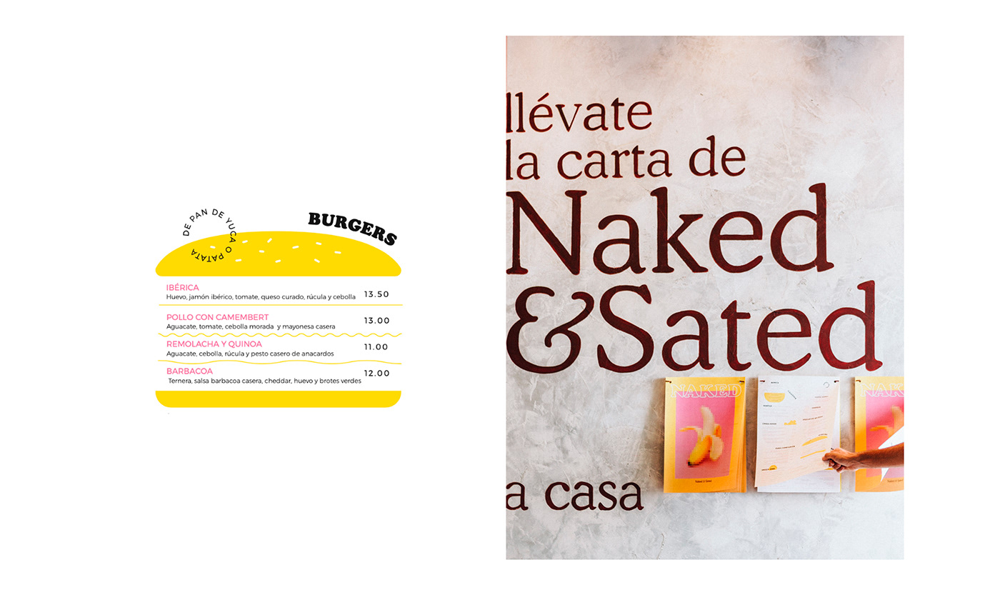
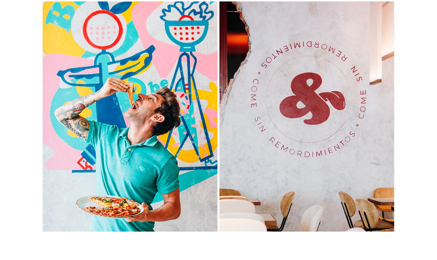
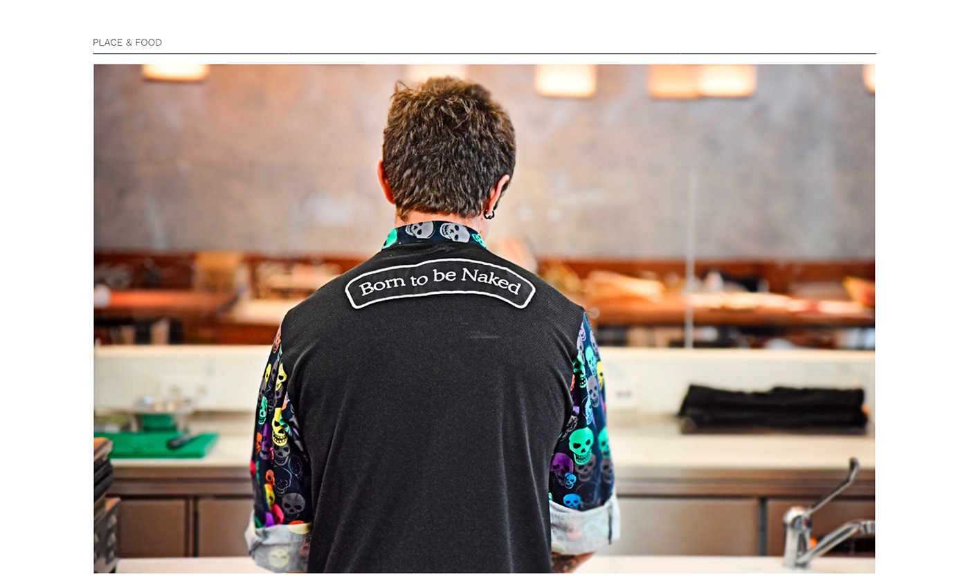
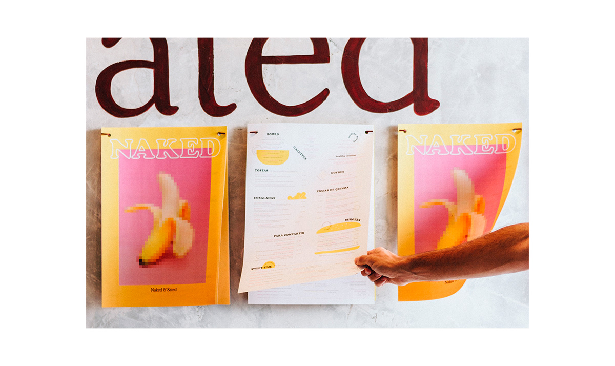
undress our products in a series of photographs that added a rogue touch to the already daring proposal of dishes. We made the restaurant menu an object of desire, a poster-size print that diners could take home.Furthermore, we needed that Naked & Sated reflects @chefbosquet philosophy: flavor, aesthetics, and proximity. So, in each opening, a
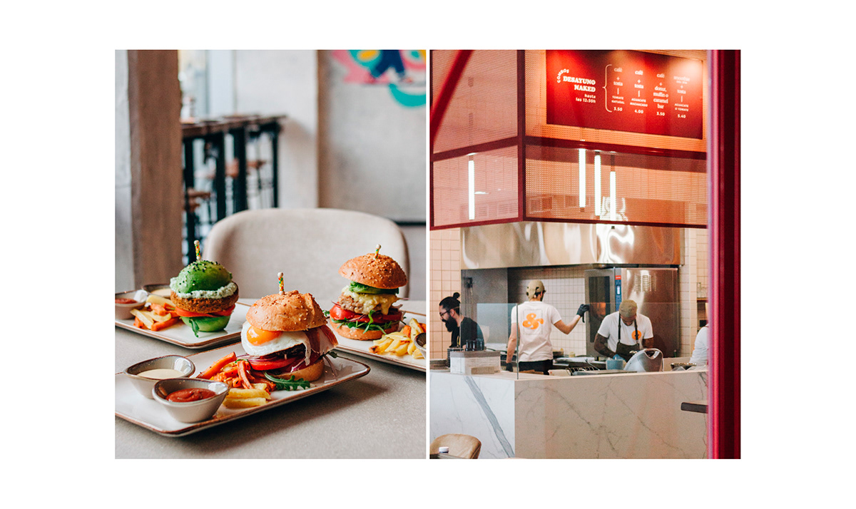
local illustrator would intervene on one of its walls, uniting art, aesthetics, and proximity. The illustrator who inaugurated the initiative was @delhambre.
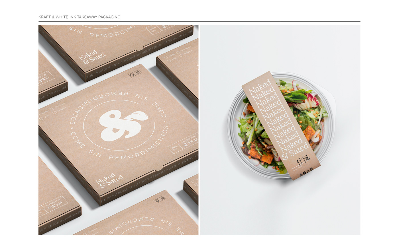
Naked and Sated Cafe Branding by eleyuve.